Get all the CSS button styles in one place for your default Gutenberg Blocks
Neon Glowing Button –
To get the Block or CSS click here ⥅
Copy the Block from and paste in your editor ↓
<!-- wp:buttons {"layout":{"type":"flex","justifyContent":"center"},"style":{"spacing":{"blockGap":"0"}},"hasCustomCSS":true,"customCSS":".button {\n  position: relative;\n  padding: 16px 30px;\n  font-size: 1.5rem;\n  color: var(\u002d\u002dcolor);\n  border: 2px solid rgba(0, 0, 0, 0.5);\n  border-radius: 4px;\n  text-shadow: 0 0 15px var(\u002d\u002dcolor);\n  text-decoration: none;\n  text-transform: uppercase;\n  letter-spacing: 0.1rem;\n  transition: 0.5s;\n  z-index: 1;\n}\n\n.button:hover {\n  color: #fff;\n  border: 2px solid rgba(0, 0, 0, 0);\n  box-shadow: 0 0 0px var(\u002d\u002dcolor);\n}\n\n.button::before {\n  content: '';\n  position: absolute;\n  top: 0;\n  left: 0;\n  width: 100%;\n  height: 100%;\n  background: var(\u002d\u002dcolor);\n  z-index: -1;\n  transform: scale(0);\n  transition: 0.5s;\n}\n\n.button:hover::before {\n  transform: scale(1);\n  transition-delay: 0.5s;\n  box-shadow: 0 0 10px var(\u002d\u002dcolor),\n    0 0 30px var(\u002d\u002dcolor),\n    0 0 60px var(\u002d\u002dcolor);\n}\n\n.button span {\n  position: absolute;\n  background: var(\u002d\u002dcolor);\n  pointer-events: none;\n  border-radius: 2px;\n  box-shadow: 0 0 10px var(\u002d\u002dcolor),\n    0 0 20px var(\u002d\u002dcolor),\n    0 0 30px var(\u002d\u002dcolor),\n    0 0 50px var(\u002d\u002dcolor),\n    0 0 100px var(\u002d\u002dcolor);\n  transition: 0.5s ease-in-out;\n  transition-delay: 0.25s;\n}\n\n.button:hover span {\n  opacity: 0;\n  transition-delay: 0s;\n}\n\n.button span:nth-child(1),\n.button span:nth-child(3) {\n  width: 40px;\n  height: 4px;\n}\n\n.button:hover span:nth-child(1),\n.button:hover span:nth-child(3) {\n  transform: translateX(0);\n}\n\n.button span:nth-child(2),\n.button span:nth-child(4) {\n  width: 4px;\n  height: 40px;\n}\n\n.button:hover span:nth-child(1),\n.button:hover span:nth-child(3) {\n  transform: translateY(0);\n}\n\n.button span:nth-child(1) {\n  top: calc(50% - 2px);\n  left: -50px;\n  transform-origin: left;\n}\n\n.button:hover span:nth-child(1) {\n  left: 50%;\n}\n\n.button span:nth-child(3) {\n  top: calc(50% - 2px);\n  right: -50px;\n  transform-origin: right;\n}\n\n.button:hover span:nth-child(3) {\n  right: 50%;\n}\n\n.button span:nth-child(2) {\n  left: calc(50% - 2px);\n  top: -50px;\n  transform-origin: top;\n}\n\n.button:hover span:nth-child(2) {\n  top: 50%;\n}\n\n.button span:nth-child(4) {\n  left: calc(50% - 2px);\n  bottom: -50px;\n  transform-origin: bottom;\n}\n\n.button:hover span:nth-child(4 ) {\n  bottom: 50%;\n}"} -->
<div class="wp-block-buttons"><!-- wp:button {"textColor":"contrastcolor","width":75,"style":{"border":{"radius":"0px"},"color":{"background":"#ffffff00"}},"className":"is-style-fill  ticss-ea407275 glowing-btn","hasCustomCSS":true,"customCSS":":root {\n  \u002d\u002dglow-color: hsl(186 100% 69%);\n}\n.glowing-btn {\n  position: relative;\n  color: var(\u002d\u002dglow-color);\n  cursor: pointer!important;\n \n  border: 0.15em solid var(\u002d\u002dglow-color);\n  border-radius: 0.45em;\n  background: none;\n  perspective: 3.5em;\n  \n\n  -webkit-box-shadow: inset 0px 0px 0.5em 0px var(\u002d\u002dglow-color),\n    0px 0px 0.5em 0px var(\u002d\u002dglow-color);\n  -moz-box-shadow: inset 0px 0px 0.5em 0px var(\u002d\u002dglow-color),\n    0px 0px 0.5em 0px var(\u002d\u002dglow-color);\n  box-shadow: inset 0px 0px 0.5em 0px var(\u002d\u002dglow-color),\n    0px 0px 0.5em 0px var(\u002d\u002dglow-color);\n  animation: border-flicker 2s linear infinite;\n}\n\n\n.glowing-btn::before {\n  content: \u0022\u0022;\n  position: absolute;\n  top: 0;\n  bottom: 0;\n  left: 0;\n  right: 0;\n  opacity: 0.7;\n  filter: blur(1em);\n  transform: translateY(120%) rotateX(95deg) scale(1, 0.35);\n  background: var(\u002d\u002dglow-color);\n  pointer-events: none;\n}\n\n.glowing-btn::after {\n  content: \u0022\u0022;\n  position: absolute;\n  top: 0;\n  left: 0;\n  right: 0;\n  bottom: 0;\n  opacity: 0;\n  z-index: -1;\n  background-color: var(\u002d\u002dglow-color);\n  box-shadow: 0 0 2em 0.2em var(\u002d\u002dglow-color);\n  transition: opacity 100ms linear;\n}\n\n.glowing-btn:hover {\n  color: rgba(0, 0, 0, 0.8);\n  text-shadow: none;\n  animation: none;\n}\n\n\n\n.glowing-btn:hover .faulty-letter {\n  animation: none;\n  text-shadow: none;\n  opacity: 1;\n}\n\n.glowing-btn:hover:before {\n  filter: blur(1.5em);\n  opacity: 1;\n}\n\n.glowing-btn:hover:after {\n  opacity: 1;\n}\n\n@keyframes faulty-flicker {\n  0% {\n    opacity: 0.1;\n  }\n  2% {\n    opacity: 0.1;\n  }\n  4% {\n    opacity: 0.5;\n  }\n  19% {\n    opacity: 0.5;\n  }\n  21% {\n    opacity: 0.1;\n  }\n  23% {\n    opacity: 1;\n  }\n  80% {\n    opacity: 0.5;\n  }\n  83% {\n    opacity: 0.4;\n  }\n\n  87% {\n    opacity: 1;\n  }\n}\n\n@keyframes text-flicker {\n  0% {\n    opacity: 0.1;\n  }\n\n  2% {\n    opacity: 1;\n  }\n\n  8% {\n    opacity: 0.1;\n  }\n\n  9% {\n    opacity: 1;\n  }\n\n  12% {\n    opacity: 0.1;\n  }\n  20% {\n    opacity: 1;\n  }\n  25% {\n    opacity: 0.3;\n  }\n  30% {\n    opacity: 1;\n  }\n\n  70% {\n    opacity: 0.7;\n  }\n  72% {\n    opacity: 0.2;\n  }\n\n  77% {\n    opacity: 0.9;\n  }\n  100% {\n    opacity: 0.9;\n  }\n}\n\n@keyframes border-flicker {\n  0% {\n    opacity: 0.1;\n  }\n  2% {\n    opacity: 1;\n  }\n  4% {\n    opacity: 0.1;\n  }\n\n  8% {\n    opacity: 1;\n  }\n  70% {\n    opacity: 0.7;\n  }\n  100% {\n    opacity: 1;\n  }\n}\n\n@media only screen and (max-width: 600px) {\n  .glowing-btn{\n    font-size: 1em;\n  }\n}"} -->
<div class="wp-block-button has-custom-width wp-block-button__width-75 is-style-fill ticss-ea407275 glowing-btn"><a class="wp-block-button__link has-contrastcolor-color has-text-color has-background wp-element-button" style="border-radius:0px;background-color:#ffffff00">Neon Button</a></div>
<!-- /wp:button --></div>
<!-- /wp:buttons -->
You will need Block CSS plugin by Themeisle to get the exact block syle.
If you need only the CSS code here it is ↓
:root {
  --glow-color: hsl(186 100% 69%);
}
.glowing-btn {
  position: relative;
  color: var(--glow-color);
  cursor: pointer!important;

  border: 0.15em solid var(--glow-color);
  border-radius: 0.45em;
  background: none;
  perspective: 3.5em;


  -webkit-box-shadow: inset 0px 0px 0.5em 0px var(--glow-color),
    0px 0px 0.5em 0px var(--glow-color);
  -moz-box-shadow: inset 0px 0px 0.5em 0px var(--glow-color),
    0px 0px 0.5em 0px var(--glow-color);
  box-shadow: inset 0px 0px 0.5em 0px var(--glow-color),
    0px 0px 0.5em 0px var(--glow-color);
  animation: border-flicker 2s linear infinite;
}


.glowing-btn::before {
  content: "";
  position: absolute;
  top: 0;
  bottom: 0;
  left: 0;
  right: 0;
  opacity: 0.7;
  filter: blur(1em);
  transform: translateY(120%) rotateX(95deg) scale(1, 0.35);
  background: var(--glow-color);
  pointer-events: none;
}

.glowing-btn::after {
  content: "";
  position: absolute;
  top: 0;
  left: 0;
  right: 0;
  bottom: 0;
  opacity: 0;
  z-index: -1;
  background-color: var(--glow-color);
  box-shadow: 0 0 2em 0.2em var(--glow-color);
  transition: opacity 100ms linear;
}

.glowing-btn:hover {
  color: rgba(0, 0, 0, 0.8);
  text-shadow: none;
  animation: none;
}


.glowing-btn:hover .faulty-letter {
  animation: none;
  text-shadow: none;
  opacity: 1;
}

.glowing-btn:hover:before {
  filter: blur(1.5em);
  opacity: 1;
}

.glowing-btn:hover:after {
  opacity: 1;
}

@keyframes faulty-flicker {
  0% {
    opacity: 0.1;
  }
  2% {
    opacity: 0.1;
  }
  4% {
    opacity: 0.5;
  }
  19% {
    opacity: 0.5;
  }
  21% {
    opacity: 0.1;
  }
  23% {
    opacity: 1;
  }
  80% {
    opacity: 0.5;
  }
  83% {
    opacity: 0.4;
  }

  87% {
    opacity: 1;
  }
}

@keyframes text-flicker {
  0% {
    opacity: 0.1;
  }

  2% {
    opacity: 1;
  }

  8% {
    opacity: 0.1;
  }

  9% {
    opacity: 1;
  }

  12% {
    opacity: 0.1;
  }
  20% {
    opacity: 1;
  }
  25% {
    opacity: 0.3;
  }
  30% {
    opacity: 1;
  }

  70% {
    opacity: 0.7;
  }
  72% {
    opacity: 0.2;
  }

  77% {
    opacity: 0.9;
  }
  100% {
    opacity: 0.9;
  }
}

@keyframes border-flicker {
  0% {
    opacity: 0.1;
  }
  2% {
    opacity: 1;
  }
  4% {
    opacity: 0.1;
  }

  8% {
    opacity: 1;
  }
  70% {
    opacity: 0.7;
  }
  100% {
    opacity: 1;
  }
}

@media only screen and (max-width: 600px) {
  .glowing-btn{
    font-size: 1em;
  }
}
Gradient Border on Button Hover –
To get the Block or CSS click here ⥅
Copy the Block from and paste in your editor ↓
<!-- wp:buttons {"layout":{"type":"flex","justifyContent":"center"},"style":{"spacing":{"blockGap":"0"}}} -->
<div class="wp-block-buttons"><!-- wp:button {"backgroundColor":"price","textColor":"contrastcolor","width":50,"style":{"border":{"radius":"40px"}},"className":"ticss-b77bd14f gradient-border-btn-hover gradbutton is-style-fill","hasCustomCSS":true,"customCSS":".gradient-border-btn-hover :hover{\n                    box-shadow: rgb(246, 84, 174) -2px -2px 0px 2px, rgb(255, 198, 0) 0px 0px 0px 4px, rgba(0, 0, 0, 0.05) 0px 0px 2px 7px;\n  transform: scale(1.01);}\n          \n\n"} -->
<div class="wp-block-button has-custom-width wp-block-button__width-50 ticss-b77bd14f gradient-border-btn-hover gradbutton is-style-fill"><a class="wp-block-button__link has-contrastcolor-color has-price-background-color has-text-color has-background wp-element-button" style="border-radius:40px">Gradient Button</a></div>
<!-- /wp:button --></div>
<!-- /wp:buttons -->
You will need Block CSS plugin by Themeisle to get the exact block syle.
If you need only the CSS code here it is ↓
.gradient-border-btn-hover :hover{
                    box-shadow: rgb(246, 84, 174) -2px -2px 0px 2px, rgb(255, 198, 0) 0px 0px 0px 4px, rgba(0, 0, 0, 0.05) 0px 0px 2px 7px;
  transform: scale(1.01);}
Gradient Border Button –
To get the Block or CSS click here ⥅
Copy the Block from and paste in your editor ↓
<!-- wp:buttons {"layout":{"type":"flex","justifyContent":"center"},"style":{"spacing":{"blockGap":"0"}}} -->
<div class="wp-block-buttons"><!-- wp:button {"backgroundColor":"price","textColor":"contrastcolor","width":50,"style":{"border":{"radius":"40px"}},"className":"ticss-b77bd14f gradient-border-btn gradbutton is-style-fill gradient-border-btn-hover ","hasCustomCSS":true,"customCSS":".gradient-border-btn{\n                    box-shadow: rgb(246, 84, 174) -2px -2px 0px 2px, rgb(255, 198, 0) 0px 0px 0px 4px, rgba(0, 0, 0, 0.05) 0px 0px 2px 7px;\nborder-radius:40px;}\n.gradient-border-btn-hover :hover{\n    cursor:pointer;                box-shadow: rgb(246, 84, 174) -2px -2px 0px 2px, rgb(255, 198, 0) 0px 0px 0px 4px, rgba(0, 0, 0, 0.05) 0px 0px 2px 7px;\n  transform: scale(1.01);}\n          \n\n"} -->
<div class="wp-block-button has-custom-width wp-block-button__width-50 ticss-b77bd14f gradient-border-btn gradbutton is-style-fill gradient-border-btn-hover"><a class="wp-block-button__link has-contrastcolor-color has-price-background-color has-text-color has-background wp-element-button" style="border-radius:40px">Gradient Button</a></div>
<!-- /wp:button --></div>
<!-- /wp:buttons -->
You will need Block CSS plugin by Themeisle to get the exact block syle.
If you need only the CSS code here it is ↓
.gradient-border-btn{
                    box-shadow: rgb(246, 84, 174) -2px -2px 0px 2px, rgb(255, 198, 0) 0px 0px 0px 4px, rgba(0, 0, 0, 0.05) 0px 0px 2px 7px;
border-radius:40px;}
.gradient-border-btn-hover :hover{
    cursor:pointer;                box-shadow: rgb(246, 84, 174) -2px -2px 0px 2px, rgb(255, 198, 0) 0px 0px 0px 4px, rgba(0, 0, 0, 0.05) 0px 0px 2px 7px;
  transform: scale(1.01);}
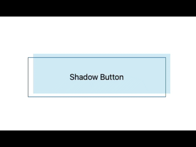
Solid Shadow on Button Hover –
To get the Block or CSS click here ⥅
Copy the Block from and paste in your editor ↓
<!-- wp:buttons {"layout":{"type":"flex","justifyContent":"center"},"style":{"spacing":{"blockGap":"0"}}} -->
<div class="wp-block-buttons"><!-- wp:button {"backgroundColor":"contrastcolor","textColor":"basecolor","width":50,"style":{"border":{"radius":"40px"}},"className":"ticss-b77bd14f is-style-fill dark-shadow-hover-btn","hasCustomCSS":true,"customCSS":".dark-shadow-hover-btn  :hover {\n           cursor:pointer;             box-shadow: 4px 4px 0 #ff8b61;\n  transform: translate(-4px,-4px);}\n\n                "} -->
<div class="wp-block-button has-custom-width wp-block-button__width-50 ticss-b77bd14f is-style-fill dark-shadow-hover-btn"><a class="wp-block-button__link has-basecolor-color has-contrastcolor-background-color has-text-color has-background wp-element-button" style="border-radius:40px">Shadow Button</a></div>
<!-- /wp:button --></div>
<!-- /wp:buttons -->
You will need Block CSS plugin by Themeisle to get the exact block syle.
If you need only the CSS code here it is ↓
.dark-shadow-hover-btn  :hover {
           cursor:pointer;             box-shadow: 4px 4px 0 #ff8b61;
  transform: translate(-4px,-4px);}
Light Blue Gradient Button Style –
To get the Block or CSS click here ⥅
Copy the Block from and paste in your editor ↓
<!-- wp:buttons {"layout":{"type":"flex","justifyContent":"center"},"style":{"spacing":{"blockGap":"0"}}} -->
<div class="wp-block-buttons"><!-- wp:button {"backgroundColor":"contrastcolor","textColor":"basecolor","width":50,"style":{"border":{"radius":"40px"}},"className":"ticss-b77bd14f is-style-fill dark-shadow-hover-btn","hasCustomCSS":true,"customCSS":".dark-shadow-hover-btn  :hover {\n                        box-shadow: 4px 4px 0 #ff8b61;\n  transform: translate(-4px,-4px);}\n\n                "} -->
<div class="wp-block-button has-custom-width wp-block-button__width-50 ticss-b77bd14f is-style-fill dark-shadow-hover-btn"><a class="wp-block-button__link has-basecolor-color has-contrastcolor-background-color has-text-color has-background wp-element-button" style="border-radius:40px">Shadow Button</a></div>
<!-- /wp:button --></div>
<!-- /wp:buttons -->
You will need Block CSS plugin by Themeisle to get the exact block style.
If you need only the CSS code here it is ↓
.dark-shadow-hover-btn  :hover {
                        box-shadow: 4px 4px 0 #ff8b61;
  transform: translate(-4px,-4px);}
Button Arounder on Hover –
To get the Block or CSS click here ⥅
Copy the Block from and paste in your editor ↓
<!-- wp:buttons {"layout":{"type":"flex","justifyContent":"center"},"style":{"spacing":{"blockGap":"0"}}} -->
<div class="wp-block-buttons"><!-- wp:button {"textColor":"contrastcolor","width":50,"style":{"border":{"radius":"0px"},"color":{"background":"#ffffff00"}},"className":"is-style-fill button-arounder ticss-ea407275","hasCustomCSS":true,"customCSS":".button-arounder {\n  border: solid 2px black;\n  cursor:pointer;\n \n  background: hsl(190deg, 30%, 15%);\n  color: hsl(190deg, 10%, 95%);\n  \n  box-shadow: 0 0px 0px hsla(190deg, 15%, 5%, .2);\n  transfrom: translateY(0);\n  border-top-left-radius: 0px;\n  border-top-right-radius: 0px;\n  border-bottom-left-radius: 0px;\n  border-bottom-right-radius: 0px;\n  \n  \u002d\u002ddur: .15s;\n  \u002d\u002ddelay: .15s;\n  \u002d\u002dradius: 16px;\n  \n  transition:\n    border-top-left-radius var(\u002d\u002ddur) var(\u002d\u002ddelay) ease-out,\n    border-top-right-radius var(\u002d\u002ddur) calc(var(\u002d\u002ddelay) * 2) ease-out,\n    border-bottom-right-radius var(\u002d\u002ddur) calc(var(\u002d\u002ddelay) * 3) ease-out,\n    border-bottom-left-radius var(\u002d\u002ddur) calc(var(\u002d\u002ddelay) * 4) ease-out,\n    box-shadow calc(var(\u002d\u002ddur) * 4) ease-out,\n    transform calc(var(\u002d\u002ddur) * 4) ease-out,\n    background calc(var(\u002d\u002ddur) * 4) steps(4, jump-end);\n}\n\n.button-arounder:hover,\n.button-arounder:focus {\n  cursor:pointer!important;\n  box-shadow: 0 4px 8px hsla(190deg, 15%, 5%, .2);\n  transform: translateY(-4px);\n  background: hsl(230deg, 50%, 45%);\n  border-top-left-radius: var(\u002d\u002dradius);\n  border-top-right-radius: var(\u002d\u002dradius);\n  border-bottom-left-radius: var(\u002d\u002dradius);\n  border-bottom-right-radius: var(\u002d\u002dradius);\n}\n                "} -->
<div class="wp-block-button has-custom-width wp-block-button__width-50 is-style-fill button-arounder ticss-ea407275"><a class="wp-block-button__link has-contrastcolor-color has-text-color has-background wp-element-button" style="border-radius:0px;background-color:#ffffff00">Button Arounder</a></div>
<!-- /wp:button --></div>
<!-- /wp:buttons -->
You will need Block CSS plugin by Themeisle to get the exact block style.
If you need only the CSS code here it is ↓
.button-arounder {
  border: solid 2px black;
  cursor:pointer;

  background: hsl(190deg, 30%, 15%);
  color: hsl(190deg, 10%, 95%);

  box-shadow: 0 0px 0px hsla(190deg, 15%, 5%, .2);
  transfrom: translateY(0);
  border-top-left-radius: 0px;
  border-top-right-radius: 0px;
  border-bottom-left-radius: 0px;
  border-bottom-right-radius: 0px;

  --dur: .15s;
  --delay: .15s;
  --radius: 16px;

  transition:
    border-top-left-radius var(--dur) var(--delay) ease-out,
    border-top-right-radius var(--dur) calc(var(--delay) * 2) ease-out,
    border-bottom-right-radius var(--dur) calc(var(--delay) * 3) ease-out,
    border-bottom-left-radius var(--dur) calc(var(--delay) * 4) ease-out,
    box-shadow calc(var(--dur) * 4) ease-out,
    transform calc(var(--dur) * 4) ease-out,
    background calc(var(--dur) * 4) steps(4, jump-end);
}

.button-arounder:hover,
.button-arounder:focus {
  cursor:pointer!important;
  box-shadow: 0 4px 8px hsla(190deg, 15%, 5%, .2);
  transform: translateY(-4px);
  background: hsl(230deg, 50%, 45%);
  border-top-left-radius: var(--radius);
  border-top-right-radius: var(--radius);
  border-bottom-left-radius: var(--radius);
  border-bottom-right-radius: var(--radius);
}
Button Fence Style –
To get the Block or CSS click here ⥅
Copy the Block from and paste in your editor ↓
<!-- wp:buttons {"layout":{"type":"flex","justifyContent":"center"},"style":{"spacing":{"blockGap":"0"}}} -->
<div class="wp-block-buttons"><!-- wp:button {"textColor":"contrastcolor","width":50,"style":{"border":{"radius":"0px"},"color":{"background":"#ffffff00"}},"className":"is-style-fill ticss-ea407275 button-fence","hasCustomCSS":true,"customCSS":".button-fence {\n  \u002d\u002db: 3px;   /* border thickness */\n  \u002d\u002ds: .15em; /* size of the corner */\n  \u002d\u002dc: #BD5532;\n  \n  padding: calc(.05em + var(\u002d\u002ds)) calc(.3em + var(\u002d\u002ds));\n  color: var(\u002d\u002dc);\n  \u002d\u002d_p: var(\u002d\u002ds);\n  background:\n    conic-gradient(from 90deg at var(\u002d\u002db) var(\u002d\u002db),#0000 90deg,var(\u002d\u002dc) 0)\n    var(\u002d\u002d_p) var(\u002d\u002d_p)/calc(100% - var(\u002d\u002db) - 2*var(\u002d\u002d_p)) calc(100% - var(\u002d\u002db) - 2*var(\u002d\u002d_p));\n  transition: .3s linear, color 0s, background-color 0s;\n  outline: var(\u002d\u002db) solid #0000;\n  outline-offset: .2em;\n}\n.button-fence:hover,\n.button-fence:focus-visible{\n  \u002d\u002d_p: 0px;\n  outline-color: var(\u002d\u002dc);\n  outline-offset: .05em;\n}\n.button-fence:active {\n  background: var(\u002d\u002dc);\n  color: #fff;\n}"} -->
<div class="wp-block-button has-custom-width wp-block-button__width-50 is-style-fill ticss-ea407275 button-fence"><a class="wp-block-button__link has-contrastcolor-color has-text-color has-background wp-element-button" style="border-radius:0px;background-color:#ffffff00">Button Fence</a></div>
<!-- /wp:button --></div>
<!-- /wp:buttons -->
You will need Block CSS plugin by Themeisle to get the exact block syle.
If you need only the CSS code here it is ↓
.button-fence {
  --b: 3px;   /* border thickness */
  --s: .15em; /* size of the corner */
  --c: #BD5532;

  padding: calc(.05em + var(--s)) calc(.3em + var(--s));
  color: var(--c);
  --_p: var(--s);
  background:
    conic-gradient(from 90deg at var(--b) var(--b),#0000 90deg,var(--c) 0)
    var(--_p) var(--_p)/calc(100% - var(--b) - 2*var(--_p)) calc(100% - var(--b) - 2*var(--_p));
  transition: .3s linear, color 0s, background-color 0s;
  outline: var(--b) solid #0000;
  outline-offset: .2em;
}
.button-fence:hover,
.button-fence:focus-visible{
  --_p: 0px;
  outline-color: var(--c);
  outline-offset: .05em;
}
.button-fence:active {
  background: var(--c);
  color: #fff;
}
CSS Glass Morphism Button Hover Effects –
To get the Block or CSS click here ⥅
Copy the Block from and paste in your editor ↓
<!-- wp:buttons {"className":"","layout":{"type":"flex","justifyContent":"center"},"style":{"spacing":{"blockGap":"0"}},"hasCustomCSS":true} -->
<div class="wp-block-buttons"><!-- wp:button {"textColor":"contrastcolor","width":75,"style":{"border":{"radius":"0px"},"color":{"background":"#ffffff00"}},"className":"ticss-ea407275 glassmorphism-btn1 is-style-fill","hasCustomCSS":true,"customCSS":".glassmorphism-btn1 {\n\tposition: relative;\n\ttop: 0;\n\tleft: 0;\n\twidth: 250px;\n\theight: 50px;\n\tmargin: 0;\n\tdisplay: flex;\n\tjustify-content: center;\n\talign-items: center;\n}\n.glassmorphism-btn1 {\n\tposition: absolute;\n\ttop: 0;\n\tleft: 0;\n\twidth: 100%;\n\theight: 100%;\n\tdisplay: flex;\n\tjustify-content: center;\n\talign-items: center;\n\tbackground: rgba(255, 255, 255, 0.05);\n\tbox-shadow: 0 15px 15px rgba(0, 0, 0, 0.3);\n\tborder-bottom: 1px solid rgba(255, 255, 255, 0.1);\n\tborder-top: 1px solid rgba(255, 255, 255, 0.1);\n\tborder-radius: 30px;\n\tpadding: 10px;\n\tletter-spacing: 1px;\n\ttext-decoration: none;\n\toverflow: hidden;\n\tcolor: #fff;\n\tfont-weight: 400px;\n\tz-index: 1;\n\ttransition: 0.5s;\n\tbackdrop-filter: blur(15px);\n}\n.glassmorphism-btn1:hover {\n\tletter-spacing: 3px;\n}\n.glassmorphism-btn1 ::before {\n\tcontent: \u0022\u0022;\n\tposition: absolute;\n\ttop: 0;\n\tleft: 0;\n\twidth: 50%;\n\theight: 100%;\n\tbackground: linear-gradient(to left, rgba(255, 255, 255, 0.15), transparent);\n\ttransform: skewX(45deg) translate(0);\n\ttransition: 0.5s;\n\tfilter: blur(0px);\n}\n.glassmorphism-btn1:hover ::before {\n\ttransform: skewX(45deg) translate(200px);\n}\n.glassmorphism-btn1::before {\n\tcontent: \u0022\u0022;\n\tposition: absolute;\n\tleft: 50%;\n\ttransform: translatex(-50%);\n\tbottom: -5px;\n\twidth: 30px;\n\theight: 0px;\n\tbackground: #f00;\n\tborder-radius: 10px;\n\ttransition: 0.5s;\n\ttransition-delay: 0.5;\n}\n.glassmorphism-btn1:hover::before /*lightup button*/ {\n\tbottom: 0;\n\theight: 100%;\n\twidth: 90%;\n\tborder-radius: 30px;\n}\n\n.glassmorphism-btn1::after {\n\tcontent: \u0022\u0022;\n\tposition: absolute;\n\tleft: 50%;\n\ttransform: translatex(-150%);\n\ttop: -100px;\n\twidth: 0px;\n\theight: 1px;\n\tbackground: #f00;\n\tborder-radius: 10px;\n\ttransition: 0.5s;\n\ttransition-delay: 0.5;\n}\n.glassmorphism-btn1:hover::after /*lightup button*/ {\n\ttop: 0;\n\theight: 0%;\n\twidth: 0%;\n\tborder-radius: 30px;\n}\n.glassmorphism-btn1:nth-child(1)::before, /*chnage 1*/\n.glassmorphism-btn1:nth-child(1)::after {\n\tbackground: #ff1f71;\n\tbox-shadow: 0 0 5px #ff1f71, 0 0 15px #ff1f71, 0 0 30px #ff1f71,\n\t\t0 0 60px #ff1f71;\n}"} -->
<div class="wp-block-button has-custom-width wp-block-button__width-75 ticss-ea407275 glassmorphism-btn1 is-style-fill"><a class="wp-block-button__link has-contrastcolor-color has-text-color has-background wp-element-button" style="border-radius:0px;background-color:#ffffff00">Glass Button</a></div>
<!-- /wp:button --></div>
<!-- /wp:buttons -->
You will need Block CSS plugin by Themeisle to get the exact block syle.
If you need only the CSS code here it is ↓
.glassmorphism-btn1 {
	position: relative;
	top: 0;
	left: 0;
	width: 250px;
	height: 50px;
	margin: 0;
	display: flex;
	justify-content: center;
	align-items: center;
}
.glassmorphism-btn1 {
	position: absolute;
	top: 0;
	left: 0;
	width: 100%;
	height: 100%;
	display: flex;
	justify-content: center;
	align-items: center;
	background: rgba(255, 255, 255, 0.05);
	box-shadow: 0 15px 15px rgba(0, 0, 0, 0.3);
	border-bottom: 1px solid rgba(255, 255, 255, 0.1);
	border-top: 1px solid rgba(255, 255, 255, 0.1);
	border-radius: 30px;
	padding: 10px;
	letter-spacing: 1px;
	text-decoration: none;
	overflow: hidden;
	color: #fff;
	font-weight: 400px;
	z-index: 1;
	transition: 0.5s;
	backdrop-filter: blur(15px);
}
.glassmorphism-btn1:hover {
	letter-spacing: 3px;
}
.glassmorphism-btn1 ::before {
	content: "";
	position: absolute;
	top: 0;
	left: 0;
	width: 50%;
	height: 100%;
	background: linear-gradient(to left, rgba(255, 255, 255, 0.15), transparent);
	transform: skewX(45deg) translate(0);
	transition: 0.5s;
	filter: blur(0px);
}
.glassmorphism-btn1:hover ::before {
	transform: skewX(45deg) translate(200px);
}
.glassmorphism-btn1::before {
	content: "";
	position: absolute;
	left: 50%;
	transform: translatex(-50%);
	bottom: -5px;
	width: 30px;
	height: 0px;
	background: #f00;
	border-radius: 10px;
	transition: 0.5s;
	transition-delay: 0.5;
}
.glassmorphism-btn1:hover::before /*lightup button*/ {
	bottom: 0;
	height: 100%;
	width: 90%;
	border-radius: 30px;
}

.glassmorphism-btn1::after {
	content: "";
	position: absolute;
	left: 50%;
	transform: translatex(-150%);
	top: -100px;
	width: 0px;
	height: 1px;
	background: #f00;
	border-radius: 10px;
	transition: 0.5s;
	transition-delay: 0.5;
}
.glassmorphism-btn1:hover::after /*lightup button*/ {
	top: 0;
	height: 0%;
	width: 0%;
	border-radius: 30px;
}
.glassmorphism-btn1:nth-child(1)::before, /*chnage 1*/
.glassmorphism-btn1:nth-child(1)::after {
	background: #ff1f71;
	box-shadow: 0 0 5px #ff1f71, 0 0 15px #ff1f71, 0 0 30px #ff1f71,
		0 0 60px #ff1f71;
}
3d Button Effects –
To get the Block or CSS click here ⥅
Copy the Block from and paste in your editor ↓
<!-- wp:buttons {"className":"","layout":{"type":"flex","justifyContent":"center"},"style":{"spacing":{"blockGap":"0"}},"hasCustomCSS":true} -->
<div class="wp-block-buttons"><!-- wp:button {"textColor":"contrastcolor","width":75,"style":{"border":{"radius":"0px"},"color":{"background":"#ffffff00"},"typography":{"fontSize":"26px"}},"className":"ticss-ea407275 btn3d","hasCustomCSS":true,"customCSS":".btn3d {\n  \u002d\u002dc: #fff; /* text color */\n  \n  background: \n    linear-gradient(90deg, #0000 33%, #fff5, #0000 67%) var(\u002d\u002d_p,100%)/300% no-repeat,\n    #E97F02; /* background color */\n  color: #0000;\n  border: none;\n  transform: perspective(500px) rotateY(calc(20deg*var(\u002d\u002d_i,-1)));\n  text-shadow: \n    calc(var(\u002d\u002d_i,-1)* 0.08em) -.01em 0   var(\u002d\u002dc),\n    calc(var(\u002d\u002d_i,-1)*-0.08em)  .01em 2px #0004;\n  outline-offset: .1em;\n  transition: 0.3s;\n}\n.btn3d:hover,\n.btn3d:focus-visible {\n  \u002d\u002d_p: 0%;\n  \u002d\u002d_i: 1;\n}\n.btn3d:active {\n  text-shadow: none;\n  color: var(\u002d\u002dc);\n  box-shadow: inset 0 0 9e9q #0005;\n  transition: 0s;\n}\n.btn3d {\n  font-family: system-ui, sans-serif;\n  font-weight:bold;\n  font-size: 4rem;\n  margin: 0;\n  cursor: pointer;\n  padding: .1em .3em;\n}"} -->
<div class="wp-block-button has-custom-width wp-block-button__width-75 has-custom-font-size ticss-ea407275 btn3d" style="font-size:26px"><a class="wp-block-button__link has-contrastcolor-color has-text-color has-background wp-element-button" style="border-radius:0px;background-color:#ffffff00">3d Button</a></div>
<!-- /wp:button --></div>
<!-- /wp:buttons -->
You will need Block CSS plugin by Themeisle to get the exact block syle.
If you need only the CSS code here it is ↓
.btn3d {
  --c: #fff; /* text color */

  background:
    linear-gradient(90deg, #0000 33%, #fff5, #0000 67%) var(--_p,100%)/300% no-repeat,
    #E97F02; /* background color */
  color: #0000;
  border: none;
  transform: perspective(500px) rotateY(calc(20deg*var(--_i,-1)));
  text-shadow:
    calc(var(--_i,-1)* 0.08em) -.01em 0   var(--c),
    calc(var(--_i,-1)*-0.08em)  .01em 2px #0004;
  outline-offset: .1em;
  transition: 0.3s;
}
.btn3d:hover,
.btn3d:focus-visible {
  --_p: 0%;
  --_i: 1;
}
.btn3d:active {
  text-shadow: none;
  color: var(--c);
  box-shadow: inset 0 0 9e9q #0005;
  transition: 0s;
}
.btn3d {
  font-family: system-ui, sans-serif;
  font-weight:bold;
  font-size: 4rem;
  margin: 0;
  cursor: pointer;
  padding: .1em .3em;
}
Box Button Hover Effects –
To get the Block or CSS click here ⥅
Copy the Block from and paste in your editor ↓
<!-- wp:buttons {"className":"","layout":{"type":"flex","justifyContent":"center"},"style":{"spacing":{"blockGap":"0"}},"hasCustomCSS":true} -->
<div class="wp-block-buttons"><!-- wp:button {"textColor":"contrastcolor","width":75,"style":{"border":{"radius":"0px"},"color":{"background":"#ffffff00"},"typography":{"fontSize":"26px"}},"className":"ticss-ea407275 boxbtn","hasCustomCSS":true,"customCSS":".boxbtn {\n  \u002d\u002dc: #1095c1; /* the color */\n  \u002d\u002db: .1em;    /* border length*/\n  \u002d\u002dd: 20px;    /* the cube depth */\n  \u002d\u002dh: 1.6em;   /* the height */\n  \n  \u002d\u002d_s: calc(var(\u002d\u002dd) + var(\u002d\u002db));\n\n  line-height: var(\u002d\u002dh);\n  color: #0000;\n  text-shadow: \n    0 calc(-1*var(\u002d\u002d_t,0em)) var(\u002d\u002dc), \n    0 calc(var(\u002d\u002dh) - var(\u002d\u002d_t,0em)) #fff;\n  border: solid #0000;\n  overflow: hidden;\n  border-width: var(\u002d\u002db) var(\u002d\u002db) var(\u002d\u002d_s) var(\u002d\u002d_s);\n  background:\n    linear-gradient(var(\u002d\u002dc) 0 0) 100% 100%\n     /101% var(\u002d\u002d_p,0%) no-repeat,\n    conic-gradient(at left var(\u002d\u002dd)  bottom var(\u002d\u002dd),\n      #0000 90deg, rgb(255 255 255 /0.3) 0 225deg,rgb(255 255 255 /0.6) 0) border-box,\n    conic-gradient(at left var(\u002d\u002d_s) bottom var(\u002d\u002d_s),\n      #0000 90deg,var(\u002d\u002dc) 0) 0 100%/calc(100% - var(\u002d\u002db)) calc(100% - var(\u002d\u002db))  border-box;\n  transform: translate(calc(var(\u002d\u002dd)/-1),var(\u002d\u002dd));\n  clip-path: \n    polygon(\n     var(\u002d\u002dd) 0%, \n     var(\u002d\u002dd) 0%, \n     100% 0%, \n     100% calc(100% - var(\u002d\u002dd)),\n     100% calc(100% - var(\u002d\u002dd)),\n     var(\u002d\u002dd) calc(100% - var(\u002d\u002dd))\n    );\n  transition: 0.5s;\n}\n.boxbtn:hover {\n  transform: translate(0,0);\n  clip-path: \n    polygon(\n     0% var(\u002d\u002dd), \n     var(\u002d\u002dd) 0%, \n     100% 0%, \n     100% calc(100% - var(\u002d\u002dd)), \n     calc(100% - var(\u002d\u002dd)) 100%, \n     0% 100%\n   );\n  \u002d\u002d_t: var(\u002d\u002dh);\n  \u002d\u002d_p: 105%;\n}"} -->
<div class="wp-block-button has-custom-width wp-block-button__width-75 has-custom-font-size ticss-ea407275 boxbtn" style="font-size:26px"><a class="wp-block-button__link has-contrastcolor-color has-text-color has-background wp-element-button" style="border-radius:0px;background-color:#ffffff00">Box Button</a></div>
<!-- /wp:button --></div>
<!-- /wp:buttons -->
You will need Block CSS plugin by Themeisle to get the exact block syle.
If you need only the CSS code here it is ↓
.boxbtn {
  --c: #1095c1; /* the color */
  --b: .1em;    /* border length*/
  --d: 20px;    /* the cube depth */
  --h: 1.6em;   /* the height */

  --_s: calc(var(--d) + var(--b));

  line-height: var(--h);
  color: #0000;
  text-shadow:
    0 calc(-1*var(--_t,0em)) var(--c),
    0 calc(var(--h) - var(--_t,0em)) #fff;
  border: solid #0000;
  overflow: hidden;
  border-width: var(--b) var(--b) var(--_s) var(--_s);
  background:
    linear-gradient(var(--c) 0 0) 100% 100%
     /101% var(--_p,0%) no-repeat,
    conic-gradient(at left var(--d)  bottom var(--d),
      #0000 90deg, rgb(255 255 255 /0.3) 0 225deg,rgb(255 255 255 /0.6) 0) border-box,
    conic-gradient(at left var(--_s) bottom var(--_s),
      #0000 90deg,var(--c) 0) 0 100%/calc(100% - var(--b)) calc(100% - var(--b))  border-box;
  transform: translate(calc(var(--d)/-1),var(--d));
  clip-path:
    polygon(
     var(--d) 0%,
     var(--d) 0%,
     100% 0%,
     100% calc(100% - var(--d)),
     100% calc(100% - var(--d)),
     var(--d) calc(100% - var(--d))
    );
  transition: 0.5s;
}
.boxbtn:hover {
  transform: translate(0,0);
  clip-path:
    polygon(
     0% var(--d),
     var(--d) 0%,
     100% 0%,
     100% calc(100% - var(--d)),
     calc(100% - var(--d)) 100%,
     0% 100%
   );
  --_t: var(--h);
  --_p: 105%;
}
Capsule Button Style On hover –
To get the Block or CSS click here ⥅
Copy the Block from and paste in your editor ↓
<!-- wp:buttons {"className":"","layout":{"type":"flex","justifyContent":"center"},"style":{"spacing":{"blockGap":"0"}},"hasCustomCSS":true} -->
<div class="wp-block-buttons"><!-- wp:button {"width":50,"style":{"border":{"radius":"0px"},"color":{"background":"#ffffff00","text":"#34914b"},"typography":{"fontSize":"18px"}},"className":"ticss-ea407275 capsule-btn","hasCustomCSS":true,"customCSS":".capsule-btn{\n  background-color: #c2fbd7;\n  border-radius: 100px;\n  box-shadow: rgba(44, 187, 99, .2) 0 -25px 18px -14px inset,rgba(44, 187, 99, .15) 0 1px 2px,rgba(44, 187, 99, .15) 0 2px 4px,rgba(44, 187, 99, .15) 0 4px 8px,rgba(44, 187, 99, .15) 0 8px 16px,rgba(44, 187, 99, .15) 0 16px 32px;\n  color: green;\n  cursor: pointer;\n  display: inline-block;\n  font-family: CerebriSans-Regular,-apple-system,system-ui,Roboto,sans-serif;\n  padding: 7px 20px;\n  text-align: center;\n  text-decoration: none;\n  transition: all 250ms;\n  border: 0;\n  font-size: 16px;\n  user-select: none;\n  -webkit-user-select: none;\n  touch-action: manipulation;\n}\n\n.capsule-btn:hover {\n  box-shadow: rgba(44,187,99,.35) 0 -25px 18px -14px inset,rgba(44,187,99,.25) 0 1px 2px,rgba(44,187,99,.25) 0 2px 4px,rgba(44,187,99,.25) 0 4px 8px,rgba(44,187,99,.25) 0 8px 16px,rgba(44,187,99,.25) 0 16px 32px;\n  transform: scale(1.05) rotate(-1deg);\n}\n"} -->
<div class="wp-block-button has-custom-width wp-block-button__width-50 has-custom-font-size ticss-ea407275 capsule-btn" style="font-size:18px"><a class="wp-block-button__link has-text-color has-background wp-element-button" style="border-radius:0px;color:#34914b;background-color:#ffffff00">Box Button</a></div>
<!-- /wp:button --></div>
<!-- /wp:buttons -->
You will need Block CSS plugin by Themeisle to get the exact block syle.
If you need only the CSS code here it is ↓
.capsule-btn{
  background-color: #c2fbd7;
  border-radius: 100px;
  box-shadow: rgba(44, 187, 99, .2) 0 -25px 18px -14px inset,rgba(44, 187, 99, .15) 0 1px 2px,rgba(44, 187, 99, .15) 0 2px 4px,rgba(44, 187, 99, .15) 0 4px 8px,rgba(44, 187, 99, .15) 0 8px 16px,rgba(44, 187, 99, .15) 0 16px 32px;
  color: green;
  cursor: pointer;
  display: inline-block;
  font-family: CerebriSans-Regular,-apple-system,system-ui,Roboto,sans-serif;
  padding: 7px 20px;
  text-align: center;
  text-decoration: none;
  transition: all 250ms;
  border: 0;
  font-size: 16px;
  user-select: none;
  -webkit-user-select: none;
  touch-action: manipulation;
}

.capsule-btn:hover {
  box-shadow: rgba(44,187,99,.35) 0 -25px 18px -14px inset,rgba(44,187,99,.25) 0 1px 2px,rgba(44,187,99,.25) 0 2px 4px,rgba(44,187,99,.25) 0 4px 8px,rgba(44,187,99,.25) 0 8px 16px,rgba(44,187,99,.25) 0 16px 32px;
  transform: scale(1.05) rotate(-1deg);
}
No Shadow on Hover Button Style –
To get the Block or CSS click here ⥅
Copy the Block from and paste in your editor ↓
<!-- wp:buttons {"className":"","layout":{"type":"flex","justifyContent":"center","orientation":"horizontal","flexWrap":"wrap"},"style":{"spacing":{"blockGap":"0"}},"hasCustomCSS":true} -->
<div class="wp-block-buttons"><!-- wp:button {"textColor":"primary","width":50,"style":{"border":{"radius":"0px"},"color":{"background":"#ffffff00"},"typography":{"fontSize":"18px"}},"className":"ticss-ea407275 no-shadow-on-hover-btn","hasCustomCSS":true,"customCSS":".no-shadow-on-hover-btn{\n  align-items: center;\n  background-color: #fff;\n  border-radius: 12px;\n  box-shadow: transparent 0 0 0 3px,#5D41D0 0 6px 20px;\n  box-sizing: border-box;\n  color: #fff;\n  cursor: pointer;\n  margin: 0;\n  outline: none;\n  padding: 10px 15px;\n  text-align: center;\n  text-decoration: none;\n  transition: box-shadow .2s,-webkit-box-shadow .2s;\n  white-space: nowrap;\n  border: 0;\n  user-select: none;\n  -webkit-user-select: none;\n  touch-action: manipulation;\n}\n\n.no-shadow-on-hover-btn:hover {\n  box-shadow: #5D41D0 0 0 0 3px, transparent 0 0 0 0;\n}"} -->
<div class="wp-block-button has-custom-width wp-block-button__width-50 has-custom-font-size ticss-ea407275 no-shadow-on-hover-btn" style="font-size:18px"><a class="wp-block-button__link has-primary-color has-text-color has-background wp-element-button" style="border-radius:0px;background-color:#ffffff00">Box Button</a></div>
<!-- /wp:button --></div>
<!-- /wp:buttons -->
You will need Block CSS plugin by Themeisle to get the exact block syle.
If you need only the CSS code here it is ↓
.no-shadow-on-hover-btn{
  align-items: center;
  background-color: #fff;
  border-radius: 12px;
  box-shadow: transparent 0 0 0 3px,#5D41D0 0 6px 20px;
  box-sizing: border-box;
  color: #fff;
  cursor: pointer;
  margin: 0;
  outline: none;
  padding: 10px 15px;
  text-align: center;
  text-decoration: none;
  transition: box-shadow .2s,-webkit-box-shadow .2s;
  white-space: nowrap;
  border: 0;
  user-select: none;
  -webkit-user-select: none;
  touch-action: manipulation;
}

.no-shadow-on-hover-btn:hover {
  box-shadow: #5D41D0 0 0 0 3px, transparent 0 0 0 0;
}
Shadow on Hover Button Style –
To get the Block or CSS click here ⥅
Copy the Block from and paste in your editor ↓
<!-- wp:buttons {"className":"","layout":{"type":"flex","justifyContent":"center","orientation":"horizontal","verticalAlignment":"center","flexWrap":"wrap"},"style":{"spacing":{"blockGap":"0"}},"hasCustomCSS":true} -->
<div class="wp-block-buttons"><!-- wp:button {"textColor":"contrastcolor","width":50,"style":{"border":{"radius":"0px"},"color":{"background":"#ffffff00"},"typography":{"fontSize":"18px"}},"className":"ticss-ea407275 shadow-on-hover-btn","hasCustomCSS":true,"customCSS":".shadow-on-hover-btn{\n  background-image: linear-gradient(92.88deg, #455EB5 9.16%, #5643CC 43.89%, #673FD7 64.72%);\n  border-radius: 8px;\n  border-style: none;\n  box-sizing: border-box;\n  color: #FFFFFF;\n  cursor: pointer;\n  flex-shrink: 0;\n  \n  padding: 0 1.6rem;\n  text-align: center;\n  text-shadow: rgba(0, 0, 0, 0.25) 0 3px 8px;\n  transition: all .5s;\n  user-select: none;\n  -webkit-user-select: none;\n  touch-action: manipulation;\n}\n\n.shadow-on-hover-btn:hover {\n  box-shadow: rgba(80, 63, 205, 0.5) 0 1px 30px;\n  transition-duration: .1s;\n}\n\n@media (min-width: 768px) {\n  .button-36 {\n    padding: 0 2.6rem;\n  }\n}"} -->
<div class="wp-block-button has-custom-width wp-block-button__width-50 has-custom-font-size ticss-ea407275 shadow-on-hover-btn" style="font-size:18px"><a class="wp-block-button__link has-contrastcolor-color has-text-color has-background wp-element-button" style="border-radius:0px;background-color:#ffffff00">Box Button</a></div>
<!-- /wp:button --></div>
<!-- /wp:buttons -->
You will need Block CSS plugin by Themeisle to get the exact block syle.
If you need only the CSS code here it is ↓
.shadow-on-hover-btn{
  background-image: linear-gradient(92.88deg, #455EB5 9.16%, #5643CC 43.89%, #673FD7 64.72%);
  border-radius: 8px;
  border-style: none;
  box-sizing: border-box;
  color: #FFFFFF;
  cursor: pointer;
  flex-shrink: 0;

  padding: 0 1.6rem;
  text-align: center;
  text-shadow: rgba(0, 0, 0, 0.25) 0 3px 8px;
  transition: all .5s;
  user-select: none;
  -webkit-user-select: none;
  touch-action: manipulation;
}

.shadow-on-hover-btn:hover {
  box-shadow: rgba(80, 63, 205, 0.5) 0 1px 30px;
  transition-duration: .1s;
}

@media (min-width: 768px) {
  .button-36 {
    padding: 0 2.6rem;
  }
}
Double Layer Black Button Style –
To get the Block or CSS click here ⥅
Copy the Block from and paste in your editor ↓
<!-- wp:buttons {"className":"","layout":{"type":"flex","justifyContent":"center","orientation":"horizontal","verticalAlignment":"center","flexWrap":"wrap"},"style":{"spacing":{"blockGap":"0"}},"hasCustomCSS":true} -->
<div class="wp-block-buttons"><!-- wp:button {"textColor":"contrastcolor","width":50,"style":{"border":{"radius":"0px"},"color":{"background":"#ffffff00"},"typography":{"fontSize":"18px"}},"className":"ticss-ea407275 black-double-layer-button ","hasCustomCSS":true,"customCSS":".black-double-layer-button {\n  appearance: button;\n  background-color: #000;\n  background-image: none;\n  border: 1px solid #000;\n  border-radius: 4px;\n  box-shadow: #fff 4px 4px 0 0,#000 4px 4px 0 1px;\n  box-sizing: border-box;\n  color: #fff;\n  cursor: pointer;\n  display: inline-block;\n  font-family: ITCAvantGardeStd-Bk,Arial,sans-serif;\n  font-size: 14px;\n  font-weight: 400;\n  line-height: 20px;\n  margin: 0 5px 10px 0;\n  overflow: visible;\n  padding: 12px 40px;\n  text-align: center;\n  text-transform: none;\n  touch-action: manipulation;\n  user-select: none;\n  -webkit-user-select: none;\n  vertical-align: middle;\n  white-space: nowrap;\n}\n\n.black-double-layer-button :focus {\n  text-decoration: none;\n}\n\n.black-double-layer-button :hover {\n  text-decoration: none;\n}\n\n.black-double-layer-button :active {\n  box-shadow: rgba(0, 0, 0, .125) 0 3px 5px inset;\n  outline: 0;\n}\n\n.black-double-layer-button :not([disabled]):active {\n  box-shadow: #fff 2px 2px 0 0, #000 2px 2px 0 1px;\n  transform: translate(2px, 2px);\n}\n\n@media (min-width: 768px) {\n  .black-double-layer-button  {\n    padding: 12px 50px;\n  }\n}"} -->
<div class="wp-block-button has-custom-width wp-block-button__width-50 has-custom-font-size ticss-ea407275 black-double-layer-button" style="font-size:18px"><a class="wp-block-button__link has-contrastcolor-color has-text-color has-background wp-element-button" style="border-radius:0px;background-color:#ffffff00">Black Button</a></div>
<!-- /wp:button --></div>
<!-- /wp:buttons -->
You will need Block CSS plugin by Themeisle to get the exact block syle.
If you need only the CSS code here it is ↓
.black-double-layer-button {
  appearance: button;
  background-color: #000;
  background-image: none;
  border: 1px solid #000;
  border-radius: 4px;
  box-shadow: #fff 4px 4px 0 0,#000 4px 4px 0 1px;
  box-sizing: border-box;
  color: #fff;
  cursor: pointer;
  display: inline-block;
  font-family: ITCAvantGardeStd-Bk,Arial,sans-serif;
  font-size: 14px;
  font-weight: 400;
  line-height: 20px;
  margin: 0 5px 10px 0;
  overflow: visible;
  padding: 12px 40px;
  text-align: center;
  text-transform: none;
  touch-action: manipulation;
  user-select: none;
  -webkit-user-select: none;
  vertical-align: middle;
  white-space: nowrap;
}

.black-double-layer-button :focus {
  text-decoration: none;
}

.black-double-layer-button :hover {
  text-decoration: none;
}

.black-double-layer-button :active {
  box-shadow: rgba(0, 0, 0, .125) 0 3px 5px inset;
  outline: 0;
}

.black-double-layer-button :not([disabled]):active {
  box-shadow: #fff 2px 2px 0 0, #000 2px 2px 0 1px;
  transform: translate(2px, 2px);
}

@media (min-width: 768px) {
  .black-double-layer-button  {
    padding: 12px 50px;
  }
}
Double Layer Blue Button Style –
To get the Block or CSS click here ⥅
Copy the Block from and paste in your editor ↓
<!-- wp:buttons {"className":"ticss-d9980bfc double-layer-blue-btn-1","layout":{"type":"flex","justifyContent":"center","orientation":"horizontal","verticalAlignment":"center","flexWrap":"wrap"},"style":{"spacing":{"blockGap":"0"}},"hasCustomCSS":true,"customCSS":".double-layer-blue-btn-1{\n  z-index:3;\n}\n"} -->
<div class="wp-block-buttons ticss-d9980bfc double-layer-blue-btn-1"><!-- wp:button {"textColor":"custom-dark-neviblue","width":50,"style":{"border":{"radius":"0px"},"color":{"background":"#ffffff00"},"typography":{"fontSize":"18px"}},"className":"ticss-ea407275 double-layer-blue-btn","hasCustomCSS":true,"customCSS":".double-layer-blue-btn {\n  background-color: transparent;\n  border: 1px solid #266DB6;\n  box-sizing: border-box;\n  padding: 16px 23px;\n  position: relative;\n  user-select: none;\n  -webkit-user-select: none;\n  touch-action: manipulation;\n}\n\n.double-layer-blue-btn:hover,\n.double-layer-blue-btn:active {\n  outline: 0;\n}\n\n.double-layer-blue-btn:hover {\n  background-color: transparent;\n  cursor: pointer;\n}\n\n.double-layer-blue-btn:before {\n  background-color: #D5EDF6;\n  content: \u0022\u0022;\n  height: calc(100% + 2px);\n  position: absolute;\n  right: -11px;\n  top: -9px;\n  transition: background-color 300ms ease-in;\n  width: 100%;\n  z-index: -1;\n}\n\n.double-layer-blue-btn:hover:before {\n  background-color: #6DCFF6;\n}\n\n@media (min-width: 768px) {\n  .double-layer-blue-btn {\n    padding: 16px 32px;\n  }\n}"} -->
<div class="wp-block-button has-custom-width wp-block-button__width-50 has-custom-font-size ticss-ea407275 double-layer-blue-btn" style="font-size:18px"><a class="wp-block-button__link has-custom-dark-neviblue-color has-text-color has-background wp-element-button" style="border-radius:0px;background-color:#ffffff00">Shadow Button</a></div>
<!-- /wp:button --></div>
<!-- /wp:buttons -->
You will need Block CSS plugin by Themeisle to get the exact block syle.
If you need only the CSS code here it is ↓
.double-layer-blue-btn {
  background-color: transparent;
  border: 1px solid #266DB6;
  box-sizing: border-box;
  padding: 16px 23px;
  position: relative;
  user-select: none;
  -webkit-user-select: none;
  touch-action: manipulation;
}

.double-layer-blue-btn:hover,
.double-layer-blue-btn:active {
  outline: 0;
}

.double-layer-blue-btn:hover {
  background-color: transparent;
  cursor: pointer;
}

.double-layer-blue-btn:before {
  background-color: #D5EDF6;
  content: "";
  height: calc(100% + 2px);
  position: absolute;
  right: -11px;
  top: -9px;
  transition: background-color 300ms ease-in;
  width: 100%;
  z-index: -1;
}

.double-layer-blue-btn:hover:before {
  background-color: #6DCFF6;
}

@media (min-width: 768px) {
  .double-layer-blue-btn {
    padding: 16px 32px;
  }
}
Double Layer Yellow Button Style –

To get the Block or CSS click here ⥅
Copy the Block from and paste in your editor ↓
<!-- wp:buttons {"className":"ticss-d9980bfc yellow-shadow-button-1","layout":{"type":"flex","justifyContent":"center","orientation":"horizontal","verticalAlignment":"center","flexWrap":"wrap"},"style":{"spacing":{"blockGap":"0"}},"hasCustomCSS":true,"customCSS":".yellow-shadow-button-1{\n  z-index:30;\n}\n.yellow-shadow-button {\n  padding: 10px 15px 10px;\n  outline: 0;\n  border: 1px solid black;\n  cursor: pointer;\n  position: relative;\n  background-color: rgba(0, 0, 0, 0);\n  user-select: none;\n  -webkit-user-select: none;\n  touch-action: manipulation;\n}\n\n.yellow-shadow-button:after {\n  content: \u0022\u0022;\n  background-color: #FFE54B;\n  width: 100%;\n  z-index: -1;\n  position: absolute;\n  height: 100%;\n  top: 7px;\n  left: 7px;\n  transition: 0.2s;\n}\n\n.yellow-shadow-button:hover:after {\n  top: 0px;\n  left: 0px;\n}\n\n@media (min-width: 768px) {\n  .yellow-shadow-button {\n    padding: 13px 50px 13px;\n  }\n}"} -->
<div class="wp-block-buttons ticss-d9980bfc yellow-shadow-button-1"><!-- wp:button {"textColor":"custom-dark-neviblue","width":50,"style":{"border":{"radius":"0px"},"color":{"background":"#ffffff00"},"typography":{"fontSize":"18px"}},"className":"ticss-ea407275 yellow-shadow-button","hasCustomCSS":true,"customCSS":".yellow-shadow-button {\n  padding: 10px 15px 10px;\n  outline: 0;\n  border: 1px solid black;\n  cursor: pointer;\n  position: relative;\n  background-color: rgba(0, 0, 0, 0);\n  user-select: none;\n  -webkit-user-select: none;\n  touch-action: manipulation;\n}\n\n.yellow-shadow-button:after {\n  content: \u0022\u0022;\n  background-color: #FFE54B;\n  width: 100%;\n  z-index: -1;\n  position: absolute;\n  height: 100%;\n  top: 7px;\n  left: 7px;\n  transition: 0.2s;\n}\n\n.yellow-shadow-button:hover:after {\n  top: 0px;\n  left: 0px;\n}\n\n@media (min-width: 768px) {\n  .yellow-shadow-button {\n    padding: 13px 50px 13px;\n  }\n}"} -->
<div class="wp-block-button has-custom-width wp-block-button__width-50 has-custom-font-size ticss-ea407275 yellow-shadow-button" style="font-size:18px"><a class="wp-block-button__link has-custom-dark-neviblue-color has-text-color has-background wp-element-button" style="border-radius:0px;background-color:#ffffff00">Yellow Button</a></div>
<!-- /wp:button --></div>
<!-- /wp:buttons -->
You will need Block CSS plugin by Themeisle to get the exact block syle.
If you need only the CSS code here it is ↓
.yellow-shadow-button {
  padding: 13px 20px 13px;
  outline: 0;
  border: 1px solid black;
  cursor: pointer;
  position: relative;
  background-color: rgba(0, 0, 0, 0);
  user-select: none;
  -webkit-user-select: none;
  touch-action: manipulation;
}

.yellow-shadow-button:after {
  content: "";
  background-color: #FFE54B;
  width: 100%;
  z-index: -1;
  position: absolute;
  height: 100%;
  top: 7px;
  left: 7px;
  transition: 0.2s;
}

.yellow-shadow-button:hover:after {
  top: 0px;
  left: 0px;
}

@media (min-width: 768px) {
  .yellow-shadow-button {
    padding: 13px 50px 13px;
  }
}
Double Layer Blue Rotate Button Style –
To get the Block or CSS click here ⥅
Copy the Block from and paste in your editor ↓
<!-- wp:buttons {"className":"ticss-d9980bfc ","layout":{"type":"flex","justifyContent":"center","orientation":"horizontal","verticalAlignment":"center","flexWrap":"wrap"},"style":{"spacing":{"blockGap":"0"}},"hasCustomCSS":true,"customCSS":"\n"} -->
<div class="wp-block-buttons ticss-d9980bfc"><!-- wp:button {"textColor":"custom-dark-neviblue","width":50,"style":{"border":{"radius":"0px"},"color":{"background":"#ffffff00"},"typography":{"fontSize":"18px"}},"className":"ticss-ea407275 blue-shadow-rotate-button","hasCustomCSS":true,"customCSS":".blue-shadow-rotate-button {\n  background-color: #3DD1E7;\n  border: 0 solid #E5E7EB;\n  box-sizing: border-box;\n  color: #000000;\n  padding: .75rem 1.65rem;\n  position: relative;\n  text-align: center;\n  text-decoration: none #000000 solid;\n  text-decoration-thickness: auto;\n  width: 100%;\n  max-width: 460px;\n  position: relative;\n  cursor: pointer;\n  transform: rotate(-2deg);\n  user-select: none;\n  -webkit-user-select: none;\n  touch-action: manipulation;\n}\n\n.blue-shadow-rotate-button:focus {\n  outline: 0;\n}\n\n.blue-shadow-rotate-button:after {\n  content: '';\n  position: absolute;\n  border: 1px solid #000000;\n  bottom: 4px;\n  left: 4px;\n  width: calc(100% - 1px);\n  height: calc(100% - 1px);\n}\n\n.blue-shadow-rotate-button:hover:after {\n  bottom: 2px;\n  left: 2px;\n}\n\n@media (min-width: 768px) {\n  .blue-shadow-rotate-button {\n    padding: .75rem 3rem;\n    font-size: 1.25rem;\n  }\n}"} -->
<div class="wp-block-button has-custom-width wp-block-button__width-50 has-custom-font-size ticss-ea407275 blue-shadow-rotate-button" style="font-size:18px"><a class="wp-block-button__link has-custom-dark-neviblue-color has-text-color has-background wp-element-button" style="border-radius:0px;background-color:#ffffff00">Blue Button</a></div>
<!-- /wp:button --></div>
<!-- /wp:buttons -->
You will need Block CSS plugin by Themeisle to get the exact block syle.
If you need only the CSS code here it is ↓
.blue-shadow-rotate-button {
  background-color: #3DD1E7;
  border: 0 solid #E5E7EB;
  box-sizing: border-box;
  color: #000000;
  padding: .75rem 1.65rem;
  position: relative;
  text-align: center;
  text-decoration: none #000000 solid;
  text-decoration-thickness: auto;
  width: 100%;
  max-width: 460px;
  position: relative;
  cursor: pointer;
  transform: rotate(-2deg);
  user-select: none;
  -webkit-user-select: none;
  touch-action: manipulation;
}

.blue-shadow-rotate-button:focus {
  outline: 0;
}

.blue-shadow-rotate-button:after {
  content: '';
  position: absolute;
  border: 1px solid #000000;
  bottom: 4px;
  left: 4px;
  width: calc(100% - 1px);
  height: calc(100% - 1px);
}

.blue-shadow-rotate-button:hover:after {
  bottom: 2px;
  left: 2px;
}

@media (min-width: 768px) {
  .blue-shadow-rotate-button {
    padding: .75rem 3rem;
    font-size: 1.25rem;
  }
}
Hand Draw Border Button Style –
To get the Block or CSS click here ⥅
Copy the Block from and paste in your editor ↓
<!-- wp:buttons {"className":"ticss-d9980bfc ","layout":{"type":"flex","justifyContent":"center","orientation":"horizontal","verticalAlignment":"center","flexWrap":"wrap"},"style":{"spacing":{"blockGap":"0"}},"hasCustomCSS":true,"customCSS":"\n"} -->
<div class="wp-block-buttons ticss-d9980bfc"><!-- wp:button {"textColor":"custom-dark-neviblue","width":50,"style":{"border":{"radius":"0px"},"color":{"background":"#ffffff00"},"typography":{"fontSize":"18px"}},"className":"ticss-ea407275 hand-draw-border-button","hasCustomCSS":true,"customCSS":".hand-draw-border-button {\n  align-self: center;\n  background-color: #fff;\n  background-image: none;\n  background-position: 0 90%;\n  background-repeat: repeat no-repeat;\n  background-size: 4px 3px;\n  border-radius: 15px 225px 255px 15px 15px 255px 225px 15px;\n  border-style: solid;\n  border-width: 2px;\n  box-shadow: rgba(0, 0, 0, .2) 15px 28px 25px -18px;\n  box-sizing: border-box;\n  color: #41403e;\n  cursor: pointer;\n  padding: .75rem;\n  text-decoration: none;\n  transition: all 235ms ease-in-out;\n  border-bottom-left-radius: 15px 255px;\n  border-bottom-right-radius: 225px 15px;\n  border-top-left-radius: 255px 15px;\n  border-top-right-radius: 15px 225px;\n  user-select: none;\n  -webkit-user-select: none;\n  touch-action: manipulation;\n}\n\n.hand-draw-border-button:hover {\n  box-shadow: rgba(0, 0, 0, .3) 2px 8px 8px -5px;\n  transform: translate3d(0, 2px, 0);\n}\n\n.hand-draw-border-button:focus {\n  box-shadow: rgba(0, 0, 0, .3) 2px 8px 4px -6px;\n}"} -->
<div class="wp-block-button has-custom-width wp-block-button__width-50 has-custom-font-size ticss-ea407275 hand-draw-border-button" style="font-size:18px"><a class="wp-block-button__link has-custom-dark-neviblue-color has-text-color has-background wp-element-button" style="border-radius:0px;background-color:#ffffff00">Hand Draw Button</a></div>
<!-- /wp:button --></div>
<!-- /wp:buttons -->
You will need Block CSS plugin by Themeisle to get the exact block syle.
If you need only the CSS code here it is ↓
.hand-draw-border-button {
  align-self: center;
  background-color: #fff;
  background-image: none;
  background-position: 0 90%;
  background-repeat: repeat no-repeat;
  background-size: 4px 3px;
  border-radius: 15px 225px 255px 15px 15px 255px 225px 15px;
  border-style: solid;
  border-width: 2px;
  box-shadow: rgba(0, 0, 0, .2) 15px 28px 25px -18px;
  box-sizing: border-box;
  color: #41403e;
  cursor: pointer;
  padding: .75rem;
  text-decoration: none;
  transition: all 235ms ease-in-out;
  border-bottom-left-radius: 15px 255px;
  border-bottom-right-radius: 225px 15px;
  border-top-left-radius: 255px 15px;
  border-top-right-radius: 15px 225px;
  user-select: none;
  -webkit-user-select: none;
  touch-action: manipulation;
}

.hand-draw-border-button:hover {
  box-shadow: rgba(0, 0, 0, .3) 2px 8px 8px -5px;
  transform: translate3d(0, 2px, 0);
}

.hand-draw-border-button:focus {
  box-shadow: rgba(0, 0, 0, .3) 2px 8px 4px -6px;
}
Double Layer Babypink Button Style –

To get the Block or CSS click here ⥅
Copy the Block from and paste in your editor ↓
<!-- wp:buttons {"className":"ticss-d9980bfc babypink-double-layer-button-1","layout":{"type":"flex","justifyContent":"center","orientation":"horizontal","verticalAlignment":"center","flexWrap":"wrap"},"style":{"spacing":{"blockGap":"0"}},"hasCustomCSS":true,"customCSS":".babypink-double-layer-button-1{\n  z-index:3;\n}\n"} -->
<div class="wp-block-buttons ticss-d9980bfc babypink-double-layer-button-1"><!-- wp:button {"textColor":"custom-dark-neviblue","width":50,"style":{"border":{"radius":"0px"},"color":{"background":"#ffffff00"},"typography":{"fontSize":"18px"}},"className":"ticss-ea407275 babypink-double-layer-button","hasCustomCSS":true,"customCSS":".babypink-double-layer-button {\n  align-items: center;\n  background-color: #fee6e3;\n  border: 2px solid #111;\n  border-radius: 8px;\n  box-sizing: border-box;\n  color: #111;\n  cursor: pointer;\n  max-width: 100%;\n  padding: 0 25px;\n  position: relative;\n  text-align: center;\n  text-decoration: none;\n  user-select: none;\n  -webkit-user-select: none;\n  touch-action: manipulation;\n}\n\n.babypink-double-layer-button:after {\n  background-color: #111;\n  border-radius: 8px;\n  content: \u0022\u0022;\n  display: block;\n  height: 48px;\n  left: 0;\n  width: 100%;\n  position: absolute;\n  top: -2px;\n  transform: translate(8px, 15px);\n  transition: transform .2s ease-out;\n  z-index: -1;\n}\n\n.babypink-double-layer-button:hover:after {\n  transform: translate(0, 0);\n}\n\n.babypink-double-layer-button:active {\n  background-color: #ffdeda;\n  outline: 0;\n}\n\n.babypink-double-layer-button:hover {\n  outline: 0;\n}\n\n@media (min-width: 768px) {\n  .babypink-double-layer-button {\n    padding: 0 40px;\n  }\n}"} -->
<div class="wp-block-button has-custom-width wp-block-button__width-50 has-custom-font-size ticss-ea407275 babypink-double-layer-button" style="font-size:18px"><a class="wp-block-button__link has-custom-dark-neviblue-color has-text-color has-background wp-element-button" style="border-radius:0px;background-color:#ffffff00">Double Layer</a></div>
<!-- /wp:button --></div>
<!-- /wp:buttons -->
You will need Block CSS plugin by Themeisle to get the exact block syle.
If you need only the CSS code here it is ↓
.babypink-double-layer-button {
  align-items: center;
  background-color: #fee6e3;
  border: 2px solid #111;
  border-radius: 8px;
  box-sizing: border-box;
  color: #111;
  cursor: pointer;
  max-width: 100%;
  padding: 0 25px;
  position: relative;
  text-align: center;
  text-decoration: none;
  user-select: none;
  -webkit-user-select: none;
  touch-action: manipulation;
}

.babypink-double-layer-button:after {
  background-color: #111;
  border-radius: 8px;
  content: "";
  display: block;
  height: 48px;
  left: 0;
  width: 100%;
  position: absolute;
  top: -2px;
  transform: translate(8px, 15px);
  transition: transform .2s ease-out;
  z-index: -1;
}

.babypink-double-layer-button:hover:after {
  transform: translate(0, 0);
}

.babypink-double-layer-button:active {
  background-color: #ffdeda;
  outline: 0;
}

.babypink-double-layer-button:hover {
  outline: 0;
}

@media (min-width: 768px) {
  .babypink-double-layer-button {
    padding: 0 40px;
  }
}
On Hover Slide in Background Button Style –
To get the Block or CSS click here ⥅
Copy the Block from and paste in your editor ↓
<!-- wp:buttons {"className":"ticss-d9980bfc ","layout":{"type":"flex","justifyContent":"center","orientation":"horizontal","verticalAlignment":"center","flexWrap":"wrap"},"style":{"spacing":{"blockGap":"0"}},"hasCustomCSS":true,"customCSS":"\n"} -->
<div class="wp-block-buttons ticss-d9980bfc"><!-- wp:button {"textColor":"basecolor","width":50,"style":{"border":{"radius":"0px"},"color":{"background":"#ffffff00"},"typography":{"fontSize":"18px"}},"className":"ticss-ea407275 slide-in-background-btn","hasCustomCSS":true,"customCSS":".slide-in-background-btn {\n  position: relative;\n  overflow: hidden;\n  border: 1px solid #18181a;\n  color: #18181a;\n  display: inline-block;\n  font-size: 15px;\n  line-height: 15px;\n  padding: 18px 18px 17px;\n  text-decoration: none;\n  cursor: pointer;\n  background: #fff;\n  user-select: none;\n  -webkit-user-select: none;\n  touch-action: manipulation;\n}\n\n.slide-in-background-btn span:first-child {\n  position: relative;\n  transition: color 600ms cubic-bezier(0.48, 0, 0.12, 1);\n  z-index: 10;\n}\n\n.slide-in-background-btn span:last-child {\n  color: white;\n  display: block;\n  position: absolute;\n  bottom: 0;\n  transition: all 500ms cubic-bezier(0.48, 0, 0.12, 1);\n  z-index: 100;\n  opacity: 0;\n  top: 50%;\n  left: 50%;\n  transform: translateY(225%) translateX(-50%);\n  height: 14px;\n  line-height: 13px;\n}\n\n.slide-in-background-btn:after {\n  content: \u0022\u0022;\n  position: absolute;\n  bottom: -50%;\n  left: 0;\n  width: 100%;\n  height: 100%;\n  background-color: rgba(158, 19, 245, 0.5);\n  transform-origin: bottom center;\n  transition: transform 600ms cubic-bezier(0.48, 0, 0.12, 1);\n  transform: skewY(9.3deg) scaleY(0);\n  z-index: 50;\n}\n\n.slide-in-background-btn:hover:after {\n  transform-origin: bottom center;\n  transform: skewY(9.3deg) scaleY(2);\n}\n\n.slide-in-background-btn:hover span:last-child {\n  transform: translateX(-50%) translateY(-100%);\n  opacity: 1;\n  transition: all 900ms cubic-bezier(0.48, 0, 0.12, 1);\n}"} -->
<div class="wp-block-button has-custom-width wp-block-button__width-50 has-custom-font-size ticss-ea407275 slide-in-background-btn" style="font-size:18px"><a class="wp-block-button__link has-basecolor-color has-text-color has-background wp-element-button" style="border-radius:0px;background-color:#ffffff00">Slide in BG Button</a></div>
<!-- /wp:button --></div>
<!-- /wp:buttons -->
You will need Block CSS plugin by Themeisle to get the exact block syle.
If you need only the CSS code here it is ↓
.slide-in-background-btn {
  position: relative;
  overflow: hidden;
  border: 1px solid #18181a;
  color: #18181a;
  display: inline-block;
  font-size: 15px;
  line-height: 15px;
  padding: 18px 18px 17px;
  text-decoration: none;
  cursor: pointer;
  background: #fff;
  user-select: none;
  -webkit-user-select: none;
  touch-action: manipulation;
}

.slide-in-background-btn span:first-child {
  position: relative;
  transition: color 600ms cubic-bezier(0.48, 0, 0.12, 1);
  z-index: 10;
}

.slide-in-background-btn span:last-child {
  color: white;
  display: block;
  position: absolute;
  bottom: 0;
  transition: all 500ms cubic-bezier(0.48, 0, 0.12, 1);
  z-index: 100;
  opacity: 0;
  top: 50%;
  left: 50%;
  transform: translateY(225%) translateX(-50%);
  height: 14px;
  line-height: 13px;
}

.slide-in-background-btn:after {
  content: "";
  position: absolute;
  bottom: -50%;
  left: 0;
  width: 100%;
  height: 100%;
  background-color: rgba(158, 19, 245, 0.5);
  transform-origin: bottom center;
  transition: transform 600ms cubic-bezier(0.48, 0, 0.12, 1);
  transform: skewY(9.3deg) scaleY(0);
  z-index: 50;
}

.slide-in-background-btn:hover:after {
  transform-origin: bottom center;
  transform: skewY(9.3deg) scaleY(2);
}

.slide-in-background-btn:hover span:last-child {
  transform: translateX(-50%) translateY(-100%);
  opacity: 1;
  transition: all 900ms cubic-bezier(0.48, 0, 0.12, 1);
}
Neo Morphism Button Style –
To get the Block or CSS click here ⥅
Copy the Block from and paste in your editor ↓
<!-- wp:buttons {"className":"ticss-d9980bfc ","layout":{"type":"flex","justifyContent":"center","orientation":"horizontal","verticalAlignment":"center","flexWrap":"wrap"},"style":{"spacing":{"blockGap":"0"}},"hasCustomCSS":true,"customCSS":".neo-morphism-button {\n  align-items: center;\n  background-image: linear-gradient(144deg,#AF40FF, #5B42F3 50%,#00DDEB);\n  border: 0;\n  border-radius: 8px;\n  box-shadow: rgba(151, 65, 252, 0.2) 0 15px 30px -5px;\n  box-sizing: border-box;\n  color: #FFFFFF;\n  padding: 3px;\n  text-decoration: none;\n  user-select: none;\n  -webkit-user-select: none;\n  touch-action: manipulation;\n  white-space: nowrap;\n  cursor: pointer;\n}\n\n.neo-morphism-button:active,\n.neo-morphism-button:hover {\n  outline: 0;\n}\n\n.neo-morphism-button .button-64-span {\n  background-color: rgb(5, 6, 45);\n  padding: 10px 15px;\n  border-radius: 6px;\n  width: 50%!important;\n  height: 50%!important;\n  transition: 300ms;\n}\n\n.button-64:hover .button-64-span {\n  background: none;\n}\n\n@media (min-width: 768px) {\n  .button-64 {\n    font-size: 24px;\n    min-width: 196px;\n  }\n}\n"} -->
<div class="wp-block-buttons ticss-d9980bfc"><!-- wp:button {"textColor":"basecolor","width":50,"style":{"border":{"radius":"10px"},"typography":{"fontSize":"18px","fontStyle":"normal","fontWeight":"200"},"color":{"background":"#ffffff00"}},"className":"ticss-ea407275 neo-morphism-button-style","hasCustomCSS":true,"customCSS":".neo-morphism-button-style {\n  align-items: center;\n  background: #f5f5fa;\n  border: 0;\n  border-radius: 8px;\n  box-shadow: -10px -10px 30px 0 #fff,10px 10px 30px 0 #1d0dca17;\n  box-sizing: border-box;\n  color: #2a1f62;\n  cursor: pointer;\n  display: flex;\n  font-family: \u0022Cascadia Code\u0022,Consolas,Monaco,\u0022Andale Mono\u0022,\u0022Ubuntu Mono\u0022,monospace;\n  font-size: 1rem;\n  justify-content: center;\n  line-height: 1.5rem;\n  padding: 15px;\n  position: relative;\n  text-align: left;\n  transition: .2s;\n  user-select: none;\n  -webkit-user-select: none;\n  touch-action: manipulation;\n  white-space: pre;\n  width: max-content;\n  word-break: normal;\n  word-spacing: normal;\n}\n\n.neo-morphism-button-style:hover {\n  background: #f8f8ff;\n  box-shadow: -15px -15px 30px 0 #fff, 15px 15px 30px 0 #1d0dca17;\n}\n\n@media (min-width: 768px) {\n  .neo-morphism-button-style {\n    padding: 24px;\n  }\n}\n        "} -->
<div class="wp-block-button has-custom-width wp-block-button__width-50 has-custom-font-size ticss-ea407275 neo-morphism-button-style" style="font-size:18px;font-style:normal;font-weight:200"><a class="wp-block-button__link has-basecolor-color has-text-color has-background wp-element-button" style="border-radius:10px;background-color:#ffffff00">Neo Morphism</a></div>
<!-- /wp:button --></div>
<!-- /wp:buttons -->
You will need Block CSS plugin by Themeisle to get the exact block syle.
If you need only the CSS code here it is ↓
.neo-morphism-button-style {
  align-items: center;
  background: #f5f5fa;
  border: 0;
  border-radius: 8px;
  box-shadow: -10px -10px 30px 0 #fff,10px 10px 30px 0 #1d0dca17;
  box-sizing: border-box;
  color: #2a1f62;
  cursor: pointer;
  display: flex;
  font-family: "Cascadia Code",Consolas,Monaco,"Andale Mono","Ubuntu Mono",monospace;
  font-size: 1rem;
  justify-content: center;
  line-height: 1.5rem;
  padding: 15px;
  position: relative;
  text-align: left;
  transition: .2s;
  user-select: none;
  -webkit-user-select: none;
  touch-action: manipulation;
  white-space: pre;
  width: max-content;
  word-break: normal;
  word-spacing: normal;
}

.neo-morphism-button-style:hover {
  background: #f8f8ff;
  box-shadow: -15px -15px 30px 0 #fff, 15px 15px 30px 0 #1d0dca17;
}

@media (min-width: 768px) {
  .neo-morphism-button-style {
    padding: 24px;
  }
}
Animated Gradient Background Button Style –
To get the Block or CSS click here ⥅
Copy the Block from and paste in your editor ↓
<!-- wp:buttons {"className":"ticss-d9980bfc ","layout":{"type":"flex","justifyContent":"center","orientation":"horizontal","verticalAlignment":"center","flexWrap":"wrap"},"style":{"spacing":{"blockGap":"0"}},"hasCustomCSS":true,"customCSS":".neo-morphism-button {\n  align-items: center;\n  background-image: linear-gradient(144deg,#AF40FF, #5B42F3 50%,#00DDEB);\n  border: 0;\n  border-radius: 8px;\n  box-shadow: rgba(151, 65, 252, 0.2) 0 15px 30px -5px;\n  box-sizing: border-box;\n  color: #FFFFFF;\n  padding: 3px;\n  text-decoration: none;\n  user-select: none;\n  -webkit-user-select: none;\n  touch-action: manipulation;\n  white-space: nowrap;\n  cursor: pointer;\n}\n\n.neo-morphism-button:active,\n.neo-morphism-button:hover {\n  outline: 0;\n}\n\n.neo-morphism-button .button-64-span {\n  background-color: rgb(5, 6, 45);\n  padding: 10px 15px;\n  border-radius: 6px;\n  width: 50%!important;\n  height: 50%!important;\n  transition: 300ms;\n}\n\n.button-64:hover .button-64-span {\n  background: none;\n}\n\n@media (min-width: 768px) {\n  .button-64 {\n    font-size: 24px;\n    min-width: 196px;\n  }\n}\n"} -->
<div class="wp-block-buttons ticss-d9980bfc"><!-- wp:button {"textColor":"contrastcolor","width":50,"style":{"border":{"radius":"10px"},"typography":{"fontSize":"18px","fontStyle":"normal","fontWeight":"200"},"color":{"background":"#cfcfcf00"}},"className":"ticss-ea407275 gradient-animated-bg-button","hasCustomCSS":true,"customCSS":".gradient-animated-bg-button {\n  padding: 0.6em 2em;\n  border: none;\n  outline: none;\n  color: rgb(255, 255, 255);\n  background: #111;\n  cursor: pointer;\n  position: relative;\n  z-index: 0;\n  border-radius: 10px;\n  user-select: none;\n  -webkit-user-select: none;\n  touch-action: manipulation;\n}\n\n.gradient-animated-bg-button:before {\n  content: \u0022\u0022;\n  background: linear-gradient(\n    45deg,\n    #ff0000,\n    #ff7300,\n    #fffb00,\n    #48ff00,\n    #00ffd5,\n    #002bff,\n    #7a00ff,\n    #ff00c8,\n    #ff0000\n  );\n  position: absolute;\n  top: -2px;\n  left: -2px;\n  background-size: 400%;\n  z-index: -1;\n  filter: blur(5px);\n  -webkit-filter: blur(5px);\n  width: calc(100% + 4px);\n  height: calc(100% + 4px);\n  animation: glowing-button-85 20s linear infinite;\n  transition: opacity 0.3s ease-in-out;\n  border-radius: 10px;\n}\n\n@keyframes glowing-button-85 {\n  0% {\n    background-position: 0 0;\n  }\n  50% {\n    background-position: 400% 0;\n  }\n  100% {\n    background-position: 0 0;\n  }\n}\n\n.gradient-animated-bg-button:after {\n  z-index: -1;\n  content: \u0022\u0022;\n  position: absolute;\n  width: 100%;\n  height: 100%;\n  background: #222;\n  left: 0;\n  top: 0;\n  border-radius: 10px;\n}"} -->
<div class="wp-block-button has-custom-width wp-block-button__width-50 has-custom-font-size ticss-ea407275 gradient-animated-bg-button" style="font-size:18px;font-style:normal;font-weight:200"><a class="wp-block-button__link has-contrastcolor-color has-text-color has-background wp-element-button" style="border-radius:10px;background-color:#cfcfcf00">Animated Gradient BTN</a></div>
<!-- /wp:button --></div>
<!-- /wp:buttons -->
You will need Block CSS plugin by Themeisle to get the exact block syle.
If you need only the CSS code here it is ↓
.gradient-animated-bg-button {
  padding: 0.6em 2em;
  border: none;
  outline: none;
  color: rgb(255, 255, 255);
  background: #111;
  cursor: pointer;
  position: relative;
  z-index: 0;
  border-radius: 10px;
  user-select: none;
  -webkit-user-select: none;
  touch-action: manipulation;
}

.gradient-animated-bg-button:before {
  content: "";
  background: linear-gradient(
    45deg,
    #ff0000,
    #ff7300,
    #fffb00,
    #48ff00,
    #00ffd5,
    #002bff,
    #7a00ff,
    #ff00c8,
    #ff0000
  );
  position: absolute;
  top: -2px;
  left: -2px;
  background-size: 400%;
  z-index: -1;
  filter: blur(5px);
  -webkit-filter: blur(5px);
  width: calc(100% + 4px);
  height: calc(100% + 4px);
  animation: glowing-button-85 20s linear infinite;
  transition: opacity 0.3s ease-in-out;
  border-radius: 10px;
}

@keyframes glowing-button-85 {
  0% {
    background-position: 0 0;
  }
  50% {
    background-position: 400% 0;
  }
  100% {
    background-position: 0 0;
  }
}

.gradient-animated-bg-button:after {
  z-index: -1;
  content: "";
  position: absolute;
  width: 100%;
  height: 100%;
  background: #222;
  left: 0;
  top: 0;
  border-radius: 10px;
}
Orange Gradient Background on Hover Button Style –
To get the Block or CSS click here ⥅
Copy the Block from and paste in your editor ↓
<!-- wp:buttons {"className":"ticss-d9980bfc ","layout":{"type":"flex","justifyContent":"center","orientation":"horizontal","verticalAlignment":"center","flexWrap":"wrap"},"style":{"spacing":{"blockGap":"0"}},"hasCustomCSS":true,"customCSS":".neo-morphism-button {\n  align-items: center;\n  background-image: linear-gradient(144deg,#AF40FF, #5B42F3 50%,#00DDEB);\n  border: 0;\n  border-radius: 8px;\n  box-shadow: rgba(151, 65, 252, 0.2) 0 15px 30px -5px;\n  box-sizing: border-box;\n  color: #FFFFFF;\n  padding: 3px;\n  text-decoration: none;\n  user-select: none;\n  -webkit-user-select: none;\n  touch-action: manipulation;\n  white-space: nowrap;\n  cursor: pointer;\n}\n\n.neo-morphism-button:active,\n.neo-morphism-button:hover {\n  outline: 0;\n}\n\n.neo-morphism-button .button-64-span {\n  background-color: rgb(5, 6, 45);\n  padding: 10px 15px;\n  border-radius: 6px;\n  width: 50%!important;\n  height: 50%!important;\n  transition: 300ms;\n}\n\n.button-64:hover .button-64-span {\n  background: none;\n}\n\n@media (min-width: 768px) {\n  .button-64 {\n    font-size: 24px;\n    min-width: 196px;\n  }\n}\n"} -->
<div class="wp-block-buttons ticss-d9980bfc"><!-- wp:button {"textColor":"contrastcolor","width":75,"style":{"border":{"radius":"10px"},"typography":{"fontSize":"18px","fontStyle":"normal","fontWeight":"200"},"color":{"background":"#cfcfcf00"}},"className":"ticss-ea407275 orrange-grad-hover-button","hasCustomCSS":true,"customCSS":".orrange-grad-hover-button {\n  align-items: center;\n  appearance: none;\n  background-clip: padding-box;\n  background-color: initial;\n  background-image: none;\n  border-style: none;\n  box-sizing: border-box;\n  color: #fff;\n  cursor: pointer;\n  display: inline-block;\n  flex-direction: row;\n  flex-shrink: 0;\n  font-family: Eina01,sans-serif;\n  font-size: 16px;\n  font-weight: 800;\n  justify-content: center;\n  line-height: 24px;\n  margin: 0;\n  min-height: 64px;\n  outline: none;\n  overflow: visible;\n  padding: 19px 26px;\n  pointer-events: auto;\n  position: relative;\n  text-align: center;\n  text-decoration: none;\n  text-transform: none;\n  user-select: none;\n  -webkit-user-select: none;\n  touch-action: manipulation;\n  vertical-align: middle;\n  width: auto;\n  word-break: keep-all;\n  z-index: 0;\n}\n\n@media (min-width: 768px) {\n  .orrange-grad-hover-button{\n    padding: 19px 32px;\n  }\n}\n\n.orrange-grad-hover-button:before,\n.orrange-grad-hover-button:after {\n  border-radius: 80px;\n}\n\n.orrange-grad-hover-button:before {\n  background-image: linear-gradient(92.83deg, #ff7426 0, #f93a13 100%);\n  content: \u0022\u0022;\n  display: block;\n  height: 100%;\n  left: 0;\n  overflow: hidden;\n  position: absolute;\n  top: 0;\n  width: 100%;\n  z-index: -2;\n}\n\n.orrange-grad-hover-button:after {\n  background-color: initial;\n  background-image: linear-gradient(#541a0f 0, #0c0d0d 100%);\n  bottom: 4px;\n  content: \u0022\u0022;\n  display: block;\n  left: 4px;\n  overflow: hidden;\n  position: absolute;\n  right: 4px;\n  top: 4px;\n  transition: all 100ms ease-out;\n  z-index: -1;\n}\n\n.orrange-grad-hover-button:hover:not(:disabled):before {\n  background: linear-gradient(92.83deg, rgb(255, 116, 38) 0%, rgb(249, 58, 19) 100%);\n}\n\n.orrange-grad-hover-button:hover:not(:disabled):after {\n  bottom: 0;\n  left: 0;\n  right: 0;\n  top: 0;\n  transition-timing-function: ease-in;\n  opacity: 0;\n}\n\n.orrange-grad-hover-button:active:not(:disabled) {\n  color: #ccc;\n}\n\n.orrange-grad-hover-button:active:not(:disabled):before {\n  background-image: linear-gradient(0deg, rgba(0, 0, 0, .2), rgba(0, 0, 0, .2)), linear-gradient(92.83deg, #ff7426 0, #f93a13 100%);\n}\n\n.orrange-grad-hover-button:active:not(:disabled):after {\n  background-image: linear-gradient(#541a0f 0, #0c0d0d 100%);\n  bottom: 4px;\n  left: 4px;\n  right: 4px;\n  top: 4px;\n}\n\n.orrange-grad-hover-button:disabled {\n  cursor: default;\n  opacity: .24;\n}"} -->
<div class="wp-block-button has-custom-width wp-block-button__width-75 has-custom-font-size ticss-ea407275 orrange-grad-hover-button" style="font-size:18px;font-style:normal;font-weight:200"><a class="wp-block-button__link has-contrastcolor-color has-text-color has-background wp-element-button" style="border-radius:10px;background-color:#cfcfcf00">Hover Gradient</a></div>
<!-- /wp:button --></div>
<!-- /wp:buttons -->
You will need Block CSS plugin by Themeisle to get the exact block syle.
If you need only the CSS code here it is ↓
.orrange-grad-hover-button {
  align-items: center;
  appearance: none;
  background-clip: padding-box;
  background-color: initial;
  background-image: none;
  border-style: none;
  box-sizing: border-box;
  color: #fff;
  cursor: pointer;
  display: inline-block;
  flex-direction: row;
  flex-shrink: 0;
  font-family: Eina01,sans-serif;
  font-size: 16px;
  font-weight: 800;
  justify-content: center;
  line-height: 24px;
  margin: 0;
  min-height: 64px;
  outline: none;
  overflow: visible;
  padding: 19px 26px;
  pointer-events: auto;
  position: relative;
  text-align: center;
  text-decoration: none;
  text-transform: none;
  user-select: none;
  -webkit-user-select: none;
  touch-action: manipulation;
  vertical-align: middle;
  width: auto;
  word-break: keep-all;
  z-index: 0;
}

@media (min-width: 768px) {
  .orrange-grad-hover-button{
    padding: 19px 32px;
  }
}

.orrange-grad-hover-button:before,
.orrange-grad-hover-button:after {
  border-radius: 80px;
}

.orrange-grad-hover-button:before {
  background-image: linear-gradient(92.83deg, #ff7426 0, #f93a13 100%);
  content: "";
  display: block;
  height: 100%;
  left: 0;
  overflow: hidden;
  position: absolute;
  top: 0;
  width: 100%;
  z-index: -2;
}

.orrange-grad-hover-button:after {
  background-color: initial;
  background-image: linear-gradient(#541a0f 0, #0c0d0d 100%);
  bottom: 4px;
  content: "";
  display: block;
  left: 4px;
  overflow: hidden;
  position: absolute;
  right: 4px;
  top: 4px;
  transition: all 100ms ease-out;
  z-index: -1;
}

.orrange-grad-hover-button:hover:not(:disabled):before {
  background: linear-gradient(92.83deg, rgb(255, 116, 38) 0%, rgb(249, 58, 19) 100%);
}

.orrange-grad-hover-button:hover:not(:disabled):after {
  bottom: 0;
  left: 0;
  right: 0;
  top: 0;
  transition-timing-function: ease-in;
  opacity: 0;
}

.orrange-grad-hover-button:active:not(:disabled) {
  color: #ccc;
}

.orrange-grad-hover-button:active:not(:disabled):before {
  background-image: linear-gradient(0deg, rgba(0, 0, 0, .2), rgba(0, 0, 0, .2)), linear-gradient(92.83deg, #ff7426 0, #f93a13 100%);
}

.orrange-grad-hover-button:active:not(:disabled):after {
  background-image: linear-gradient(#541a0f 0, #0c0d0d 100%);
  bottom: 4px;
  left: 4px;
  right: 4px;
  top: 4px;
}

.orrange-grad-hover-button:disabled {
  cursor: default;
  opacity: .24;
}
Dot Fill Button Background on Hover Style –
To get the Block or CSS click here ⥅
Copy the Block from and paste in your editor ↓
<!-- wp:buttons {"className":"ticss-d9980bfc ","layout":{"type":"flex","justifyContent":"center","orientation":"horizontal","verticalAlignment":"center","flexWrap":"wrap"},"style":{"spacing":{"blockGap":"0"}},"hasCustomCSS":true,"customCSS":".neo-morphism-button {\n  align-items: center;\n  background-image: linear-gradient(144deg,#AF40FF, #5B42F3 50%,#00DDEB);\n  border: 0;\n  border-radius: 8px;\n  box-shadow: rgba(151, 65, 252, 0.2) 0 15px 30px -5px;\n  box-sizing: border-box;\n  color: #FFFFFF;\n  padding: 3px;\n  text-decoration: none;\n  user-select: none;\n  -webkit-user-select: none;\n  touch-action: manipulation;\n  white-space: nowrap;\n  cursor: pointer;\n}\n\n.neo-morphism-button:active,\n.neo-morphism-button:hover {\n  outline: 0;\n}\n\n.neo-morphism-button .button-64-span {\n  background-color: rgb(5, 6, 45);\n  padding: 10px 15px;\n  border-radius: 6px;\n  width: 50%!important;\n  height: 50%!important;\n  transition: 300ms;\n}\n\n.button-64:hover .button-64-span {\n  background: none;\n}\n\n@media (min-width: 768px) {\n  .button-64 {\n    font-size: 24px;\n    min-width: 196px;\n  }\n}\n"} -->
<div class="wp-block-buttons ticss-d9980bfc"><!-- wp:button {"textColor":"contrastcolor","width":50,"style":{"border":{"radius":"10px"},"typography":{"fontSize":"18px","fontStyle":"normal","fontWeight":"200"},"color":{"background":"#cfcfcf00"}},"className":"ticss-ea407275 dot-on-hover-full-button","hasCustomCSS":true,"customCSS":".dot-on-hover-full-button {\n  background: transparent;\n  border: none;\n  position: relative;\n  color: #f0f0f0;\n  cursor: pointer;\n  z-index: 1;\n  padding: 10px 20px;\n  display: flex;\n  align-items: center;\n  justify-content: center;\n  white-space: nowrap;\n  user-select: none;\n  -webkit-user-select: none;\n  touch-action: manipulation;\n}\n\n.dot-on-hover-full-button::after,\n.dot-on-hover-full-button::before {\n  content: '';\n  position: absolute;\n  bottom: 0;\n  right: 0;\n  z-index: -99999;\n  transition: all .4s;\n}\n\n.dot-on-hover-full-button::before {\n  transform: translate(0%, 0%);\n  width: 100%;\n  height: 100%;\n  background: #28282d;\n  border-radius: 10px;\n}\n\n.dot-on-hover-full-button::after {\n  transform: translate(10px, 10px);\n  width: 35px;\n  height: 35px;\n  background: #ffffff15;\n  backdrop-filter: blur(5px);\n  -webkit-backdrop-filter: blur(5px);\n  border-radius: 50px;\n}\n\n.dot-on-hover-full-button:hover::before {\n  transform: translate(5%, 20%);\n  width: 110%;\n  height: 110%;\n}\n\n.dot-on-hover-full-button:hover::after {\n  border-radius: 10px;\n  transform: translate(0, 0);\n  width: 100%;\n  height: 100%;\n}\n\n.dot-on-hover-full-button:active::after {\n  transition: 0s;\n  transform: translate(0, 5%);\n}"} -->
<div class="wp-block-button has-custom-width wp-block-button__width-50 has-custom-font-size ticss-ea407275 dot-on-hover-full-button" style="font-size:18px;font-style:normal;font-weight:200"><a class="wp-block-button__link has-contrastcolor-color has-text-color has-background wp-element-button" style="border-radius:10px;background-color:#cfcfcf00">Dot Fill Button</a></div>
<!-- /wp:button --></div>
<!-- /wp:buttons -->
You will need Block CSS plugin by Themeisle to get the exact block syle.
If you need only the CSS code here it is ↓
.dot-on-hover-full-button {
  background: transparent;
  border: none;
  position: relative;
  color: #f0f0f0;
  cursor: pointer;
  z-index: 1;
  padding: 10px 20px;
  display: flex;
  align-items: center;
  justify-content: center;
  white-space: nowrap;
  user-select: none;
  -webkit-user-select: none;
  touch-action: manipulation;
}

.dot-on-hover-full-button::after,
.dot-on-hover-full-button::before {
  content: '';
  position: absolute;
  bottom: 0;
  right: 0;
  z-index: -99999;
  transition: all .4s;
}

.dot-on-hover-full-button::before {
  transform: translate(0%, 0%);
  width: 100%;
  height: 100%;
  background: #28282d;
  border-radius: 10px;
}

.dot-on-hover-full-button::after {
  transform: translate(10px, 10px);
  width: 35px;
  height: 35px;
  background: #ffffff15;
  backdrop-filter: blur(5px);
  -webkit-backdrop-filter: blur(5px);
  border-radius: 50px;
}

.dot-on-hover-full-button:hover::before {
  transform: translate(5%, 20%);
  width: 110%;
  height: 110%;
}

.dot-on-hover-full-button:hover::after {
  border-radius: 10px;
  transform: translate(0, 0);
  width: 100%;
  height: 100%;
}

.dot-on-hover-full-button:active::after {
  transition: 0s;
  transform: translate(0, 5%);
}
White Shade Background Button Style –
To get the Block or CSS click here ⥅
Copy the Block from and paste in your editor ↓
<!-- wp:buttons {"className":"ticss-d9980bfc ","layout":{"type":"flex","justifyContent":"center","orientation":"horizontal","verticalAlignment":"center","flexWrap":"wrap"},"style":{"spacing":{"blockGap":"0"}},"hasCustomCSS":true,"customCSS":".neo-morphism-button {\n  align-items: center;\n  background-image: linear-gradient(144deg,#AF40FF, #5B42F3 50%,#00DDEB);\n  border: 0;\n  border-radius: 8px;\n  box-shadow: rgba(151, 65, 252, 0.2) 0 15px 30px -5px;\n  box-sizing: border-box;\n  color: #FFFFFF;\n  padding: 3px;\n  text-decoration: none;\n  user-select: none;\n  -webkit-user-select: none;\n  touch-action: manipulation;\n  white-space: nowrap;\n  cursor: pointer;\n}\n\n.neo-morphism-button:active,\n.neo-morphism-button:hover {\n  outline: 0;\n}\n\n.neo-morphism-button .button-64-span {\n  background-color: rgb(5, 6, 45);\n  padding: 10px 15px;\n  border-radius: 6px;\n  width: 50%!important;\n  height: 50%!important;\n  transition: 300ms;\n}\n\n.button-64:hover .button-64-span {\n  background: none;\n}\n\n@media (min-width: 768px) {\n  .button-64 {\n    font-size: 24px;\n    min-width: 196px;\n  }\n}\n"} -->
<div class="wp-block-buttons ticss-d9980bfc"><!-- wp:button {"width":50,"style":{"border":{"radius":"10px"},"typography":{"fontSize":"18px","fontStyle":"normal","fontWeight":"400"},"color":{"background":"#cfcfcf00","text":"#994a0e"}},"className":"ticss-ea407275 white-shade-button","hasCustomCSS":true,"customCSS":".white-shade-button {\n  appearance: button;\n  background-color: transparent;\n  background-image: linear-gradient(to bottom, #fff, #f8eedb);\n  border: 0 solid #e5e7eb;\n  border-radius: .5rem;\n  box-sizing: border-box;\n  color: #482307;\n  column-gap: 1rem;\n  cursor: pointer;\n  padding: 1rem 1.5rem;\n  text-align: center;\n  text-transform: none;\n  transition: all .1s cubic-bezier(.4, 0, .2, 1);\n  user-select: none;\n  -webkit-user-select: none;\n  touch-action: manipulation;\n  box-shadow: -6px 8px 10px rgba(81,41,10,0.1),0px 2px 2px rgba(81,41,10,0.2);\n}\n\n.white-shade-button:active {\n  background-color: #f3f4f6;\n  box-shadow: -1px 2px 5px rgba(81,41,10,0.15),0px 1px 1px rgba(81,41,10,0.15);\n  transform: translateY(0.125rem);\n}\n\n.white-shade-button:focus {\n  box-shadow: rgba(72, 35, 7, .46) 0 0 0 4px, -6px 8px 10px rgba(81,41,10,0.1), 0px 2px 2px rgba(81,41,10,0.2);\n}"} -->
<div class="wp-block-button has-custom-width wp-block-button__width-50 has-custom-font-size ticss-ea407275 white-shade-button" style="font-size:18px;font-style:normal;font-weight:400"><a class="wp-block-button__link has-text-color has-background wp-element-button" style="border-radius:10px;color:#994a0e;background-color:#cfcfcf00">White Shade</a></div>
<!-- /wp:button --></div>
<!-- /wp:buttons -->
You will need Block CSS plugin by Themeisle to get the exact block syle.
If you need only the CSS code here it is ↓
.white-shade-button {
  appearance: button;
  background-color: transparent;
  background-image: linear-gradient(to bottom, #fff, #f8eedb);
  border: 0 solid #e5e7eb;
  border-radius: .5rem;
  box-sizing: border-box;
  color: #482307;
  column-gap: 1rem;
  cursor: pointer;
  padding: 1rem 1.5rem;
  text-align: center;
  text-transform: none;
  transition: all .1s cubic-bezier(.4, 0, .2, 1);
  user-select: none;
  -webkit-user-select: none;
  touch-action: manipulation;
  box-shadow: -6px 8px 10px rgba(81,41,10,0.1),0px 2px 2px rgba(81,41,10,0.2);
}

.white-shade-button:active {
  background-color: #f3f4f6;
  box-shadow: -1px 2px 5px rgba(81,41,10,0.15),0px 1px 1px rgba(81,41,10,0.15);
  transform: translateY(0.125rem);
}

.white-shade-button:focus {
  box-shadow: rgba(72, 35, 7, .46) 0 0 0 4px, -6px 8px 10px rgba(81,41,10,0.1), 0px 2px 2px rgba(81,41,10,0.2);
}
Ray Shade Background on Hover Button Style –
To get the Block or CSS click here ⥅
Copy the Block from and paste in your editor ↓
<!-- wp:buttons {"className":"ticss-d9980bfc ","layout":{"type":"flex","justifyContent":"center","orientation":"horizontal","verticalAlignment":"center","flexWrap":"wrap"},"style":{"spacing":{"blockGap":"0"}},"hasCustomCSS":true,"customCSS":".neo-morphism-button {\n  align-items: center;\n  background-image: linear-gradient(144deg,#AF40FF, #5B42F3 50%,#00DDEB);\n  border: 0;\n  border-radius: 8px;\n  box-shadow: rgba(151, 65, 252, 0.2) 0 15px 30px -5px;\n  box-sizing: border-box;\n  color: #FFFFFF;\n  padding: 3px;\n  text-decoration: none;\n  user-select: none;\n  -webkit-user-select: none;\n  touch-action: manipulation;\n  white-space: nowrap;\n  cursor: pointer;\n}\n\n.neo-morphism-button:active,\n.neo-morphism-button:hover {\n  outline: 0;\n}\n\n.neo-morphism-button .button-64-span {\n  background-color: rgb(5, 6, 45);\n  padding: 10px 15px;\n  border-radius: 6px;\n  width: 50%!important;\n  height: 50%!important;\n  transition: 300ms;\n}\n\n.button-64:hover .button-64-span {\n  background: none;\n}\n\n@media (min-width: 768px) {\n  .button-64 {\n    font-size: 24px;\n    min-width: 196px;\n  }\n}\n"} -->
<div class="wp-block-buttons ticss-d9980bfc"><!-- wp:button {"textColor":"contrastcolor","width":50,"style":{"border":{"radius":"10px"},"typography":{"fontSize":"18px","fontStyle":"normal","fontWeight":"400"},"color":{"background":"#cfcfcf00"}},"className":"ticss-ea407275 ray-on-button","hasCustomCSS":true,"customCSS":".ray-on-button {\n  margin: 10px;\n  padding: 15px 30px;\n  text-align: center;\n  transition: 0.5s;\n  background-size: 200% auto;\n  color: white;\n  border-radius: 10px;\n  display: block;\n  border: 0px;\n  font-weight: 700;\n  box-shadow: 0px 0px 14px -7px #f09819;\n  background-image: linear-gradient(45deg, #FF512F 0%, #F09819  51%, #FF512F  100%);\n  cursor: pointer;\n  user-select: none;\n  -webkit-user-select: none;\n  touch-action: manipulation;\n}\n\n.ray-on-button:hover {\n  background-position: right center;\n  /* change the direction of the change here */\n  color: #fff;\n  text-decoration: none;\n}\n\n.ray-on-button:active {\n  transform: scale(0.95);\n}"} -->
<div class="wp-block-button has-custom-width wp-block-button__width-50 has-custom-font-size ticss-ea407275 ray-on-button" style="font-size:18px;font-style:normal;font-weight:400"><a class="wp-block-button__link has-contrastcolor-color has-text-color has-background wp-element-button" style="border-radius:10px;background-color:#cfcfcf00">Ray On Hover</a></div>
<!-- /wp:button --></div>
<!-- /wp:buttons -->
You will need Block CSS plugin by Themeisle to get the exact block syle.
If you need only the CSS code here it is ↓
.ray-on-button {
  margin: 10px;
  padding: 15px 30px;
  text-align: center;
  transition: 0.5s;
  background-size: 200% auto;
  color: white;
  border-radius: 10px;
  display: block;
  border: 0px;
  font-weight: 700;
  box-shadow: 0px 0px 14px -7px #f09819;
  background-image: linear-gradient(45deg, #FF512F 0%, #F09819  51%, #FF512F  100%);
  cursor: pointer;
  user-select: none;
  -webkit-user-select: none;
  touch-action: manipulation;
}

.ray-on-button:hover {
  background-position: right center;
  /* change the direction of the change here */
  color: #fff;
  text-decoration: none;
}

.ray-on-button:active {
  transform: scale(0.95);
}
Glitch Button on Hover Style –
To get the Block or CSS click here ⥅
Copy the Block from and paste in your editor ↓
<!-- wp:buttons {"className":"ticss-d9980bfc ","layout":{"type":"flex","justifyContent":"center","orientation":"horizontal","verticalAlignment":"center","flexWrap":"wrap"},"style":{"spacing":{"blockGap":"0"}},"hasCustomCSS":true,"customCSS":".neo-morphism-button {\n  align-items: center;\n  background-image: linear-gradient(144deg,#AF40FF, #5B42F3 50%,#00DDEB);\n  border: 0;\n  border-radius: 8px;\n  box-shadow: rgba(151, 65, 252, 0.2) 0 15px 30px -5px;\n  box-sizing: border-box;\n  color: #FFFFFF;\n  padding: 3px;\n  text-decoration: none;\n  user-select: none;\n  -webkit-user-select: none;\n  touch-action: manipulation;\n  white-space: nowrap;\n  cursor: pointer;\n}\n\n.neo-morphism-button:active,\n.neo-morphism-button:hover {\n  outline: 0;\n}\n\n.neo-morphism-button .button-64-span {\n  background-color: rgb(5, 6, 45);\n  padding: 10px 15px;\n  border-radius: 6px;\n  width: 50%!important;\n  height: 50%!important;\n  transition: 300ms;\n}\n\n.button-64:hover .button-64-span {\n  background: none;\n}\n\n@media (min-width: 768px) {\n  .button-64 {\n    font-size: 24px;\n    min-width: 196px;\n  }\n}\n"} -->
<div class="wp-block-buttons ticss-d9980bfc"><!-- wp:button {"textColor":"contrastcolor","width":50,"style":{"border":{"radius":"10px"},"typography":{"fontSize":"18px","fontStyle":"normal","fontWeight":"400"},"color":{"background":"#cfcfcf00"}},"className":"ticss-ea407275 glitch-button","hasCustomCSS":true,"customCSS":".glitch-button,\n.glitch-button:after {\n  width: 150px;\n  height: 76px;\n  line-height: 78px;\n  font-size: 20px;\n  font-family: 'Bebas Neue', sans-serif;\n  background: linear-gradient(45deg, transparent 5%, #FF013C 5%);\n  border: 0;\n  color: #fff;\n  letter-spacing: 3px;\n  box-shadow: 6px 0px 0px #00E6F6;\n  outline: transparent;\n  position: relative;\n  user-select: none;\n  -webkit-user-select: none;\n  touch-action: manipulation;\n}\n\n.glitch-button:after {\n  \u002d\u002dslice-0: inset(50% 50% 50% 50%);\n  \u002d\u002dslice-1: inset(80% -6px 0 0);\n  \u002d\u002dslice-2: inset(50% -6px 30% 0);\n  \u002d\u002dslice-3: inset(10% -6px 85% 0);\n  \u002d\u002dslice-4: inset(40% -6px 43% 0);\n  \u002d\u002dslice-5: inset(80% -6px 5% 0);\n  \n  content: 'GlitchButton';\n  display: block;\n  position: absolute;\n  top: 0;\n  left: 0;\n  right: 0;\n  bottom: 0;\n  background: linear-gradient(45deg, transparent 3%, #00E6F6 3%, #00E6F6 5%, #FF013C 5%);\n  text-shadow: -3px -3px 0px #F8F005, 3px 3px 0px #00E6F6;\n  clip-path: var(\u002d\u002dslice-0);\n}\n\n.glitch-button:hover:after {\n  animation: 1s glitch;\n  animation-timing-function: steps(2, end);\n}\n\n@keyframes glitch {\n  0% {\n    clip-path: var(\u002d\u002dslice-1);\n    transform: translate(-20px, -10px);\n  }\n  10% {\n    clip-path: var(\u002d\u002dslice-3);\n    transform: translate(10px, 10px);\n  }\n  20% {\n    clip-path: var(\u002d\u002dslice-1);\n    transform: translate(-10px, 10px);\n  }\n  30% {\n    clip-path: var(\u002d\u002dslice-3);\n    transform: translate(0px, 5px);\n  }\n  40% {\n    clip-path: var(\u002d\u002dslice-2);\n    transform: translate(-5px, 0px);\n  }\n  50% {\n    clip-path: var(\u002d\u002dslice-3);\n    transform: translate(5px, 0px);\n  }\n  60% {\n    clip-path: var(\u002d\u002dslice-4);\n    transform: translate(5px, 10px);\n  }\n  70% {\n    clip-path: var(\u002d\u002dslice-2);\n    transform: translate(-10px, 10px);\n  }\n  80% {\n    clip-path: var(\u002d\u002dslice-5);\n    transform: translate(20px, -10px);\n  }\n  90% {\n    clip-path: var(\u002d\u002dslice-1);\n    transform: translate(-10px, 0px);\n  }\n  100% {\n    clip-path: var(\u002d\u002dslice-1);\n    transform: translate(0);\n  }\n}\n\n@media (min-width: 768px) {\n  .glitch-button,\n  .glitch-button :after {\n    width: 200px;\n    height:100px;\n    line-height: 88px;\n  }\n}"} -->
<div class="wp-block-button has-custom-width wp-block-button__width-50 has-custom-font-size ticss-ea407275 glitch-button" style="font-size:18px;font-style:normal;font-weight:400"><a class="wp-block-button__link has-contrastcolor-color has-text-color has-background wp-element-button" style="border-radius:10px;background-color:#cfcfcf00">Glitch Button</a></div>
<!-- /wp:button --></div>
<!-- /wp:buttons -->
You will need Block CSS plugin by Themeisle to get the exact block syle.
If you need only the CSS code here it is ↓
.glitch-button,
.glitch-button:after {
  width: 150px;
  height: 76px;
  line-height: 78px;
  font-size: 20px;
  font-family: 'Bebas Neue', sans-serif;
  background: linear-gradient(45deg, transparent 5%, #FF013C 5%);
  border: 0;
  color: #fff;
  letter-spacing: 3px;
  box-shadow: 6px 0px 0px #00E6F6;
  outline: transparent;
  position: relative;
  user-select: none;
  -webkit-user-select: none;
  touch-action: manipulation;
}

.glitch-button:after {
  --slice-0: inset(50% 50% 50% 50%);
  --slice-1: inset(80% -6px 0 0);
  --slice-2: inset(50% -6px 30% 0);
  --slice-3: inset(10% -6px 85% 0);
  --slice-4: inset(40% -6px 43% 0);
  --slice-5: inset(80% -6px 5% 0);

  content: 'GlitchButton';
  display: block;
  position: absolute;
  top: 0;
  left: 0;
  right: 0;
  bottom: 0;
  background: linear-gradient(45deg, transparent 3%, #00E6F6 3%, #00E6F6 5%, #FF013C 5%);
  text-shadow: -3px -3px 0px #F8F005, 3px 3px 0px #00E6F6;
  clip-path: var(--slice-0);
}

.glitch-button:hover:after {
  animation: 1s glitch;
  animation-timing-function: steps(2, end);
}

@keyframes glitch {
  0% {
    clip-path: var(--slice-1);
    transform: translate(-20px, -10px);
  }
  10% {
    clip-path: var(--slice-3);
    transform: translate(10px, 10px);
  }
  20% {
    clip-path: var(--slice-1);
    transform: translate(-10px, 10px);
  }
  30% {
    clip-path: var(--slice-3);
    transform: translate(0px, 5px);
  }
  40% {
    clip-path: var(--slice-2);
    transform: translate(-5px, 0px);
  }
  50% {
    clip-path: var(--slice-3);
    transform: translate(5px, 0px);
  }
  60% {
    clip-path: var(--slice-4);
    transform: translate(5px, 10px);
  }
  70% {
    clip-path: var(--slice-2);
    transform: translate(-10px, 10px);
  }
  80% {
    clip-path: var(--slice-5);
    transform: translate(20px, -10px);
  }
  90% {
    clip-path: var(--slice-1);
    transform: translate(-10px, 0px);
  }
  100% {
    clip-path: var(--slice-1);
    transform: translate(0);
  }
}

@media (min-width: 768px) {
  .glitch-button,
  .glitch-button :after {
    width: 200px;
    height:100px;
    line-height: 88px;
  }
}
Green 3d Button Style –
To get the Block or CSS click here ⥅
Copy the Block from and paste in your editor ↓
<!-- wp:buttons {"className":"ticss-d9980bfc ","layout":{"type":"flex","justifyContent":"center","orientation":"horizontal","verticalAlignment":"center","flexWrap":"wrap"},"style":{"spacing":{"blockGap":"0"}},"hasCustomCSS":true,"customCSS":".neo-morphism-button {\n  align-items: center;\n  background-image: linear-gradient(144deg,#AF40FF, #5B42F3 50%,#00DDEB);\n  border: 0;\n  border-radius: 8px;\n  box-shadow: rgba(151, 65, 252, 0.2) 0 15px 30px -5px;\n  box-sizing: border-box;\n  color: #FFFFFF;\n  padding: 3px;\n  text-decoration: none;\n  user-select: none;\n  -webkit-user-select: none;\n  touch-action: manipulation;\n  white-space: nowrap;\n  cursor: pointer;\n}\n\n.neo-morphism-button:active,\n.neo-morphism-button:hover {\n  outline: 0;\n}\n\n.neo-morphism-button .button-64-span {\n  background-color: rgb(5, 6, 45);\n  padding: 10px 15px;\n  border-radius: 6px;\n  width: 50%!important;\n  height: 50%!important;\n  transition: 300ms;\n}\n\n.button-64:hover .button-64-span {\n  background: none;\n}\n\n@media (min-width: 768px) {\n  .button-64 {\n    font-size: 24px;\n    min-width: 196px;\n  }\n}\n"} -->
<div class="wp-block-buttons ticss-d9980bfc"><!-- wp:button {"textColor":"contrastcolor","width":50,"style":{"border":{"radius":"10px"},"typography":{"fontSize":"18px","fontStyle":"normal","fontWeight":"400"},"color":{"background":"#ffffff00"}},"className":"ticss-ea407275 green-3d-button","hasCustomCSS":true,"customCSS":".green-3d-button {\n  color: #fff;\n  padding: 15px 25px;\n  background-color: #38D2D2;\n  background-image: radial-gradient(93% 87% at 87% 89%, rgba(0, 0, 0, 0.23) 0%, transparent 86.18%), radial-gradient(66% 66% at 26% 20%, rgba(255, 255, 255, 0.55) 0%, rgba(255, 255, 255, 0) 69.79%, rgba(255, 255, 255, 0) 100%);\n  box-shadow: inset -3px -3px 9px rgba(255, 255, 255, 0.25), inset 0px 3px 9px rgba(255, 255, 255, 0.3), inset 0px 1px 1px rgba(255, 255, 255, 0.6), inset 0px -8px 36px rgba(0, 0, 0, 0.3), inset 0px 1px 5px rgba(255, 255, 255, 0.6), 2px 19px 31px rgba(0, 0, 0, 0.2);\n  border-radius: 14px;\n  font-weight: bold;\n  font-size: 16px;\n\n  border: 0;\n\n  user-select: none;\n  -webkit-user-select: none;\n  touch-action: manipulation;\n\n  cursor: pointer;\n}"} -->
<div class="wp-block-button has-custom-width wp-block-button__width-50 has-custom-font-size ticss-ea407275 green-3d-button" style="font-size:18px;font-style:normal;font-weight:400"><a class="wp-block-button__link has-contrastcolor-color has-text-color has-background wp-element-button" style="border-radius:10px;background-color:#ffffff00">3d Button</a></div>
<!-- /wp:button --></div>
<!-- /wp:buttons -->
You will need Block CSS plugin by Themeisle to get the exact block syle.
If you need only the CSS code here it is ↓
.green-3d-button {
  color: #fff;
  padding: 15px 25px;
  background-color: #38D2D2;
  background-image: radial-gradient(93% 87% at 87% 89%, rgba(0, 0, 0, 0.23) 0%, transparent 86.18%), radial-gradient(66% 66% at 26% 20%, rgba(255, 255, 255, 0.55) 0%, rgba(255, 255, 255, 0) 69.79%, rgba(255, 255, 255, 0) 100%);
  box-shadow: inset -3px -3px 9px rgba(255, 255, 255, 0.25), inset 0px 3px 9px rgba(255, 255, 255, 0.3), inset 0px 1px 1px rgba(255, 255, 255, 0.6), inset 0px -8px 36px rgba(0, 0, 0, 0.3), inset 0px 1px 5px rgba(255, 255, 255, 0.6), 2px 19px 31px rgba(0, 0, 0, 0.2);
  border-radius: 14px;
  font-weight: bold;
  font-size: 16px;

  border: 0;

  user-select: none;
  -webkit-user-select: none;
  touch-action: manipulation;

  cursor: pointer;
}
Layered Shadow Button Style –
To get the Block or CSS click here ⥅
Copy the Block from and paste in your editor ↓
<!-- wp:buttons {"className":"ticss-d9980bfc ","layout":{"type":"flex","justifyContent":"center","orientation":"horizontal","verticalAlignment":"center","flexWrap":"wrap"},"style":{"spacing":{"blockGap":"0"}},"hasCustomCSS":true,"customCSS":".neo-morphism-button {\n  align-items: center;\n  background-image: linear-gradient(144deg,#AF40FF, #5B42F3 50%,#00DDEB);\n  border: 0;\n  border-radius: 8px;\n  box-shadow: rgba(151, 65, 252, 0.2) 0 15px 30px -5px;\n  box-sizing: border-box;\n  color: #FFFFFF;\n  padding: 3px;\n  text-decoration: none;\n  user-select: none;\n  -webkit-user-select: none;\n  touch-action: manipulation;\n  white-space: nowrap;\n  cursor: pointer;\n}\n\n.neo-morphism-button:active,\n.neo-morphism-button:hover {\n  outline: 0;\n}\n\n.neo-morphism-button .button-64-span {\n  background-color: rgb(5, 6, 45);\n  padding: 10px 15px;\n  border-radius: 6px;\n  width: 50%!important;\n  height: 50%!important;\n  transition: 300ms;\n}\n\n.button-64:hover .button-64-span {\n  background: none;\n}\n\n@media (min-width: 768px) {\n  .button-64 {\n    font-size: 24px;\n    min-width: 196px;\n  }\n}\n"} -->
<div class="wp-block-buttons ticss-d9980bfc"><!-- wp:button {"textColor":"basecolor","width":50,"style":{"border":{"radius":"10px"},"typography":{"fontSize":"18px","fontStyle":"normal","fontWeight":"400"},"color":{"background":"#ffffff00"}},"className":"ticss-ea407275 layer-shadow-button","hasCustomCSS":true,"customCSS":".layer-shadow-button {\n  background-color: #fbeee0;\n  border: 2px solid #422800;\n  border-radius: 30px;\n  box-shadow: #422800 4px 4px 0 0;\n  color: #422800;\n  cursor: pointer;\n  display: inline-block;\n  font-weight: 600;\n  font-size: 18px;\n  padding: 0 18px;\n  line-height: 50px;\n  text-align: center;\n  text-decoration: none;\n  user-select: none;\n  -webkit-user-select: none;\n  touch-action: manipulation;\n}\n\n.layer-shadow-button:hover {\n  background-color: #fff;\n}\n\n.layer-shadow-button:active {\n  box-shadow: #422800 2px 2px 0 0;\n  transform: translate(2px, 2px);\n}\n\n@media (min-width: 768px) {\n  .layer-shadow-button {\n    min-width: 120px;\n    padding: 0 25px;\n  }\n}"} -->
<div class="wp-block-button has-custom-width wp-block-button__width-50 has-custom-font-size ticss-ea407275 layer-shadow-button" style="font-size:18px;font-style:normal;font-weight:400"><a class="wp-block-button__link has-basecolor-color has-text-color has-background wp-element-button" style="border-radius:10px;background-color:#ffffff00">Shadow Button</a></div>
<!-- /wp:button --></div>
<!-- /wp:buttons -->
You will need Block CSS plugin by Themeisle to get the exact block syle.
If you need only the CSS code here it is ↓
.layer-shadow-button {
  background-color: #fbeee0;
  border: 2px solid #422800;
  border-radius: 30px;
  box-shadow: #422800 4px 4px 0 0;
  color: #422800;
  cursor: pointer;
  display: inline-block;
  font-weight: 600;
  font-size: 18px;
  padding: 0 18px;
  line-height: 50px;
  text-align: center;
  text-decoration: none;
  user-select: none;
  -webkit-user-select: none;
  touch-action: manipulation;
}

.layer-shadow-button:hover {
  background-color: #fff;
}

.layer-shadow-button:active {
  box-shadow: #422800 2px 2px 0 0;
  transform: translate(2px, 2px);
}

@media (min-width: 768px) {
  .layer-shadow-button {
    min-width: 120px;
    padding: 0 25px;
  }
}
Capsule 3d Blue Button Style –
To get the Block or CSS click here ⥅
Copy the Block from and paste in your editor ↓
<!-- wp:buttons {"className":"ticss-d9980bfc ","layout":{"type":"flex","justifyContent":"center","orientation":"horizontal","verticalAlignment":"center","flexWrap":"wrap"},"style":{"spacing":{"blockGap":"0"}},"hasCustomCSS":true,"customCSS":".neo-morphism-button {\n  align-items: center;\n  background-image: linear-gradient(144deg,#AF40FF, #5B42F3 50%,#00DDEB);\n  border: 0;\n  border-radius: 8px;\n  box-shadow: rgba(151, 65, 252, 0.2) 0 15px 30px -5px;\n  box-sizing: border-box;\n  color: #FFFFFF;\n  padding: 3px;\n  text-decoration: none;\n  user-select: none;\n  -webkit-user-select: none;\n  touch-action: manipulation;\n  white-space: nowrap;\n  cursor: pointer;\n}\n\n.neo-morphism-button:active,\n.neo-morphism-button:hover {\n  outline: 0;\n}\n\n.neo-morphism-button .button-64-span {\n  background-color: rgb(5, 6, 45);\n  padding: 10px 15px;\n  border-radius: 6px;\n  width: 50%!important;\n  height: 50%!important;\n  transition: 300ms;\n}\n\n.button-64:hover .button-64-span {\n  background: none;\n}\n\n@media (min-width: 768px) {\n  .button-64 {\n    font-size: 24px;\n    min-width: 196px;\n  }\n}\n"} -->
<div class="wp-block-buttons ticss-d9980bfc"><!-- wp:button {"textColor":"contrastcolor","width":50,"style":{"border":{"radius":"10px"},"typography":{"fontSize":"18px","fontStyle":"normal","fontWeight":"400"},"color":{"background":"#ffffff00"}},"className":"ticss-ea407275 capsule-3d-blue-button","hasCustomCSS":true,"customCSS":".capsule-3d-blue-button {\n  background-color: #0078d0;\n  border: 0;\n  border-radius: 56px;\n  color: #fff;\n  cursor: pointer;\n  display: inline-block;\n  padding: 16px 21px;\n  position: relative;\n  text-align: center;\n  text-decoration: none;\n  transition: all .3s;\n  user-select: none;\n  -webkit-user-select: none;\n  touch-action: manipulation;\n}\n\n.capsule-3d-blue-button:before {\n  background-color: initial;\n  background-image: linear-gradient(#fff 0, rgba(255, 255, 255, 0) 100%);\n  border-radius: 125px;\n  content: \u0022\u0022;\n  height: 50%;\n  left: 4%;\n  opacity: .5;\n  position: absolute;\n  top: 0;\n  transition: all .3s;\n  width: 92%;\n}\n\n.capsule-3d-blue-button:hover {\n  box-shadow: rgba(255, 255, 255, .2) 0 3px 15px inset, rgba(0, 0, 0, .1) 0 3px 5px, rgba(0, 0, 0, .1) 0 10px 13px;\n  transform: scale(1.05);\n}\n\n@media (min-width: 768px) {\n  .capsule-3d-blue-button {\n    padding: 16px 48px;\n  }\n}"} -->
<div class="wp-block-button has-custom-width wp-block-button__width-50 has-custom-font-size ticss-ea407275 capsule-3d-blue-button" style="font-size:18px;font-style:normal;font-weight:400"><a class="wp-block-button__link has-contrastcolor-color has-text-color has-background wp-element-button" style="border-radius:10px;background-color:#ffffff00">3d Button</a></div>
<!-- /wp:button --></div>
<!-- /wp:buttons -->
You will need Block CSS plugin by Themeisle to get the exact block syle.
If you need only the CSS code here it is ↓
.capsule-3d-blue-button {
  background-color: #0078d0;
  border: 0;
  border-radius: 56px;
  color: #fff;
  cursor: pointer;
  display: inline-block;
  padding: 16px 21px;
  position: relative;
  text-align: center;
  text-decoration: none;
  transition: all .3s;
  user-select: none;
  -webkit-user-select: none;
  touch-action: manipulation;
}

.capsule-3d-blue-button:before {
  background-color: initial;
  background-image: linear-gradient(#fff 0, rgba(255, 255, 255, 0) 100%);
  border-radius: 125px;
  content: "";
  height: 50%;
  left: 4%;
  opacity: .5;
  position: absolute;
  top: 0;
  transition: all .3s;
  width: 92%;
}

.capsule-3d-blue-button:hover {
  box-shadow: rgba(255, 255, 255, .2) 0 3px 15px inset, rgba(0, 0, 0, .1) 0 3px 5px, rgba(0, 0, 0, .1) 0 10px 13px;
  transform: scale(1.05);
}

@media (min-width: 768px) {
  .capsule-3d-blue-button {
    padding: 16px 48px;
  }
}
Line Shade On Hover Button Style –
To get the Block or CSS click here ⥅
Copy the Block from and paste in your editor ↓
<!-- wp:buttons {"className":"ticss-d9980bfc ","layout":{"type":"flex","justifyContent":"center","orientation":"horizontal","verticalAlignment":"center","flexWrap":"wrap"},"style":{"spacing":{"blockGap":"0"}},"hasCustomCSS":true,"customCSS":".neo-morphism-button {\n  align-items: center;\n  background-image: linear-gradient(144deg,#AF40FF, #5B42F3 50%,#00DDEB);\n  border: 0;\n  border-radius: 8px;\n  box-shadow: rgba(151, 65, 252, 0.2) 0 15px 30px -5px;\n  box-sizing: border-box;\n  color: #FFFFFF;\n  padding: 3px;\n  text-decoration: none;\n  user-select: none;\n  -webkit-user-select: none;\n  touch-action: manipulation;\n  white-space: nowrap;\n  cursor: pointer;\n}\n\n.neo-morphism-button:active,\n.neo-morphism-button:hover {\n  outline: 0;\n}\n\n.neo-morphism-button .button-64-span {\n  background-color: rgb(5, 6, 45);\n  padding: 10px 15px;\n  border-radius: 6px;\n  width: 50%!important;\n  height: 50%!important;\n  transition: 300ms;\n}\n\n.button-64:hover .button-64-span {\n  background: none;\n}\n\n@media (min-width: 768px) {\n  .button-64 {\n    font-size: 24px;\n    min-width: 196px;\n  }\n}\n"} -->
<div class="wp-block-buttons ticss-d9980bfc"><!-- wp:button {"textColor":"primary","width":50,"style":{"border":{"radius":"10px"},"typography":{"fontSize":"18px","fontStyle":"normal","fontWeight":"400"},"color":{"background":"#ffffff00"}},"className":"ticss-ea407275 line-shade-hover-button","hasCustomCSS":true,"customCSS":".line-shade-hover-button {\n  appearance: none;\n  background-color: #FFFFFF;\n  border-width: 0;\n  box-sizing: border-box;\n  color: #000000;\n  cursor: pointer;\n  display: inline-block;\n  margin: 0;\n  opacity: 1;\n  outline: 0;\n  padding: 1.5em 2.2em;\n  position: relative;\n  text-align: center;\n  text-decoration: none;\n  text-rendering: geometricprecision;\n  transition: opacity 300ms cubic-bezier(.694, 0, 0.335, 1),background-color 100ms cubic-bezier(.694, 0, 0.335, 1),color 100ms cubic-bezier(.694, 0, 0.335, 1);\n  user-select: none;\n  -webkit-user-select: none;\n  touch-action: manipulation;\n  vertical-align: baseline;\n  white-space: nowrap;\n}\n\n.line-shade-hover-button:before {\n  animation: opacityFallbackOut .5s step-end forwards;\n  backface-visibility: hidden;\n  background-color: #EBEBEB;\n  clip-path: polygon(-1% 0, 0 0, -25% 100%, -1% 100%);\n  content: \u0022\u0022;\n  height: 100%;\n  left: 0;\n  position: absolute;\n  top: 0;\n  transform: translateZ(0);\n  transition: clip-path .5s cubic-bezier(.165, 0.84, 0.44, 1), -webkit-clip-path .5s cubic-bezier(.165, 0.84, 0.44, 1);\n  width: 100%;\n}\n\n.line-shade-hover-button:hover:before {\n  animation: opacityFallbackIn 0s step-start forwards;\n  clip-path: polygon(0 0, 101% 0, 101% 101%, 0 101%);\n}\n\n.line-shade-hover-button:after {\n  background-color: #FFFFFF;\n}\n\n.line-shade-hover-button span {\n  z-index: 1;\n  position: relative;\n}"} -->
<div class="wp-block-button has-custom-width wp-block-button__width-50 has-custom-font-size ticss-ea407275 line-shade-hover-button" style="font-size:18px;font-style:normal;font-weight:400"><a class="wp-block-button__link has-primary-color has-text-color has-background wp-element-button" style="border-radius:10px;background-color:#ffffff00">Shade Button</a></div>
<!-- /wp:button --></div>
<!-- /wp:buttons -->
You will need Block CSS plugin by Themeisle to get the exact block syle.
If you need only the CSS code here it is ↓
.line-shade-hover-button {
  appearance: none;
  background-color: #FFFFFF;
  border-width: 0;
  box-sizing: border-box;
  color: #000000;
  cursor: pointer;
  display: inline-block;
  margin: 0;
  opacity: 1;
  outline: 0;
  padding: 1.5em 2.2em;
  position: relative;
  text-align: center;
  text-decoration: none;
  text-rendering: geometricprecision;
  transition: opacity 300ms cubic-bezier(.694, 0, 0.335, 1),background-color 100ms cubic-bezier(.694, 0, 0.335, 1),color 100ms cubic-bezier(.694, 0, 0.335, 1);
  user-select: none;
  -webkit-user-select: none;
  touch-action: manipulation;
  vertical-align: baseline;
  white-space: nowrap;
}

.line-shade-hover-button:before {
  animation: opacityFallbackOut .5s step-end forwards;
  backface-visibility: hidden;
  background-color: #EBEBEB;
  clip-path: polygon(-1% 0, 0 0, -25% 100%, -1% 100%);
  content: "";
  height: 100%;
  left: 0;
  position: absolute;
  top: 0;
  transform: translateZ(0);
  transition: clip-path .5s cubic-bezier(.165, 0.84, 0.44, 1), -webkit-clip-path .5s cubic-bezier(.165, 0.84, 0.44, 1);
  width: 100%;
}

.line-shade-hover-button:hover:before {
  animation: opacityFallbackIn 0s step-start forwards;
  clip-path: polygon(0 0, 101% 0, 101% 101%, 0 101%);
}

.line-shade-hover-button:after {
  background-color: #FFFFFF;
}

.line-shade-hover-button span {
  z-index: 1;
  position: relative;
}
White Shadow with Hover Button Style –
To get the Block or CSS click here ⥅
Copy the Block from and paste in your editor ↓
<!-- wp:buttons {"className":"ticss-d9980bfc ","layout":{"type":"flex","justifyContent":"center","orientation":"horizontal","verticalAlignment":"center","flexWrap":"wrap"},"style":{"spacing":{"blockGap":"0"}},"hasCustomCSS":true,"customCSS":".neo-morphism-button {\n  align-items: center;\n  background-image: linear-gradient(144deg,#AF40FF, #5B42F3 50%,#00DDEB);\n  border: 0;\n  border-radius: 8px;\n  box-shadow: rgba(151, 65, 252, 0.2) 0 15px 30px -5px;\n  box-sizing: border-box;\n  color: #FFFFFF;\n  padding: 3px;\n  text-decoration: none;\n  user-select: none;\n  -webkit-user-select: none;\n  touch-action: manipulation;\n  white-space: nowrap;\n  cursor: pointer;\n}\n\n.neo-morphism-button:active,\n.neo-morphism-button:hover {\n  outline: 0;\n}\n\n.neo-morphism-button .button-64-span {\n  background-color: rgb(5, 6, 45);\n  padding: 10px 15px;\n  border-radius: 6px;\n  width: 50%!important;\n  height: 50%!important;\n  transition: 300ms;\n}\n\n.button-64:hover .button-64-span {\n  background: none;\n}\n\n@media (min-width: 768px) {\n  .button-64 {\n    font-size: 24px;\n    min-width: 196px;\n  }\n}\n"} -->
<div class="wp-block-buttons ticss-d9980bfc"><!-- wp:button {"textColor":"basecolor","width":50,"style":{"border":{"radius":"10px"},"typography":{"fontSize":"18px","fontStyle":"normal","fontWeight":"100"},"color":{"background":"#ffffff00"}},"className":"ticss-ea407275 white-shadow-button","hasCustomCSS":true,"customCSS":".white-shadow-button {\n  align-items: center;\n  appearance: none;\n  background-color: #fff;\n  border-radius: 24px;\n  border-style: none;\n  box-shadow: rgba(0, 0, 0, .2) 0 3px 5px -1px,rgba(0, 0, 0, .14) 0 6px 10px 0,rgba(0, 0, 0, .12) 0 1px 18px 0;\n  box-sizing: border-box;\n  color: #3c4043;\n  cursor: pointer;\n  display: inline-flex;\n  fill: currentcolor;\n  max-width: 100%;\n  overflow: visible;\n  padding: 2px 24px;\n  position: relative;\n  text-align: center;\n  text-transform: none;\n  transition: box-shadow 280ms cubic-bezier(.4, 0, .2, 1),opacity 15ms linear 30ms,transform 270ms cubic-bezier(0, 0, .2, 1) 0ms;\n  user-select: none;\n  -webkit-user-select: none;\n  touch-action: manipulation;\n  width: auto;\n  will-change: transform,opacity;\n  z-index: 0;\n}\n\n.white-shadow-button:hover {\n  background: #F6F9FE;\n  color: #174ea6;\n}\n\n.white-shadow-button:active {\n  box-shadow: 0 4px 4px 0 rgb(60 64 67 / 30%), 0 8px 12px 6px rgb(60 64 67 / 15%);\n  outline: none;\n}\n\n.white-shadow-button:focus {\n  outline: none;\n  border: 2px solid #4285f4;\n}\n\n.white-shadow-button:not(:disabled) {\n  box-shadow: rgba(60, 64, 67, .3) 0 1px 3px 0, rgba(60, 64, 67, .15) 0 4px 8px 3px;\n}\n\n.white-shadow-button:not(:disabled):hover {\n  box-shadow: rgba(60, 64, 67, .3) 0 2px 3px 0, rgba(60, 64, 67, .15) 0 6px 10px 4px;\n}\n\n.white-shadow-button:not(:disabled):focus {\n  box-shadow: rgba(60, 64, 67, .3) 0 1px 3px 0, rgba(60, 64, 67, .15) 0 4px 8px 3px;\n}\n\n.white-shadow-button:not(:disabled):active {\n  box-shadow: rgba(60, 64, 67, .3) 0 4px 4px 0, rgba(60, 64, 67, .15) 0 8px 12px 6px;\n}\n\n.white-shadow-button:disabled {\n  box-shadow: rgba(60, 64, 67, .3) 0 1px 3px 0, rgba(60, 64, 67, .15) 0 4px 8px 3px;\n}"} -->
<div class="wp-block-button has-custom-width wp-block-button__width-50 has-custom-font-size ticss-ea407275 white-shadow-button" style="font-size:18px;font-style:normal;font-weight:100"><a class="wp-block-button__link has-basecolor-color has-text-color has-background wp-element-button" style="border-radius:10px;background-color:#ffffff00">Shade Button</a></div>
<!-- /wp:button --></div>
<!-- /wp:buttons -->
You will need Block CSS plugin by Themeisle to get the exact block syle.
If you need only the CSS code here it is ↓
.white-shadow-button {
  align-items: center;
  appearance: none;
  background-color: #fff;
  border-radius: 24px;
  border-style: none;
  box-shadow: rgba(0, 0, 0, .2) 0 3px 5px -1px,rgba(0, 0, 0, .14) 0 6px 10px 0,rgba(0, 0, 0, .12) 0 1px 18px 0;
  box-sizing: border-box;
  color: #3c4043;
  cursor: pointer;
  display: inline-flex;
  fill: currentcolor;
  max-width: 100%;
  overflow: visible;
  padding: 2px 24px;
  position: relative;
  text-align: center;
  text-transform: none;
  transition: box-shadow 280ms cubic-bezier(.4, 0, .2, 1),opacity 15ms linear 30ms,transform 270ms cubic-bezier(0, 0, .2, 1) 0ms;
  user-select: none;
  -webkit-user-select: none;
  touch-action: manipulation;
  width: auto;
  will-change: transform,opacity;
  z-index: 0;
}

.white-shadow-button:hover {
  background: #F6F9FE;
  color: #174ea6;
}

.white-shadow-button:active {
  box-shadow: 0 4px 4px 0 rgb(60 64 67 / 30%), 0 8px 12px 6px rgb(60 64 67 / 15%);
  outline: none;
}

.white-shadow-button:focus {
  outline: none;
  border: 2px solid #4285f4;
}

.white-shadow-button:not(:disabled) {
  box-shadow: rgba(60, 64, 67, .3) 0 1px 3px 0, rgba(60, 64, 67, .15) 0 4px 8px 3px;
}

.white-shadow-button:not(:disabled):hover {
  box-shadow: rgba(60, 64, 67, .3) 0 2px 3px 0, rgba(60, 64, 67, .15) 0 6px 10px 4px;
}

.white-shadow-button:not(:disabled):focus {
  box-shadow: rgba(60, 64, 67, .3) 0 1px 3px 0, rgba(60, 64, 67, .15) 0 4px 8px 3px;
}

.white-shadow-button:not(:disabled):active {
  box-shadow: rgba(60, 64, 67, .3) 0 4px 4px 0, rgba(60, 64, 67, .15) 0 8px 12px 6px;
}

.white-shadow-button:disabled {
  box-shadow: rgba(60, 64, 67, .3) 0 1px 3px 0, rgba(60, 64, 67, .15) 0 4px 8px 3px;
}
Price Tag Button Style –
To get the Block or CSS click here ⥅
Copy the Block from and paste in your editor ↓
<!-- wp:buttons {"className":"ticss-d9980bfc ","layout":{"type":"flex","justifyContent":"center","orientation":"horizontal","verticalAlignment":"center","flexWrap":"wrap"},"style":{"spacing":{"blockGap":"0"}},"hasCustomCSS":true,"customCSS":".neo-morphism-button {\n  align-items: center;\n  background-image: linear-gradient(144deg,#AF40FF, #5B42F3 50%,#00DDEB);\n  border: 0;\n  border-radius: 8px;\n  box-shadow: rgba(151, 65, 252, 0.2) 0 15px 30px -5px;\n  box-sizing: border-box;\n  color: #FFFFFF;\n  padding: 3px;\n  text-decoration: none;\n  user-select: none;\n  -webkit-user-select: none;\n  touch-action: manipulation;\n  white-space: nowrap;\n  cursor: pointer;\n}\n\n.neo-morphism-button:active,\n.neo-morphism-button:hover {\n  outline: 0;\n}\n\n.neo-morphism-button .button-64-span {\n  background-color: rgb(5, 6, 45);\n  padding: 10px 15px;\n  border-radius: 6px;\n  width: 50%!important;\n  height: 50%!important;\n  transition: 300ms;\n}\n\n.button-64:hover .button-64-span {\n  background: none;\n}\n\n@media (min-width: 768px) {\n  .button-64 {\n    font-size: 24px;\n    min-width: 196px;\n  }\n}\n"} -->
<div class="wp-block-buttons ticss-d9980bfc"><!-- wp:button {"textColor":"textonprimary","width":25,"style":{"border":{"radius":"10px"},"typography":{"fontSize":"11px","fontStyle":"normal","fontWeight":"700"},"color":{"background":"#ffffff00"}},"className":"ticss-ea407275 price-tag","hasCustomCSS":true,"customCSS":".price-tag {\n  display: inline-block;\n  cursor:pointer;\nheight:38px;\n  \n  background-color: #ED4458;\n  -webkit-border-radius: 3px 4px 4px 3px;\n  -moz-border-radius: 3px 4px 4px 3px;\n  border-radius: 3px 4px 4px 3px;\n  \n  border-left: 1px solid #ED4458;\n\n  /* This makes room for the triangle */\n  margin-left: 19px;\n  \n  position: relative;\n  \n\n  padding: 0 10px 0 10px;\n}\n\n/* Makes the triangle */\n.price-tag:before {\n  content: \u0022\u0022;\n  position: absolute;\n  display: block;\n  left: -19px;\n  width: 0;\n  height: 0;\n  border-top: 19px solid transparent;\n  border-bottom: 19px solid transparent;\n  border-right: 19px solid #ED4458;\n}\n\n/* Makes the circle */\n.price-tag:after {\n  content: \u0022\u0022;\n  background-color: white;\n  border-radius: 50%;\n  width: 4px;\n  height: 4px;\n  display: block;\n  position: absolute;\n  left: -9px;\n  top: 17px;\n}"} -->
<div class="wp-block-button has-custom-width wp-block-button__width-25 has-custom-font-size ticss-ea407275 price-tag" style="font-size:11px;font-style:normal;font-weight:700"><a class="wp-block-button__link has-textonprimary-color has-text-color has-background wp-element-button" style="border-radius:10px;background-color:#ffffff00"><strong>Price tag</strong></a></div>
<!-- /wp:button --></div>
<!-- /wp:buttons -->
You will need Block CSS plugin by Themeisle to get the exact block syle.
If you need only the CSS code here it is ↓
.price-tag {
  display: inline-block;
  cursor:pointer;
height:38px;

  background-color: #ED4458;
  -webkit-border-radius: 3px 4px 4px 3px;
  -moz-border-radius: 3px 4px 4px 3px;
  border-radius: 3px 4px 4px 3px;

  border-left: 1px solid #ED4458;

  /* This makes room for the triangle */
  margin-left: 19px;

  position: relative;


  padding: 0 10px 0 10px;
}

/* Makes the triangle */
.price-tag:before {
  content: "";
  position: absolute;
  display: block;
  left: -19px;
  width: 0;
  height: 0;
  border-top: 19px solid transparent;
  border-bottom: 19px solid transparent;
  border-right: 19px solid #ED4458;
}

/* Makes the circle */
.price-tag:after {
  content: "";
  background-color: white;
  border-radius: 50%;
  width: 4px;
  height: 4px;
  display: block;
  position: absolute;
  left: -9px;
  top: 17px;
}
Tilt on Hover Button Style –
To get the Block or CSS click here ⥅
Copy the Block from and paste in your editor ↓
<!-- wp:buttons {"className":"ticss-d9980bfc ","layout":{"type":"flex","justifyContent":"center","orientation":"horizontal","verticalAlignment":"center","flexWrap":"wrap"},"style":{"spacing":{"blockGap":"0"}},"hasCustomCSS":true,"customCSS":".neo-morphism-button {\n  align-items: center;\n  background-image: linear-gradient(144deg,#AF40FF, #5B42F3 50%,#00DDEB);\n  border: 0;\n  border-radius: 8px;\n  box-shadow: rgba(151, 65, 252, 0.2) 0 15px 30px -5px;\n  box-sizing: border-box;\n  color: #FFFFFF;\n  padding: 3px;\n  text-decoration: none;\n  user-select: none;\n  -webkit-user-select: none;\n  touch-action: manipulation;\n  white-space: nowrap;\n  cursor: pointer;\n}\n\n.neo-morphism-button:active,\n.neo-morphism-button:hover {\n  outline: 0;\n}\n\n.neo-morphism-button .button-64-span {\n  background-color: rgb(5, 6, 45);\n  padding: 10px 15px;\n  border-radius: 6px;\n  width: 50%!important;\n  height: 50%!important;\n  transition: 300ms;\n}\n\n.button-64:hover .button-64-span {\n  background: none;\n}\n\n@media (min-width: 768px) {\n  .button-64 {\n    font-size: 24px;\n    min-width: 196px;\n  }\n}\n"} -->
<div class="wp-block-buttons ticss-d9980bfc"><!-- wp:button {"textColor":"textonprimary","width":50,"style":{"border":{"radius":"10px"},"typography":{"fontSize":"18px","fontStyle":"normal","fontWeight":"700"},"color":{"background":"#ffffff00"}},"className":"ticss-ea407275 tilt-button","hasCustomCSS":true,"customCSS":".tilt-button {\n  align-items: center;\n  appearance: none;\n  background-image: radial-gradient(100% 100% at 100% 0, #5adaff 0, #5468ff 100%);\n  border: 0;\n  border-radius: 6px;\n  box-shadow: rgba(45, 35, 66, .4) 0 2px 4px,rgba(45, 35, 66, .3) 0 7px 13px -3px,rgba(58, 65, 111, .5) 0 -3px 0 inset;\n  box-sizing: border-box;\n  color: #fff;\n  cursor: pointer;\n  display: inline-flex;\n  overflow: hidden;\n  padding-left: 16px;\n  padding-right: 16px;\n  position: relative;\n  text-align: left;\n  text-decoration: none;\n  transition: box-shadow .15s,transform .15s;\n  user-select: none;\n  -webkit-user-select: none;\n  touch-action: manipulation;\n  white-space: nowrap;\n  will-change: box-shadow,transform;\n  font-size: 18px;\n}\n\n.tilt-button:focus {\n  box-shadow: #3c4fe0 0 0 0 1.5px inset, rgba(45, 35, 66, .4) 0 2px 4px, rgba(45, 35, 66, .3) 0 7px 13px -3px, #3c4fe0 0 -3px 0 inset;\n}\n\n.tilt-button:hover {\n  box-shadow: rgba(45, 35, 66, .4) 0 4px 8px, rgba(45, 35, 66, .3) 0 7px 13px -3px, #3c4fe0 0 -3px 0 inset;\n  transform: translateY(-2px);\n}\n\n.tilt-button:active {\n  box-shadow: #3c4fe0 0 3px 7px inset;\n  transform: translateY(2px);\n}"} -->
<div class="wp-block-button has-custom-width wp-block-button__width-50 has-custom-font-size ticss-ea407275 tilt-button" style="font-size:18px;font-style:normal;font-weight:700"><a class="wp-block-button__link has-textonprimary-color has-text-color has-background wp-element-button" style="border-radius:10px;background-color:#ffffff00">Tilt Button</a></div>
<!-- /wp:button --></div>
<!-- /wp:buttons -->
You will need Block CSS plugin by Themeisle to get the exact block syle.
If you need only the CSS code here it is ↓
.tilt-button {
  align-items: center;
  appearance: none;
  background-image: radial-gradient(100% 100% at 100% 0, #5adaff 0, #5468ff 100%);
  border: 0;
  border-radius: 6px;
  box-shadow: rgba(45, 35, 66, .4) 0 2px 4px,rgba(45, 35, 66, .3) 0 7px 13px -3px,rgba(58, 65, 111, .5) 0 -3px 0 inset;
  box-sizing: border-box;
  color: #fff;
  cursor: pointer;
  display: inline-flex;
  overflow: hidden;
  padding-left: 16px;
  padding-right: 16px;
  position: relative;
  text-align: left;
  text-decoration: none;
  transition: box-shadow .15s,transform .15s;
  user-select: none;
  -webkit-user-select: none;
  touch-action: manipulation;
  white-space: nowrap;
  will-change: box-shadow,transform;
  font-size: 18px;
}

.tilt-button:focus {
  box-shadow: #3c4fe0 0 0 0 1.5px inset, rgba(45, 35, 66, .4) 0 2px 4px, rgba(45, 35, 66, .3) 0 7px 13px -3px, #3c4fe0 0 -3px 0 inset;
}

.tilt-button:hover {
  box-shadow: rgba(45, 35, 66, .4) 0 4px 8px, rgba(45, 35, 66, .3) 0 7px 13px -3px, #3c4fe0 0 -3px 0 inset;
  transform: translateY(-2px);
}

.tilt-button:active {
  box-shadow: #3c4fe0 0 3px 7px inset;
  transform: translateY(2px);
}
Black Border on Hover Button Style –
To get the Block or CSS click here ⥅
Copy the Block from and paste in your editor ↓
<!-- wp:buttons {"className":"ticss-d9980bfc ","layout":{"type":"flex","justifyContent":"center","orientation":"horizontal","verticalAlignment":"center","flexWrap":"wrap"},"style":{"spacing":{"blockGap":"0"}},"hasCustomCSS":true,"customCSS":".neo-morphism-button {\n  align-items: center;\n  background-image: linear-gradient(144deg,#AF40FF, #5B42F3 50%,#00DDEB);\n  border: 0;\n  border-radius: 8px;\n  box-shadow: rgba(151, 65, 252, 0.2) 0 15px 30px -5px;\n  box-sizing: border-box;\n  color: #FFFFFF;\n  padding: 3px;\n  text-decoration: none;\n  user-select: none;\n  -webkit-user-select: none;\n  touch-action: manipulation;\n  white-space: nowrap;\n  cursor: pointer;\n}\n\n.neo-morphism-button:active,\n.neo-morphism-button:hover {\n  outline: 0;\n}\n\n.neo-morphism-button .button-64-span {\n  background-color: rgb(5, 6, 45);\n  padding: 10px 15px;\n  border-radius: 6px;\n  width: 50%!important;\n  height: 50%!important;\n  transition: 300ms;\n}\n\n.button-64:hover .button-64-span {\n  background: none;\n}\n\n@media (min-width: 768px) {\n  .button-64 {\n    font-size: 24px;\n    min-width: 196px;\n  }\n}\n"} -->
<div class="wp-block-buttons ticss-d9980bfc"><!-- wp:button {"textColor":"custom-dark-neviblue","width":50,"style":{"border":{"radius":"10px"},"typography":{"fontSize":"18px","fontStyle":"normal","fontWeight":"700"},"color":{"background":"#ffffff00"}},"className":"ticss-ea407275 black-border-button","hasCustomCSS":true,"customCSS":".black-border-button {\n  align-items: center;\n  background-color: #fff;\n  border-radius: 12px;\n  box-shadow: transparent 0 0 0 3px,rgba(18, 18, 18, .1) 0 6px 20px;\n  box-sizing: border-box;\n  color: #121212;\n  cursor: pointer;\n  padding: 1rem 1.2rem;\n  text-align: center;\n  text-decoration: none;\n  transition: box-shadow .2s,-webkit-box-shadow .2s;\n  white-space: nowrap;\n  border: 0;\n  user-select: none;\n  -webkit-user-select: none;\n  touch-action: manipulation;\n}\n\n.black-border-button:hover {\n  box-shadow: #121212 0 0 0 3px, transparent 0 0 0 0;\n}"} -->
<div class="wp-block-button has-custom-width wp-block-button__width-50 has-custom-font-size ticss-ea407275 black-border-button" style="font-size:18px;font-style:normal;font-weight:700"><a class="wp-block-button__link has-custom-dark-neviblue-color has-text-color has-background wp-element-button" style="border-radius:10px;background-color:#ffffff00">Black Border Hover</a></div>
<!-- /wp:button --></div>
<!-- /wp:buttons -->
You will need Block CSS plugin by Themeisle to get the exact block syle.
If you need only the CSS code here it is ↓
.black-border-button {
  align-items: center;
  background-color: #fff;
  border-radius: 12px;
  box-shadow: transparent 0 0 0 3px,rgba(18, 18, 18, .1) 0 6px 20px;
  box-sizing: border-box;
  color: #121212;
  cursor: pointer;
  padding: 1rem 1.2rem;
  text-align: center;
  text-decoration: none;
  transition: box-shadow .2s,-webkit-box-shadow .2s;
  white-space: nowrap;
  border: 0;
  user-select: none;
  -webkit-user-select: none;
  touch-action: manipulation;
}

.black-border-button:hover {
  box-shadow: #121212 0 0 0 3px, transparent 0 0 0 0;
}
Outline on Hover Button Style –
To get the Block or CSS click here ⥅
Copy the Block from and paste in your editor ↓
<!-- wp:buttons {"className":"ticss-d9980bfc ","layout":{"type":"flex","justifyContent":"center","orientation":"horizontal","verticalAlignment":"center","flexWrap":"wrap"},"style":{"spacing":{"blockGap":"0"}},"hasCustomCSS":true,"customCSS":".neo-morphism-button {\n  align-items: center;\n  background-image: linear-gradient(144deg,#AF40FF, #5B42F3 50%,#00DDEB);\n  border: 0;\n  border-radius: 8px;\n  box-shadow: rgba(151, 65, 252, 0.2) 0 15px 30px -5px;\n  box-sizing: border-box;\n  color: #FFFFFF;\n  padding: 3px;\n  text-decoration: none;\n  user-select: none;\n  -webkit-user-select: none;\n  touch-action: manipulation;\n  white-space: nowrap;\n  cursor: pointer;\n}\n\n.neo-morphism-button:active,\n.neo-morphism-button:hover {\n  outline: 0;\n}\n\n.neo-morphism-button .button-64-span {\n  background-color: rgb(5, 6, 45);\n  padding: 10px 15px;\n  border-radius: 6px;\n  width: 50%!important;\n  height: 50%!important;\n  transition: 300ms;\n}\n\n.button-64:hover .button-64-span {\n  background: none;\n}\n\n@media (min-width: 768px) {\n  .button-64 {\n    font-size: 24px;\n    min-width: 196px;\n  }\n}\n"} -->
<div class="wp-block-buttons ticss-d9980bfc"><!-- wp:button {"textColor":"custom-dark-neviblue","width":50,"style":{"border":{"radius":"10px"},"typography":{"fontSize":"18px","fontStyle":"normal","fontWeight":"700"},"color":{"background":"#ffffff00"}},"className":"ticss-ea407275 black-border-button","hasCustomCSS":true,"customCSS":".black-border-button {\n  align-items: center;\n  background-color: #fff;\n  border-radius: 12px;\n  box-shadow: transparent 0 0 0 3px,rgba(18, 18, 18, .1) 0 6px 20px;\n  box-sizing: border-box;\n  color: #121212;\n  cursor: pointer;\n  padding: 1rem 1.2rem;\n  text-align: center;\n  text-decoration: none;\n  transition: box-shadow .2s,-webkit-box-shadow .2s;\n  white-space: nowrap;\n  border: 0;\n  user-select: none;\n  -webkit-user-select: none;\n  touch-action: manipulation;\n}\n\n.black-border-button:hover {\n  box-shadow: #121212 0 0 0 3px, transparent 0 0 0 0;\n}"} -->
<div class="wp-block-button has-custom-width wp-block-button__width-50 has-custom-font-size ticss-ea407275 black-border-button" style="font-size:18px;font-style:normal;font-weight:700"><a class="wp-block-button__link has-custom-dark-neviblue-color has-text-color has-background wp-element-button" style="border-radius:10px;background-color:#ffffff00">Black Border Hover</a></div>
<!-- /wp:button --></div>
<!-- /wp:buttons -->
You will need Block CSS plugin by Themeisle to get the exact block syle.
If you need only the CSS code here it is ↓
.black-border-button {
  align-items: center;
  background-color: #fff;
  border-radius: 12px;
  box-shadow: transparent 0 0 0 3px,rgba(18, 18, 18, .1) 0 6px 20px;
  box-sizing: border-box;
  color: #121212;
  cursor: pointer;
  padding: 1rem 1.2rem;
  text-align: center;
  text-decoration: none;
  transition: box-shadow .2s,-webkit-box-shadow .2s;
  white-space: nowrap;
  border: 0;
  user-select: none;
  -webkit-user-select: none;
  touch-action: manipulation;
}

.black-border-button:hover {
  box-shadow: #121212 0 0 0 3px, transparent 0 0 0 0;
}
Fluid Color on Hover Button Style –
To get the Block or CSS click here ⥅
Copy the Block from and paste in your editor ↓
<!-- wp:buttons {"className":"ticss-d9980bfc ","layout":{"type":"flex","justifyContent":"center","orientation":"horizontal","verticalAlignment":"center","flexWrap":"wrap"},"style":{"spacing":{"blockGap":"0"}},"hasCustomCSS":true,"customCSS":".neo-morphism-button {\n  align-items: center;\n  background-image: linear-gradient(144deg,#AF40FF, #5B42F3 50%,#00DDEB);\n  border: 0;\n  border-radius: 8px;\n  box-shadow: rgba(151, 65, 252, 0.2) 0 15px 30px -5px;\n  box-sizing: border-box;\n  color: #FFFFFF;\n  padding: 3px;\n  text-decoration: none;\n  user-select: none;\n  -webkit-user-select: none;\n  touch-action: manipulation;\n  white-space: nowrap;\n  cursor: pointer;\n}\n\n.neo-morphism-button:active,\n.neo-morphism-button:hover {\n  outline: 0;\n}\n\n.neo-morphism-button .button-64-span {\n  background-color: rgb(5, 6, 45);\n  padding: 10px 15px;\n  border-radius: 6px;\n  width: 50%!important;\n  height: 50%!important;\n  transition: 300ms;\n}\n\n.button-64:hover .button-64-span {\n  background: none;\n}\n\n@media (min-width: 768px) {\n  .button-64 {\n    font-size: 24px;\n    min-width: 196px;\n  }\n}\n"} -->
<div class="wp-block-buttons ticss-d9980bfc"><!-- wp:button {"textColor":"basecolor","width":50,"style":{"border":{"radius":"10px"},"typography":{"fontSize":"18px","fontStyle":"normal","fontWeight":"700"},"color":{"background":"#ffffff00"}},"className":"ticss-ea407275 hover-fluid-right-button","hasCustomCSS":true,"customCSS":".hover-fluid-right-button{\n    display: block;\n  width: 200px;\n  color: #333;\n  border: 2px solid #333;\n  letter-spacing: 2px;\n  text-align: center;\n  position: relative;\n  transition: all .35s;\n  \n}\n.hover-fluid-right-button:after{\n  position: absolute;\n  content: \u0022\u0022;\n  top: 0;\n  left: 0;\n  width: 0;\n  height: 100%;\n  background: rgba(0, 13, 255, 0.5);\n  transition: all .35s;\n \n}\n\n.hover-fluid-right-button:hover{\n  color: #fff;\n  \n}\n.hover-fluid-right-button:hover:after{\n  width: 100%;\n\n}"} -->
<div class="wp-block-button has-custom-width wp-block-button__width-50 has-custom-font-size ticss-ea407275 hover-fluid-right-button" style="font-size:18px;font-style:normal;font-weight:700"><a class="wp-block-button__link has-basecolor-color has-text-color has-background wp-element-button" style="border-radius:10px;background-color:#ffffff00">Fluid on Hover</a></div>
<!-- /wp:button --></div>
<!-- /wp:buttons -->
You will need Block CSS plugin by Themeisle to get the exact block syle.
If you need only the CSS code here it is ↓
.hover-fluid-right-button{
    display: block;
  width: 200px;
  color: #333;
  border: 2px solid #333;
  letter-spacing: 2px;
  text-align: center;
  position: relative;
  transition: all .35s;

}
.hover-fluid-right-button:after{
  position: absolute;
  content: "";
  top: 0;
  left: 0;
  width: 0;
  height: 100%;
  background: rgba(0, 13, 255, 0.5);
  transition: all .35s;

}

.hover-fluid-right-button:hover{
  color: #fff;

}
.hover-fluid-right-button:hover:after{
  width: 100%;

}
Shine on Hover Button Style –
To get the Block or CSS click here ⥅
Copy the Block from and paste in your editor ↓
<!-- wp:buttons {"className":"ticss-d9980bfc ","layout":{"type":"flex","justifyContent":"center","orientation":"horizontal","verticalAlignment":"center","flexWrap":"wrap"},"style":{"spacing":{"blockGap":"0"}},"hasCustomCSS":true,"customCSS":".neo-morphism-button {\n  align-items: center;\n  background-image: linear-gradient(144deg,#AF40FF, #5B42F3 50%,#00DDEB);\n  border: 0;\n  border-radius: 8px;\n  box-shadow: rgba(151, 65, 252, 0.2) 0 15px 30px -5px;\n  box-sizing: border-box;\n  color: #FFFFFF;\n  padding: 3px;\n  text-decoration: none;\n  user-select: none;\n  -webkit-user-select: none;\n  touch-action: manipulation;\n  white-space: nowrap;\n  cursor: pointer;\n}\n\n.neo-morphism-button:active,\n.neo-morphism-button:hover {\n  outline: 0;\n}\n\n.neo-morphism-button .button-64-span {\n  background-color: rgb(5, 6, 45);\n  padding: 10px 15px;\n  border-radius: 6px;\n  width: 50%!important;\n  height: 50%!important;\n  transition: 300ms;\n}\n\n.button-64:hover .button-64-span {\n  background: none;\n}\n\n@media (min-width: 768px) {\n  .button-64 {\n    font-size: 24px;\n    min-width: 196px;\n  }\n}\n"} -->
<div class="wp-block-buttons ticss-d9980bfc"><!-- wp:button {"textColor":"contrastcolor","width":50,"style":{"border":{"radius":"10px"},"typography":{"fontSize":"18px","fontStyle":"normal","fontWeight":"700"},"color":{"background":"#ffffff00"}},"className":"ticss-ea407275 hover-shine-right-button","hasCustomCSS":true,"customCSS":".hover-shine-right-button{\n    text-decoration: none;\n  border: 1px solid rgb(146, 148, 248);\n  position: relative;\n  overflow: hidden;\n  \n}\n.hover-shine-right-button:hover {\n  box-shadow: 1px 1px 25px 10px rgba(146, 148, 248, 0.4);\n}\n.hover-shine-right-button:before {\n  content: \u0022\u0022;\n  position: absolute;\n  top: 0;\n  left: -100%;\n  width: 100%;\n  height: 100%;\n  background: linear-gradient(\n    120deg,\n    transparent,\n    rgba(146, 148, 248, 0.4),\n    transparent\n  );\n  transition: all 650ms;\n}\n.hover-shine-right-button:hover:before {\n  left: 100%;\n}"} -->
<div class="wp-block-button has-custom-width wp-block-button__width-50 has-custom-font-size ticss-ea407275 hover-shine-right-button" style="font-size:18px;font-style:normal;font-weight:700"><a class="wp-block-button__link has-contrastcolor-color has-text-color has-background wp-element-button" style="border-radius:10px;background-color:#ffffff00">Shine on Hover</a></div>
<!-- /wp:button --></div>
<!-- /wp:buttons -->
You will need Block CSS plugin by Themeisle to get the exact block syle.
If you need only the CSS code here it is ↓
.hover-shine-right-button{
    text-decoration: none;
  border: 1px solid rgb(146, 148, 248);
  position: relative;
  overflow: hidden;

}
.hover-shine-right-button:hover {
  box-shadow: 1px 1px 25px 10px rgba(146, 148, 248, 0.4);
}
.hover-shine-right-button:before {
  content: "";
  position: absolute;
  top: 0;
  left: -100%;
  width: 100%;
  height: 100%;
  background: linear-gradient(
    120deg,
    transparent,
    rgba(146, 148, 248, 0.4),
    transparent
  );
  transition: all 650ms;
}
.hover-shine-right-button:hover:before {
  left: 100%;
}
Border Rotate on Hover Button Style –
To get the Block or CSS click here ⥅
Copy the Block from and paste in your editor ↓
<!-- wp:buttons {"className":"ticss-d9980bfc ","layout":{"type":"flex","justifyContent":"center","orientation":"horizontal","verticalAlignment":"center","flexWrap":"wrap"},"style":{"spacing":{"blockGap":"0"}},"hasCustomCSS":true,"customCSS":".neo-morphism-button {\n  align-items: center;\n  background-image: linear-gradient(144deg,#AF40FF, #5B42F3 50%,#00DDEB);\n  border: 0;\n  border-radius: 8px;\n  box-shadow: rgba(151, 65, 252, 0.2) 0 15px 30px -5px;\n  box-sizing: border-box;\n  color: #FFFFFF;\n  padding: 3px;\n  text-decoration: none;\n  user-select: none;\n  -webkit-user-select: none;\n  touch-action: manipulation;\n  white-space: nowrap;\n  cursor: pointer;\n}\n\n.neo-morphism-button:active,\n.neo-morphism-button:hover {\n  outline: 0;\n}\n\n.neo-morphism-button .button-64-span {\n  background-color: rgb(5, 6, 45);\n  padding: 10px 15px;\n  border-radius: 6px;\n  width: 50%!important;\n  height: 50%!important;\n  transition: 300ms;\n}\n\n.button-64:hover .button-64-span {\n  background: none;\n}\n\n@media (min-width: 768px) {\n  .button-64 {\n    font-size: 24px;\n    min-width: 196px;\n  }\n}\n"} -->
<div class="wp-block-buttons ticss-d9980bfc"><!-- wp:button {"textColor":"contrastcolor","width":50,"style":{"border":{"radius":"10px"},"typography":{"fontSize":"18px","fontStyle":"normal","fontWeight":"700"},"color":{"background":"#ffffff00"}},"className":"ticss-ea407275 hover-zingle-rotate-button","hasCustomCSS":true,"customCSS":".hover-zingle-rotate-button{\n  position: relative;\n  color: white;\n  line-height: 64px;\n  transition: all 0.3s;\n  span {\n    transition: all 0.3s;\n    tranform: scale(1, 1);\n  }\n}\n.hover-zingle-rotate-button::before, .hover-zingle-rotate-button::after {\n  content: '';\n  position: absolute;\n  transition: all 0.3s;\n  bottom: 0;\n  left: 0;\n  width: 100%;\n  height: 100%;\n  z-index: 1;\n}\n\n.hover-zingle-rotate-button::before, .hover-zingle-rotate-button::after {\n  content: '';\n  position: absolute;\n  width: 100%;\n  height: 100%;\n  bottom: 0;\n  left: 0;\n  z-index: 1;\n  transition: all 0.3s;\n  border: 1px solid rgba(255, 255, 255, 0.5);\n}\n.hover-zingle-rotate-button:hover::after {\n  animation-name: rotatecw;\n  animation-duration: 2s;\n}\n.hover-zingle-rotate-button:hover::before {\n  animation-name: rotateccw; \n  animation-duration: 3s;\n}\n.hover-zingle-rotate-button:hover::after, .hover-zingle-rotate-button:hover::before {\n  left: 96px;\n  width: 64px;\n  \n  animation-iteration-count: infinite;\n  animation-timing-function: linear;\n}\n\n@keyframes rotatecw {\n    from {transform: rotate(0deg);}\n    to {transform: rotate(360deg);}\n}\n\n@keyframes rotateccw {\n    from {transform: rotate(0deg);}\n    to {transform: rotate(-360deg);}\n}"} -->
<div class="wp-block-button has-custom-width wp-block-button__width-50 has-custom-font-size ticss-ea407275 hover-zingle-rotate-button" style="font-size:18px;font-style:normal;font-weight:700"><a class="wp-block-button__link has-contrastcolor-color has-text-color has-background wp-element-button" style="border-radius:10px;background-color:#ffffff00">Border Rotate on Hover</a></div>
<!-- /wp:button --></div>
<!-- /wp:buttons -->
You will need Block CSS plugin by Themeisle to get the exact block syle.
If you need only the CSS code here it is ↓
.hover-zingle-rotate-button{
  position: relative;
  color: white;
  line-height: 64px;
  transition: all 0.3s;
  span {
    transition: all 0.3s;
    tranform: scale(1, 1);
  }
}
.hover-zingle-rotate-button::before, .hover-zingle-rotate-button::after {
  content: '';
  position: absolute;
  transition: all 0.3s;
  bottom: 0;
  left: 0;
  width: 100%;
  height: 100%;
  z-index: 1;
}

.hover-zingle-rotate-button::before, .hover-zingle-rotate-button::after {
  content: '';
  position: absolute;
  width: 100%;
  height: 100%;
  bottom: 0;
  left: 0;
  z-index: 1;
  transition: all 0.3s;
  border: 1px solid rgba(255, 255, 255, 0.5);
}
.hover-zingle-rotate-button:hover::after {
  animation-name: rotatecw;
  animation-duration: 2s;
}
.hover-zingle-rotate-button:hover::before {
  animation-name: rotateccw;
  animation-duration: 3s;
}
.hover-zingle-rotate-button:hover::after, .hover-zingle-rotate-button:hover::before {
  left: 96px;
  width: 64px;

  animation-iteration-count: infinite;
  animation-timing-function: linear;
}

@keyframes rotatecw {
    from {transform: rotate(0deg);}
    to {transform: rotate(360deg);}
}

@keyframes rotateccw {
    from {transform: rotate(0deg);}
    to {transform: rotate(-360deg);}
}
Blob Fill on Hover Button Style –
To get the Block or CSS click here ⥅
Copy the Block from and paste in your editor ↓
<!-- wp:buttons {"className":"ticss-d9980bfc ","layout":{"type":"flex","justifyContent":"center","orientation":"horizontal","verticalAlignment":"center","flexWrap":"wrap"},"style":{"spacing":{"blockGap":"0"}},"hasCustomCSS":true,"customCSS":".neo-morphism-button {\n  align-items: center;\n  background-image: linear-gradient(144deg,#AF40FF, #5B42F3 50%,#00DDEB);\n  border: 0;\n  border-radius: 8px;\n  box-shadow: rgba(151, 65, 252, 0.2) 0 15px 30px -5px;\n  box-sizing: border-box;\n  color: #FFFFFF;\n  padding: 3px;\n  text-decoration: none;\n  user-select: none;\n  -webkit-user-select: none;\n  touch-action: manipulation;\n  white-space: nowrap;\n  cursor: pointer;\n}\n\n.neo-morphism-button:active,\n.neo-morphism-button:hover {\n  outline: 0;\n}\n\n.neo-morphism-button .button-64-span {\n  background-color: rgb(5, 6, 45);\n  padding: 10px 15px;\n  border-radius: 6px;\n  width: 50%!important;\n  height: 50%!important;\n  transition: 300ms;\n}\n\n.button-64:hover .button-64-span {\n  background: none;\n}\n\n@media (min-width: 768px) {\n  .button-64 {\n    font-size: 24px;\n    min-width: 196px;\n  }\n}\n"} -->
<div class="wp-block-buttons ticss-d9980bfc"><!-- wp:button {"textColor":"contrastcolor","width":50,"style":{"border":{"radius":"10px"},"typography":{"fontSize":"18px","fontStyle":"normal","fontWeight":"700"},"color":{"background":"#ffffff00"}},"className":"ticss-ea407275 hover-blob-fill-button","hasCustomCSS":true,"customCSS":".hover-blob-fill-button::before {\n  transition: transform 0.15s, 0.15s border-radius 0.15s;\n  opacity: 0;\n  background: rgba(255, 255, 255, 0.1);\n  transform: scale(0.1, 0.1);\n  border-radius: 50%;\n}\n.hover-blob-fill-button:hover::before {\n  opacity: 1;\n  transform: scale(1, 1);\n  border-radius: 0;\n} \n.hover-blob-fill-button::after {\n  transition: all 0.3s;\n  border: 1px solid rgba(255, 255, 255, 0.3);\n}\n.hover-blob-fill-button:hover::after {\n  opacity: 0;\n}\n.hover-blob-fill-button::before, .hover-blob-fill-button::after {\n  content: '';\n  position: absolute;\n  transition: all 0.3s;\n  bottom: 0;\n  left: 0;\n  width: 100%;\n  height: 100%;\n  z-index: 1;\n  cursor:pointer;\n}\n.hover-blob-fill-button{\n  position: relative;\n  color: white;\n  line-height: 64px;\n  transition: all 0.3s;\n  span {\n    transition: all 0.3s;\n    tranform: scale(1, 1);\n  }\n}"} -->
<div class="wp-block-button has-custom-width wp-block-button__width-50 has-custom-font-size ticss-ea407275 hover-blob-fill-button" style="font-size:18px;font-style:normal;font-weight:700"><a class="wp-block-button__link has-contrastcolor-color has-text-color has-background wp-element-button" style="border-radius:10px;background-color:#ffffff00">Blob Fill on Hover</a></div>
<!-- /wp:button --></div>
<!-- /wp:buttons -->
You will need Block CSS plugin by Themeisle to get the exact block syle.
If you need only the CSS code here it is ↓
.hover-blob-fill-button::before {
  transition: transform 0.15s, 0.15s border-radius 0.15s;
  opacity: 0;
  background: rgba(255, 255, 255, 0.1);
  transform: scale(0.1, 0.1);
  border-radius: 50%;
}
.hover-blob-fill-button:hover::before {
  opacity: 1;
  transform: scale(1, 1);
  border-radius: 0;
}
.hover-blob-fill-button::after {
  transition: all 0.3s;
  border: 1px solid rgba(255, 255, 255, 0.3);
}
.hover-blob-fill-button:hover::after {
  opacity: 0;
}
.hover-blob-fill-button::before, .hover-blob-fill-button::after {
  content: '';
  position: absolute;
  transition: all 0.3s;
  bottom: 0;
  left: 0;
  width: 100%;
  height: 100%;
  z-index: 1;
  cursor:pointer;
}
.hover-blob-fill-button{
  position: relative;
  color: white;
  line-height: 64px;
  transition: all 0.3s;
  span {
    transition: all 0.3s;
    tranform: scale(1, 1);
  }
}
Flip Shadow on Hover Button Style –
To get the Block or CSS click here ⥅
Copy the Block from and paste in your editor ↓
<!-- wp:buttons {"className":"ticss-d9980bfc ","layout":{"type":"flex","justifyContent":"center","orientation":"horizontal","verticalAlignment":"center","flexWrap":"wrap"},"style":{"spacing":{"blockGap":"0"}},"hasCustomCSS":true,"customCSS":".neo-morphism-button {\n  align-items: center;\n  background-image: linear-gradient(144deg,#AF40FF, #5B42F3 50%,#00DDEB);\n  border: 0;\n  border-radius: 8px;\n  box-shadow: rgba(151, 65, 252, 0.2) 0 15px 30px -5px;\n  box-sizing: border-box;\n  color: #FFFFFF;\n  padding: 3px;\n  text-decoration: none;\n  user-select: none;\n  -webkit-user-select: none;\n  touch-action: manipulation;\n  white-space: nowrap;\n  cursor: pointer;\n}\n\n.neo-morphism-button:active,\n.neo-morphism-button:hover {\n  outline: 0;\n}\n\n.neo-morphism-button .button-64-span {\n  background-color: rgb(5, 6, 45);\n  padding: 10px 15px;\n  border-radius: 6px;\n  width: 50%!important;\n  height: 50%!important;\n  transition: 300ms;\n}\n\n.button-64:hover .button-64-span {\n  background: none;\n}\n\n@media (min-width: 768px) {\n  .button-64 {\n    font-size: 24px;\n    min-width: 196px;\n  }\n}\n"} -->
<div class="wp-block-buttons ticss-d9980bfc"><!-- wp:button {"textColor":"basecolor","width":50,"style":{"border":{"radius":"10px"},"typography":{"fontSize":"18px","fontStyle":"normal","fontWeight":"700"},"color":{"background":"#ffffff00"}},"className":"ticss-ea407275 double-layer-hover-button-3-main double-layer-hover-button-3 ","hasCustomCSS":true,"customCSS":".double-layer-hover-button-3-main{\n  background-color: #fdcb6e;\n  cursor: pointer;\n  box-shadow: 5px 5px 0 0;\n  transition: 0.3s;\n}\n.double-layer-hover-button-3{\n  position: absolute;\n  text-decoration: none;\n  color: #000;\n  \n}\n.double-layer-hover-button-3-main::after {\n  content: \u0022\u0022;\n  top: 0;\n  left: 0;\n  width: 170px;\n  height: 70px;\n  background: linear-gradient(to right, #ff7675, #e84393);\n  opacity: 0;\n  transition: 0.3s;\n}\n.double-layer-hover-button-3-main:hover {\n  box-shadow: -5px -5px 0 0;\n  transform: scale(0.9);\n}\n.double-layer-hover-button-3-main:hover::after {\n  opacity: 1;\n}"} -->
<div class="wp-block-button has-custom-width wp-block-button__width-50 has-custom-font-size ticss-ea407275 double-layer-hover-button-3-main double-layer-hover-button-3" style="font-size:18px;font-style:normal;font-weight:700"><a class="wp-block-button__link has-basecolor-color has-text-color has-background wp-element-button" style="border-radius:10px;background-color:#ffffff00">Flip Shadow on Hover</a></div>
<!-- /wp:button --></div>
<!-- /wp:buttons -->
You will need Block CSS plugin by Themeisle to get the exact block syle.
If you need only the CSS code here it is ↓
.double-layer-hover-button-3-main{
  background-color: #fdcb6e;
  cursor: pointer;
  box-shadow: 5px 5px 0 0;
  transition: 0.3s;
}
.double-layer-hover-button-3{
  position: absolute;
  text-decoration: none;
  color: #000;

}
.double-layer-hover-button-3-main::after {
  content: "";
  top: 0;
  left: 0;
  width: 170px;
  height: 70px;
  background: linear-gradient(to right, #ff7675, #e84393);
  opacity: 0;
  transition: 0.3s;
}
.double-layer-hover-button-3-main:hover {
  box-shadow: -5px -5px 0 0;
  transform: scale(0.9);
}
.double-layer-hover-button-3-main:hover::after {
  opacity: 1;
}
Gradient border Button Style –
To get the Block or CSS click here ⥅
Copy the Block from and paste in your editor ↓
<!-- wp:buttons {"className":"ticss-d9980bfc ","layout":{"type":"flex","justifyContent":"center","orientation":"horizontal","verticalAlignment":"center","flexWrap":"wrap"},"style":{"spacing":{"blockGap":"0"}},"hasCustomCSS":true,"customCSS":".neo-morphism-button {\n  align-items: center;\n  background-image: linear-gradient(144deg,#AF40FF, #5B42F3 50%,#00DDEB);\n  border: 0;\n  border-radius: 8px;\n  box-shadow: rgba(151, 65, 252, 0.2) 0 15px 30px -5px;\n  box-sizing: border-box;\n  color: #FFFFFF;\n  padding: 3px;\n  text-decoration: none;\n  user-select: none;\n  -webkit-user-select: none;\n  touch-action: manipulation;\n  white-space: nowrap;\n  cursor: pointer;\n}\n\n.neo-morphism-button:active,\n.neo-morphism-button:hover {\n  outline: 0;\n}\n\n.neo-morphism-button .button-64-span {\n  background-color: rgb(5, 6, 45);\n  padding: 10px 15px;\n  border-radius: 6px;\n  width: 50%!important;\n  height: 50%!important;\n  transition: 300ms;\n}\n\n.button-64:hover .button-64-span {\n  background: none;\n}\n\n@media (min-width: 768px) {\n  .button-64 {\n    font-size: 24px;\n    min-width: 196px;\n  }\n}\n"} -->
<div class="wp-block-buttons ticss-d9980bfc"><!-- wp:button {"backgroundColor":"contrastcolor","textColor":"basecolor","width":50,"style":{"border":{"radius":"40px","width":"0px","style":"none"},"typography":{"fontSize":"18px","fontStyle":"normal","fontWeight":"700"}},"className":"ticss-ea407275 gradient-border-button is-style-fill","hasCustomCSS":true,"customCSS":".gradient-border-button{\n  padding: 2px;\n  outline: 0;\n  font-size: 17px;\n  color: rgb(0, 0, 0);\n  background: -webkit-gradient(\n    linear,\n    left top,\n    right top,\n    from(#fdde5c),\n    color-stop(#f8ab5e),\n    color-stop(#f56a62),\n    color-stop(#a176c8),\n    color-stop(#759beb),\n    color-stop(#65beb3),\n    to(#70db96)\n  );\n  background: linear-gradient(\n    to right,\n    #fdde5c,\n    #f8ab5e,\n    #f56a62,\n    #a176c8,\n    #759beb,\n    #65beb3,\n    #70db96\n  );\n  border-radius: 30px;\n  border: 0;\n  box-shadow: none;\n  cursor: pointer;\n}\n.gradient-border-button\u003e span {\n  display: block;\n  padding: 10px 40px;\n  font-size: 17px;\n  font-weight: 500;\n  background: #ebebeb;\n  border-radius: 30px;\n}"} -->
<div class="wp-block-button has-custom-width wp-block-button__width-50 has-custom-font-size ticss-ea407275 gradient-border-button is-style-fill" style="font-size:18px;font-style:normal;font-weight:700"><a class="wp-block-button__link has-basecolor-color has-contrastcolor-background-color has-text-color has-background wp-element-button" style="border-style:none;border-width:0px;border-radius:40px">Gradient Border</a></div>
<!-- /wp:button --></div>
<!-- /wp:buttons -->
You will need Block CSS plugin by Themeisle to get the exact block syle.
If you need only the CSS code here it is ↓
.gradient-border-button{
  padding: 2px;
  outline: 0;
  font-size: 17px;
  color: rgb(0, 0, 0);
  background: -webkit-gradient(
    linear,
    left top,
    right top,
    from(#fdde5c),
    color-stop(#f8ab5e),
    color-stop(#f56a62),
    color-stop(#a176c8),
    color-stop(#759beb),
    color-stop(#65beb3),
    to(#70db96)
  );
  background: linear-gradient(
    to right,
    #fdde5c,
    #f8ab5e,
    #f56a62,
    #a176c8,
    #759beb,
    #65beb3,
    #70db96
  );
  border-radius: 30px;
  border: 0;
  box-shadow: none;
  cursor: pointer;
}
.gradient-border-button> span {
  display: block;
  padding: 10px 40px;
  font-size: 17px;
  font-weight: 500;
  background: #ebebeb;
  border-radius: 30px;
}
Bouncer Button Style –
To get the Block or CSS click here ⥅
Copy the Block from and paste in your editor ↓
<!-- wp:buttons {"className":"ticss-d9980bfc ","layout":{"type":"flex","justifyContent":"center","orientation":"horizontal","verticalAlignment":"center","flexWrap":"wrap"},"style":{"spacing":{"blockGap":"0"}},"hasCustomCSS":true,"customCSS":".neo-morphism-button {\n  align-items: center;\n  background-image: linear-gradient(144deg,#AF40FF, #5B42F3 50%,#00DDEB);\n  border: 0;\n  border-radius: 8px;\n  box-shadow: rgba(151, 65, 252, 0.2) 0 15px 30px -5px;\n  box-sizing: border-box;\n  color: #FFFFFF;\n  padding: 3px;\n  text-decoration: none;\n  user-select: none;\n  -webkit-user-select: none;\n  touch-action: manipulation;\n  white-space: nowrap;\n  cursor: pointer;\n}\n\n.neo-morphism-button:active,\n.neo-morphism-button:hover {\n  outline: 0;\n}\n\n.neo-morphism-button .button-64-span {\n  background-color: rgb(5, 6, 45);\n  padding: 10px 15px;\n  border-radius: 6px;\n  width: 50%!important;\n  height: 50%!important;\n  transition: 300ms;\n}\n\n.button-64:hover .button-64-span {\n  background: none;\n}\n\n@media (min-width: 768px) {\n  .button-64 {\n    font-size: 24px;\n    min-width: 196px;\n  }\n}\n"} -->
<div class="wp-block-buttons ticss-d9980bfc"><!-- wp:button {"textColor":"contrastcolor","width":50,"style":{"border":{"radius":"40px","width":"0px","style":"none"},"typography":{"fontSize":"18px","fontStyle":"normal","fontWeight":"700"},"color":{"background":"#ffffff00"}},"className":"ticss-ea407275 bouncerbutton","hasCustomCSS":true,"customCSS":".bouncerbutton {\n  background-color: #F7985F;\n  padding: 7px;\n  width: 100px;\n  font-family: Verdana, Geneva, Tahoma, sans-serif;\n  animation: bouncerbuttonbounce 4s infinite;\n  cursor: pointer;\n  border-radius:15px;\n}\n\n@keyframes bouncerbuttonbounce {\n  5%,\n  50% {\n    transform: scale(1);\n  }\n\n  10% {\n    transform: scale(1);\n  }\n\n  15% {\n    transform: scale(1);\n  }\n\n  20% {\n    transform: scale(1) rotate(-5deg);\n  }\n\n  25% {\n    transform: scale(1) rotate(5deg);\n  }\n\n  30% {\n    transform: scale(1) rotate(-3deg);\n  }\n\n  35% {\n    transform: scale(1) rotate(2deg);\n  }\n\n  40% {\n    transform: scale(1) rotate(0);\n  }\n}"} -->
<div class="wp-block-button has-custom-width wp-block-button__width-50 has-custom-font-size ticss-ea407275 bouncerbutton" style="font-size:18px;font-style:normal;font-weight:700"><a class="wp-block-button__link has-contrastcolor-color has-text-color has-background wp-element-button" style="border-style:none;border-width:0px;border-radius:40px;background-color:#ffffff00">Bouncer Button</a></div>
<!-- /wp:button --></div>
<!-- /wp:buttons -->
You will need Block CSS plugin by Themeisle to get the exact block syle.
If you need only the CSS code here it is ↓
.bouncerbutton {
  background-color: #F7985F;
  padding: 7px;
  width: 100px;
  font-family: Verdana, Geneva, Tahoma, sans-serif;
  animation: bouncerbuttonbounce 4s infinite;
  cursor: pointer;
  border-radius:15px;
}

@keyframes bouncerbuttonbounce {
  5%,
  50% {
    transform: scale(1);
  }

  10% {
    transform: scale(1);
  }

  15% {
    transform: scale(1);
  }

  20% {
    transform: scale(1) rotate(-5deg);
  }

  25% {
    transform: scale(1) rotate(5deg);
  }

  30% {
    transform: scale(1) rotate(-3deg);
  }

  35% {
    transform: scale(1) rotate(2deg);
  }

  40% {
    transform: scale(1) rotate(0);
  }
}
Gradient Button Style –
To get the Block or CSS click here ⥅
Copy the Block from and paste in your editor ↓
<!-- wp:buttons {"className":"ticss-d9980bfc ","layout":{"type":"flex","justifyContent":"center","orientation":"horizontal","verticalAlignment":"center","flexWrap":"wrap"},"style":{"spacing":{"blockGap":"0"}},"hasCustomCSS":true,"customCSS":".neo-morphism-button {\n  align-items: center;\n  background-image: linear-gradient(144deg,#AF40FF, #5B42F3 50%,#00DDEB);\n  border: 0;\n  border-radius: 8px;\n  box-shadow: rgba(151, 65, 252, 0.2) 0 15px 30px -5px;\n  box-sizing: border-box;\n  color: #FFFFFF;\n  padding: 3px;\n  text-decoration: none;\n  user-select: none;\n  -webkit-user-select: none;\n  touch-action: manipulation;\n  white-space: nowrap;\n  cursor: pointer;\n}\n\n.neo-morphism-button:active,\n.neo-morphism-button:hover {\n  outline: 0;\n}\n\n.neo-morphism-button .button-64-span {\n  background-color: rgb(5, 6, 45);\n  padding: 10px 15px;\n  border-radius: 6px;\n  width: 50%!important;\n  height: 50%!important;\n  transition: 300ms;\n}\n\n.button-64:hover .button-64-span {\n  background: none;\n}\n\n@media (min-width: 768px) {\n  .button-64 {\n    font-size: 24px;\n    min-width: 196px;\n  }\n}\n"} -->
<div class="wp-block-buttons ticss-d9980bfc"><!-- wp:button {"textColor":"contrastcolor","width":50,"style":{"border":{"radius":"40px","width":"0px","style":"none"},"typography":{"fontSize":"18px","fontStyle":"normal","fontWeight":"700"},"color":{"background":"#ffffff00"}},"className":"ticss-ea407275 gradient-button-with-shadow-1","hasCustomCSS":true,"customCSS":".gradient-button-with-shadow-1 {\n  border: none;\n  padding: 0.8em 2.5em;\n  outline: none;\n  color: white;\n  font-style: 1.2em;\n  position: relative;\n  z-index: 1;\n  cursor: pointer;\n  background: none;\n  text-shadow: 3px 3px 10px rgba(0, 0, 0, 0.45);\n}\n\n.gradient-button-with-shadow-1:before,\n.gradient-button-with-shadow-1:after {\n  position: absolute;\n  top: 50%;\n  left: 50%;\n  border-radius: 10em;\n  -webkit-transform: translateX(-50%) translateY(-50%);\n  transform: translateX(-50%) translateY(-50%);\n  width: 105%;\n  height: 105%;\n  content: \u0022\u0022;\n  z-index: -2;\n  background-size: 400% 400%;\n  background: linear-gradient(\n    60deg,\n    #f79533,\n    #f37055,\n    #ef4e7b,\n    #a166ab,\n    #5073b8,\n    #1098ad,\n    #07b39b,\n    #6fba82\n  );\n}\n\n.gradient-button-with-shadow-1:before {\n  -webkit-filter: blur(7px);\n  filter: blur(7px);\n  -webkit-transition: all 0.25s ease;\n  transition: all 0.25s ease;\n  -webkit-animation: pulse 10s infinite ease;\n  animation: pulse 10s infinite ease;\n}\n\n.gradient-button-with-shadow-1:after {\n  -webkit-filter: blur(0.3px);\n  filter: blur(0.3px);\n}\n\n.gradient-button-with-shadow-1:hover:before {\n  width: 115%;\n  height: 115%;\n}"} -->
<div class="wp-block-button has-custom-width wp-block-button__width-50 has-custom-font-size ticss-ea407275 gradient-button-with-shadow-1" style="font-size:18px;font-style:normal;font-weight:700"><a class="wp-block-button__link has-contrastcolor-color has-text-color has-background wp-element-button" style="border-style:none;border-width:0px;border-radius:40px;background-color:#ffffff00">Gradient Button</a></div>
<!-- /wp:button --></div>
<!-- /wp:buttons -->
You will need Block CSS plugin by Themeisle to get the exact block syle.
If you need only the CSS code here it is ↓
.gradient-button-with-shadow-1 {
  border: none;
  padding: 0.8em 2.5em;
  outline: none;
  color: white;
  font-style: 1.2em;
  position: relative;
  z-index: 1;
  cursor: pointer;
  background: none;
  text-shadow: 3px 3px 10px rgba(0, 0, 0, 0.45);
}

.gradient-button-with-shadow-1:before,
.gradient-button-with-shadow-1:after {
  position: absolute;
  top: 50%;
  left: 50%;
  border-radius: 10em;
  -webkit-transform: translateX(-50%) translateY(-50%);
  transform: translateX(-50%) translateY(-50%);
  width: 105%;
  height: 105%;
  content: "";
  z-index: -2;
  background-size: 400% 400%;
  background: linear-gradient(
    60deg,
    #f79533,
    #f37055,
    #ef4e7b,
    #a166ab,
    #5073b8,
    #1098ad,
    #07b39b,
    #6fba82
  );
}

.gradient-button-with-shadow-1:before {
  -webkit-filter: blur(7px);
  filter: blur(7px);
  -webkit-transition: all 0.25s ease;
  transition: all 0.25s ease;
  -webkit-animation: pulse 10s infinite ease;
  animation: pulse 10s infinite ease;
}

.gradient-button-with-shadow-1:after {
  -webkit-filter: blur(0.3px);
  filter: blur(0.3px);
}

.gradient-button-with-shadow-1:hover:before {
  width: 115%;
  height: 115%;
}
Gradient Button with Hover Style –
To get the Block or CSS click here ⥅
Copy the Block from and paste in your editor ↓
<!-- wp:buttons {"className":"ticss-d9980bfc ","layout":{"type":"flex","justifyContent":"center","orientation":"horizontal","verticalAlignment":"center","flexWrap":"wrap"},"style":{"spacing":{"blockGap":"0"}},"hasCustomCSS":true,"customCSS":".neo-morphism-button {\n  align-items: center;\n  background-image: linear-gradient(144deg,#AF40FF, #5B42F3 50%,#00DDEB);\n  border: 0;\n  border-radius: 8px;\n  box-shadow: rgba(151, 65, 252, 0.2) 0 15px 30px -5px;\n  box-sizing: border-box;\n  color: #FFFFFF;\n  padding: 3px;\n  text-decoration: none;\n  user-select: none;\n  -webkit-user-select: none;\n  touch-action: manipulation;\n  white-space: nowrap;\n  cursor: pointer;\n}\n\n.neo-morphism-button:active,\n.neo-morphism-button:hover {\n  outline: 0;\n}\n\n.neo-morphism-button .button-64-span {\n  background-color: rgb(5, 6, 45);\n  padding: 10px 15px;\n  border-radius: 6px;\n  width: 50%!important;\n  height: 50%!important;\n  transition: 300ms;\n}\n\n.button-64:hover .button-64-span {\n  background: none;\n}\n\n@media (min-width: 768px) {\n  .button-64 {\n    font-size: 24px;\n    min-width: 196px;\n  }\n}\n"} -->
<div class="wp-block-buttons ticss-d9980bfc"><!-- wp:button {"textColor":"contrastcolor","width":50,"style":{"border":{"radius":"40px","width":"0px","style":"none"},"typography":{"fontSize":"18px","fontStyle":"normal","fontWeight":"700"},"color":{"background":"#ffffff00"}},"className":"ticss-ea407275 gradient-button-2-hover gradient-button-2","hasCustomCSS":true,"customCSS":".gradient-button-2-hover {\n  width: 160px;\n  font-size: 16px;\n  font-weight: 600;\n  color: #fff;\n  cursor: pointer;\n  margin: 20px;\n  height: 55px;\n  text-align:center;\n  border: none;\n  background-size: 300% 100%;\n  border-radius: 50px;\n  moz-transition: all .4s ease-in-out;\n  -o-transition: all .4s ease-in-out;\n  -webkit-transition: all .4s ease-in-out;\n  transition: all .4s ease-in-out;\n}\n\n.gradient-button-2-hover:hover {\n  background-position: 100% 0;\n  moz-transition: all .4s ease-in-out;\n  -o-transition: all .4s ease-in-out;\n  -webkit-transition: all .4s ease-in-out;\n  transition: all .4s ease-in-out;\n}\n\n.gradient-button-2-hover:focus {\n  outline: none;\n}\n\n.gradient-button-2-hover.gradient-button-2 {\n  background-image: linear-gradient(\n    to right,\n    #ed6ea0,\n    #ec8c69,\n    #f7186a,\n    #fbb03b\n  );\n  box-shadow: 0 4px 15px 0 rgba(236, 116, 149, 0.75);\n}"} -->
<div class="wp-block-button has-custom-width wp-block-button__width-50 has-custom-font-size ticss-ea407275 gradient-button-2-hover gradient-button-2" style="font-size:18px;font-style:normal;font-weight:700"><a class="wp-block-button__link has-contrastcolor-color has-text-color has-background wp-element-button" style="border-style:none;border-width:0px;border-radius:40px;background-color:#ffffff00">Gradient Button</a></div>
<!-- /wp:button --></div>
<!-- /wp:buttons -->
You will need Block CSS plugin by Themeisle to get the exact block syle.
If you need only the CSS code here it is ↓
.gradient-button-2-hover {
  width: 160px;
  font-size: 16px;
  font-weight: 600;
  color: #fff;
  cursor: pointer;
  margin: 20px;
  height: 55px;
  text-align:center;
  border: none;
  background-size: 300% 100%;
  border-radius: 50px;
  moz-transition: all .4s ease-in-out;
  -o-transition: all .4s ease-in-out;
  -webkit-transition: all .4s ease-in-out;
  transition: all .4s ease-in-out;
}

.gradient-button-2-hover:hover {
  background-position: 100% 0;
  moz-transition: all .4s ease-in-out;
  -o-transition: all .4s ease-in-out;
  -webkit-transition: all .4s ease-in-out;
  transition: all .4s ease-in-out;
}

.gradient-button-2-hover:focus {
  outline: none;
}

.gradient-button-2-hover.gradient-button-2 {
  background-image: linear-gradient(
    to right,
    #ed6ea0,
    #ec8c69,
    #f7186a,
    #fbb03b
  );
  box-shadow: 0 4px 15px 0 rgba(236, 116, 149, 0.75);
}
Fluid Button on Hover Style –
To get the Block or CSS click here ⥅
Copy the Block from and paste in your editor ↓
<!-- wp:buttons {"className":"ticss-d9980bfc ","layout":{"type":"flex","justifyContent":"center","orientation":"horizontal","verticalAlignment":"center","flexWrap":"wrap"},"style":{"spacing":{"blockGap":"0"}},"hasCustomCSS":true,"customCSS":".neo-morphism-button {\n  align-items: center;\n  background-image: linear-gradient(144deg,#AF40FF, #5B42F3 50%,#00DDEB);\n  border: 0;\n  border-radius: 8px;\n  box-shadow: rgba(151, 65, 252, 0.2) 0 15px 30px -5px;\n  box-sizing: border-box;\n  color: #FFFFFF;\n  padding: 3px;\n  text-decoration: none;\n  user-select: none;\n  -webkit-user-select: none;\n  touch-action: manipulation;\n  white-space: nowrap;\n  cursor: pointer;\n}\n\n.neo-morphism-button:active,\n.neo-morphism-button:hover {\n  outline: 0;\n}\n\n.neo-morphism-button .button-64-span {\n  background-color: rgb(5, 6, 45);\n  padding: 10px 15px;\n  border-radius: 6px;\n  width: 50%!important;\n  height: 50%!important;\n  transition: 300ms;\n}\n\n.button-64:hover .button-64-span {\n  background: none;\n}\n\n@media (min-width: 768px) {\n  .button-64 {\n    font-size: 24px;\n    min-width: 196px;\n  }\n}\n"} -->
<div class="wp-block-buttons ticss-d9980bfc"><!-- wp:button {"textColor":"contrastcolor","width":50,"style":{"border":{"radius":"40px","width":"0px","style":"none"},"typography":{"fontSize":"18px","fontStyle":"normal","fontWeight":"700"},"color":{"background":"#ffffff00"}},"className":"ticss-ea407275 gradient-button-3-hover gradient-button-3","hasCustomCSS":true,"customCSS":".gradient-button-3-hover {\n  width: 160px;\n  font-size: 16px;\n  font-weight: 600;\n  color: #fff;\n  cursor: pointer;\n  margin: 20px;\n  height: 55px;\n  text-align:center;\n  border: none;\n  background-size: 300% 100%;\n  border-radius: 50px;\n  moz-transition: all .4s ease-in-out;\n  -o-transition: all .4s ease-in-out;\n  -webkit-transition: all .4s ease-in-out;\n  transition: all .4s ease-in-out;\n}\n\n.gradient-button-3-hover:hover {\n  background-position: 100% 0;\n  moz-transition: all .4s ease-in-out;\n  -o-transition: all .4s ease-in-out;\n  -webkit-transition: all .4s ease-in-out;\n  transition: all .4s ease-in-out;\n}\n\n.gradient-button-3-hover:focus {\n  outline: none;\n}\n\n.gradient-button-3-hover.gradient-button-3 {\n  background-image: linear-gradient(\n    to right,\n    #0ba360,\n    #3cba92,\n    #30dd8a,\n    #2bb673\n  );\n  box-shadow: 0 4px 15px 0 rgba(23, 168, 108, 0.75);\n}"} -->
<div class="wp-block-button has-custom-width wp-block-button__width-50 has-custom-font-size ticss-ea407275 gradient-button-3-hover gradient-button-3" style="font-size:18px;font-style:normal;font-weight:700"><a class="wp-block-button__link has-contrastcolor-color has-text-color has-background wp-element-button" style="border-style:none;border-width:0px;border-radius:40px;background-color:#ffffff00">Gradient Button</a></div>
<!-- /wp:button --></div>
<!-- /wp:buttons -->
You will need Block CSS plugin by Themeisle to get the exact block syle.
If you need only the CSS code here it is ↓
.gradient-button-3-hover {
  width: 160px;
  font-size: 16px;
  font-weight: 600;
  color: #fff;
  cursor: pointer;
  margin: 20px;
  height: 55px;
  text-align:center;
  border: none;
  background-size: 300% 100%;
  border-radius: 50px;
  moz-transition: all .4s ease-in-out;
  -o-transition: all .4s ease-in-out;
  -webkit-transition: all .4s ease-in-out;
  transition: all .4s ease-in-out;
}

.gradient-button-3-hover:hover {
  background-position: 100% 0;
  moz-transition: all .4s ease-in-out;
  -o-transition: all .4s ease-in-out;
  -webkit-transition: all .4s ease-in-out;
  transition: all .4s ease-in-out;
}

.gradient-button-3-hover:focus {
  outline: none;
}

.gradient-button-3-hover.gradient-button-3 {
  background-image: linear-gradient(
    to right,
    #0ba360,
    #3cba92,
    #30dd8a,
    #2bb673
  );
  box-shadow: 0 4px 15px 0 rgba(23, 168, 108, 0.75);
}
Grab Your CSS Styles Here
Get All CSS Items In One Place
If you want to get all CSS items in one place, then visit here. We have added all the items listed there, and you will get all the resources of CSScrafter for free in one place.